[wip] a star ship, my GURPS Space
 JimP
🖼️ 280 images Departed Legend - Rest in Peace
Just a side show from the dungeon and overland maps, but this will be going up on my GURPS space web site.
The basic structure is a disk for the bridge and some accomedations and science labs.
The main part of the ship is a large rectangular box, with wings for the engines.
Here are the disk maps I have map so far. Gee, ever have one of those days where you just know where you put the graphics you want to upload, but they aren't there ?
Its my day for that. Okay, trying again.
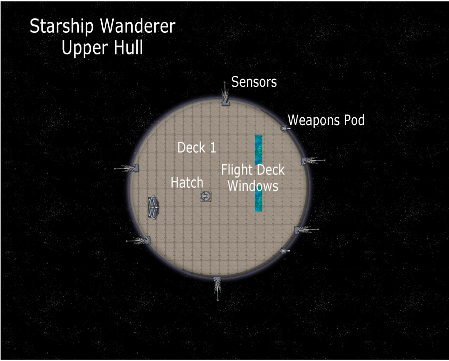
Exterior hull of Deck 1.
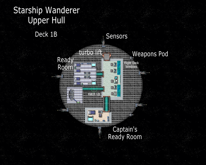
Interior of Deck 1B, the rooms and passageways. My plans are that A and C will be for cables, etc.
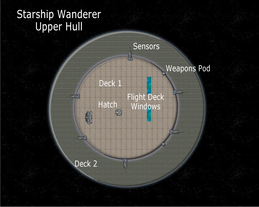
Decks 2 and 1, exterior.
What tags are available ?
Tagged:






Comments
@JimP wrote:
What tags are available ?
Just click the popular tags link on the create discussion page. That should be all of them.
@JimP
Is your Gurps space site the same one as your Crestar site?
Nope. Let's see if I can type this in from memory and auto correct doesn't mess it up.
My cell phone logged me out. Trying with my desktop computer. Now it works.
The beginnings of Hull 1, the two thin greenish-blue lines are 10' wide corridors with an air lock at each end. The map is 1000' x 800'. That small object is the right most room area is a turbo lift.
Looks like I'll use this scale for generalities, and make smaller maps for each room. Each square of this map is 50'.
I tried using the DD3 passageway tool, and found it easier to work with. Same bitmap fills are available, but I chose Brushed MetalHShuman for this 20' corridor.
Renamed it. And a closeup of the sick bay area.
Looking at the layout, there seems to be quite a distance between rooms here, with hwat I then assume is rather massive 50' walls. Any particular reason for this?
Resilience in case of attack or collision?
Each map square is 50 feet. I am using the DD3 room and passageway tools for the rooms. The thin green lines are regular star ship passageways. I felt the green ones just looked too tiny.
Well, yes, the rooms are rather far apart. But this is all preliminary. I'll be putting smaller rooms and more passageways between the rooms shown.
I did contemplate making smaller maps, say 250' x 200' instead of one huge map; however, when I have done that in the past I lost track of what connected to what. Prime example is the surface mapping of Crestar. I went from hundreds of 185x234 mile maps to two large surface maps.
Also using the green symbols from Issue 164.
I'm thinking of, well, doing something different for the main hull. I haven't planned anything.
So I'll makes some sketches, do a bit of research. Then map.
I was kinda running around in mental circles... looking through the pdfs I have bought over the past few years, I found one that will help me.
Says it isn't an official Traveller product, but I think 'Starship Geomorphs' will help me greatly. About 186 pages of various deckplans, all sorted by type. It is by Pearce Design Studio, LLC 2018. Says it was released November 11, 2018.
I'll look at this and use this as a start for ideas as my biggest problem is putting what next to where.
Better than me tossing a dart at a mental dart board for certain.
From Annual Issue 67, a planning template for starships. Width of mapped hull is 840 feet. Height is 600 feet.
This png shows the floor of the sensor area and one of the geomorphs I mentioned earlier. Some bad weather headed my way, so my Internet, and electricity may or may not hold out. i have plenty of food and water so I am fine. Took me a few minutes to realize this template has multiple grids. I chose the 35' by 35' one for this ship. The sensor floor is Floor, Metal, Bolted. I might change the scale on it.
That thin line is the hull. This is half of this deck.
While I have some ideas on areas between decks... I may or may not draw them.
Looks promising. The bridge, computer center, life support, weapons control, etc, could perhaps be in the center, most protected part of the ship.
The non-canon geomorphs have the bridge on the front. Of course, it could be like Star Trek and have them on top of the hull. Still vulnerable though.
The geomorphs have scales, so it is likely I undersized the bridge one when I added it.
This will take lots of work. So I will go back and forth on this and maps for the Atlas.
My apologies, but my Meuse is working with someone else. I'll look this over later or tomorrow or tonight, or something. So taking a break.
Well, a hop, skip, and giant leap sideways later. Anyway, no deck, not all of the walls, but progress is made. Each square is 5' x 5'.
What are those things sticking out on the curve of the bow there, Jim?
Sensor arrays.
Added a floor and some labels. Lower left is a conference room.
Testing something.
The newest update. Tried adding a star field this time to. SR is the Captain's State Room. Computer Core just 'below' the long range sensor antenna. The green square symbols are from CA 164. ( fixed some typos and added some text)
Its funny how much a decent background can sort out what the rest of the map is about :)
I fiddled with it, but its still pixelated. I'll work on it.
Have you clicked the hourglass and set the resolution to fixed and very high?
If that doesn't work I would recommend scaling the fill down a few notches, or trying one that isn't so crammed with stars so that you can scale it down smaller without the tiling becoming noticeable.
That's looking great Jim.
Its an imported graphic/photo. I'll keep trying to get the non-pixelated distance for the lower left corner. I think that is all it is. We shall see.
@Raiko Thank you.
This is with Bitmap fill starfield_08. I tried one of the others, but it was too sparse.
Oh I don't know, Jim. In some ways its better that the stars aren't all that thick in the background. It kind of detracts from the rest of the map if the stars are more of a complicated pattern than anything else. I said earlier that it was amazing how much a decent background could do for a map, but there are such things as ok backgrounds and better ones. I think this one is better.
Okay, I think I can tile this one. The one I was using has a huge nebula in the middle... but it might be under the star ship decks though.
A Quarters area, very preliminary; however, I don't want them to match. That would be redundant.
Each double room has a sink, toilet, and shower. Along with a cabinet for storage in the room, and one in the bathroom. Presume there is storage under the bed as well. Other Quarters will have different configurations. Each room of 4 has a med kit. Those are air locks existing the rooms, with strong doors for the rest.
Each square is 5 feet. This Quarters is 475 feet behind the bridge.
Some privacy doors have been added.