Text and lines moving
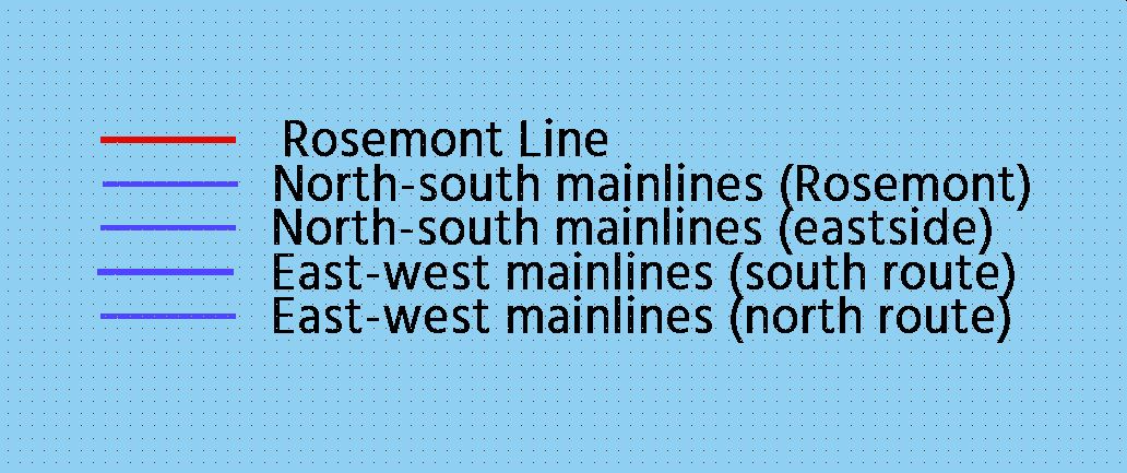
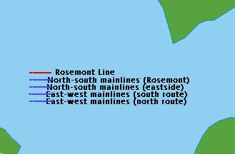
So I was adding some notation to my city map and noticed an odd phenomenon. I already have plenty of text and lines of various kinds on this and other maps, and I feel like I haven't seen this happen before? Basically, when I had several lines stacked on top of each other, and next to them, several pieces of text also lined up vertically, they seem to move closer together the farther out I zoom.
I.e., when I am zoomed in pretty close, it looks like in the first attached image.
But if I zoom out, it looks like the second attached image, and as you can see, in in this one the lines are overrunning the words. In addition, the position of the word "Rosemont" seems to change as well.
I did a couple quick text exports of this map, and this distortion IS still present - when the exported PNGs are viewed at full res, the lines were pushed over into the words in a 2300 x 3000 resolution image and the "Rosemont" was farther off to right (like in the zoomed out image), but in a 5500 x 7000 image, the lines were cleanly separate from the text and "Rosemont" was more in line with the text below it (like in the zoomed in image).
Is this normal? Is there some setting I could have turned on by accident or something to cause this? Thanks!


Comments
1. Use proper alignment and insertion points for your text. In your example, align the text "left" (horizontal) and "mid" (vertical) when placing it, and place it using the grid next to your lines. This insertion point will be the "fixed" one, making sure the text will not render over the lines (it will still vary in length on the right).
2. Explode the text after placing it. That will make it from a text entity in a number of normal entities, which will render in a fixed way. You will lose the ability to edit the text though.
...How did I not see this, lol. For some reason I just didn't think to click on the "Justify" drop-down menu when looking for the option to follow the advice in the post by Ralf. I feel silly now, but at least I know what to look for. And it does seem to work!
Thanks Ralf, DaltonSpence, and Wyvern for the responses!
Vertical alignments:
M = middle
T = top
B = bottom
Horizontal alignments:
L = left aligned
R = right aligned
C = centre aligned