1st Infantry Division Maps

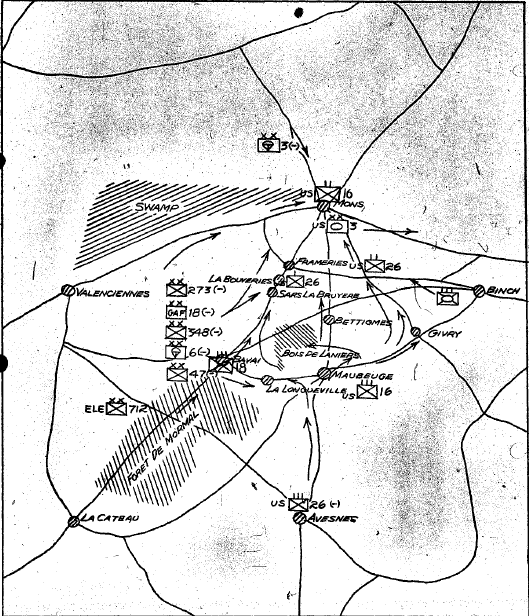
A friend asked me to make 1ID books from maps in the G3 Journal from WWII. If he likes them, he wants me to them. He will need them in black and white, but it is easier to work in color and then convert them.

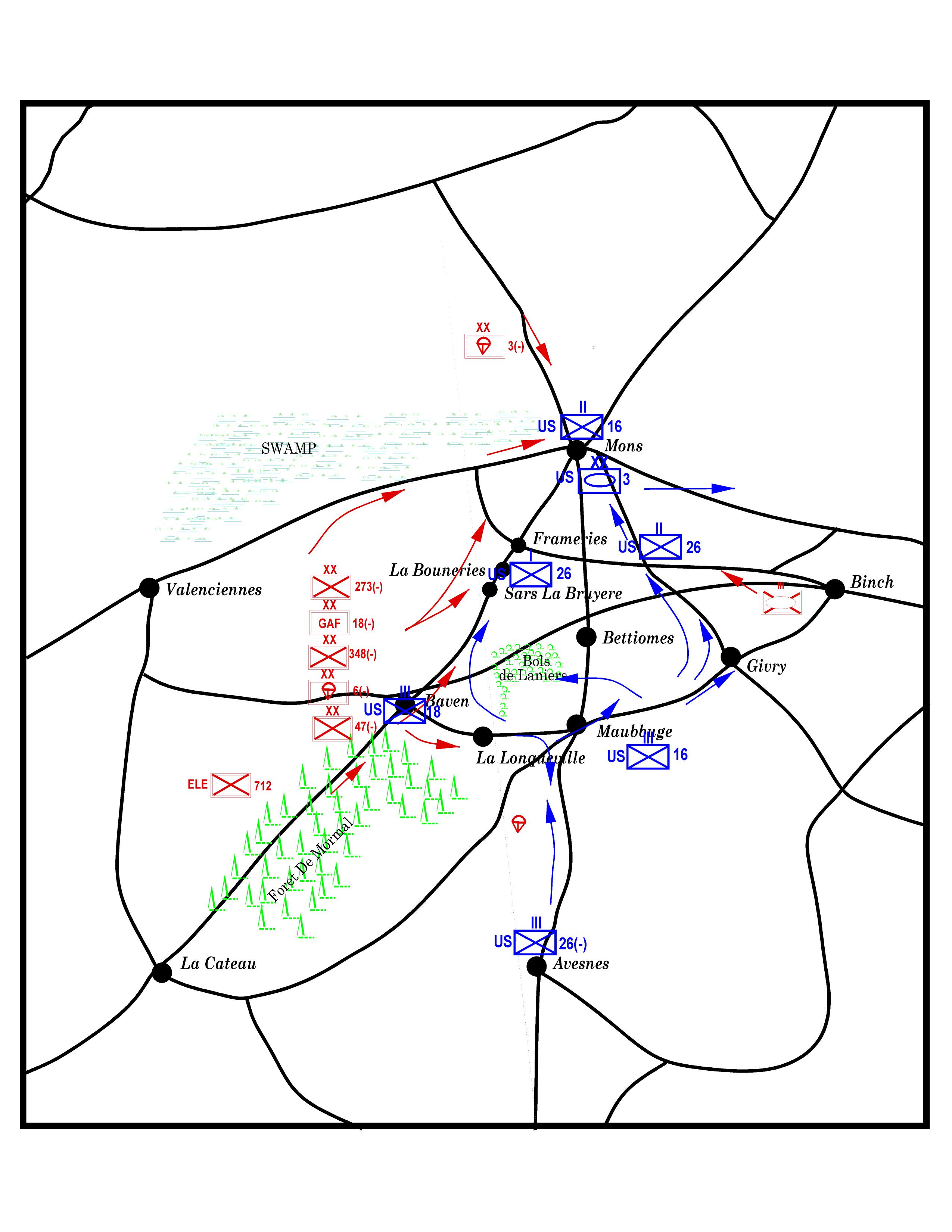
Anyway, here's the first one pretty much like it was sketched by the guy doing the journal entry. I think it has some errors in it and the symbols can probably be improved. The swamp is a bit light and the lettering might be too small. We shall see what he says.

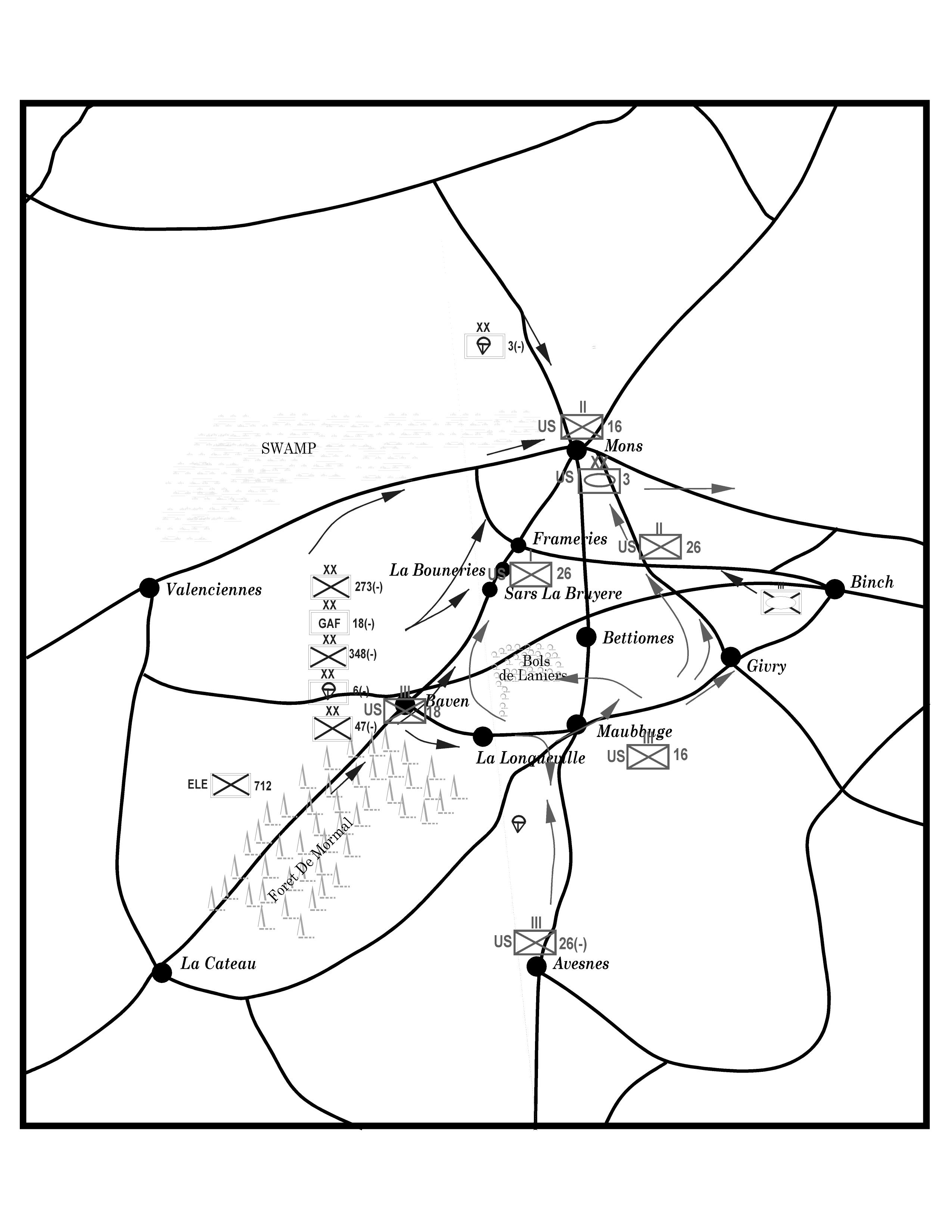
Edit: for some reason the B&W version doesn't display, so it is attached. The original is at the end.

Comments

  • When is this, Mike? It looks a little like the situation on 1944 Sep 4 - Library of Congress situation map. However that only shows divisional designations, and doesn't show any of the Axis forces west of the American lines near Mons. Indeed, I can't even find some of the marked German divisions near there (3rd Fsj, for example), while the situation map suggests a lot more German armour was nearby too (1 & 9 SS Pz and 21 Pz, for instance).

    Couple of points. You seem to have a stray airborne symbol between La Longueville and Avesnes, and I think it's Maubeuge, not Maubbuge.

    All the terrain symbols look a bit too faint on the B&W version to me presently, not just the swamp. I think it may be better to work with just the B&W version, if that's what's going to be wanted. I know I've tried conversions from colour to B&W myself before, and that can be more work than you'd expect, unfortunately. This was back when editors were starting to use more colour illustrations in magazines, but still wanted B&W versions of everything too, in case there wasn't room on the limited colour pages. A right royal pain, I can say!
  • MonsenMonsen Administrator 🖼️ 81 images Cartographer
    Posted By: mike robelEdit: for some reason the B&W version doesn't display, so it is attached.
    The reasons images don't display inline is usually due to odd characters in the file name. I commonly see it on files with the '-character in them. I am guessing it is the &-character in your files that causes it.
  • The map title says 4 SEP 1944 But the caption on the map says 14 - 31 OCT. It's an excerpt from their journal. I think you are right about Maubeuge, but it's whats on the map. :)
  • Posted By: Monsen
    Posted By: mike robelEdit: for some reason the B&W version doesn't display, so it is attached.
    The reasons images don't display inline is usually due to odd characters in the file name. I commonly see it on files with the '-character in them. I am guessing it is the &-character in your files that causes it.
    Thanks Monsen. That did it.
  • edited June 2020
    Here's my second 'Audition' map in progress. Still needs the friendly graphics and most of the lettering. Original at top, then BW, then Color.

    You can see two or three spurious lines in the bottom half. These are hard to kill because they turn up and some magnifications and not others. Even if you kill them, they sometimes come back.

    Any idea why they appear and/or how to stop them? Is it related to how much one clicks on a line?

    Thanks.
  • MonsenMonsen Administrator 🖼️ 81 images Cartographer
    These spikes happen when two nodes are very close together in a line with a width greater than 0. These are actually miters that gets extended into a very long distance as the angle approaches 0. Because zoom level affects line size on the screen, it varies if they are visible or not.
    You can try running SIMPLIFY on the lines, that should get rid of very close lines. If your map is in real world units, I would recommend trying a simplification distance of 0.02 or thereabouts based on the scale bar on the map. (If your map is not scaled in real world units you'll need to figure an appropriately small value). I recommend saving before running things like simplify. If it doesn't seem to have an effect, just try with a larger distance, if it messes with the line, undo, and try with a smalle rone.
  • Thanks Monsen. I'll give it ago. I do tend to click close so it is entirely possible I go backwards. But I am getting a lot of them on this map. Many more than my big one.
  • It's funny you mentioned real world units. I didn't even think about measuring the map via the scale to determine it. I just measured the size of the map. It looks like it is very close, though. Of course it took me now till I actually thought about it.
  • edited June 2020
    Here's the final versions of the "Map B". The large lettering I did freehand so it looks kind of sloppy, because I am not a draftsman, artist, or cartographer. My friend thought my maps look better than the original, so when I drew some lines, I experimented with changing the colors and thickness of the font to make it look less 'computery'. Sue taught me a technique by which I could take a parchment bitmap/drawing tool and put it over the map to give it some texture. In this case, it makes the map look a little more ragged. I also used some other effects to try to make it look less 'crisp'.
  • MonsenMonsen Administrator 🖼️ 81 images Cartographer
    Looks cool. Really looks like someone took a pencil to an existing map (which of course you do all the time when out in the field).
  • LoopysueLoopysue ProFantasy 🖼️ 40 images Cartographer
    Very well done, Mike! :D
  • edited June 2020
    Thanks very much. Coming from a person with much skill, I am really jazzed by your comment.

    We kept our maps in plastic cases and then either used grease pencil or alcohol permanent markers on the map case or on a piece of acetate placed inside the map in the appropriate place or taped to the outside. Things changed too much to actually DRAW on the map. :)
Sign In or Register to comment.