Edge Fade, inner: Problem with adjacent terrains
Hey guys,
I'm new to CC3+ but as of now I really like it!
But I have a little problem with adjacent terrains and the way the edges are "connected".
For the explanation:
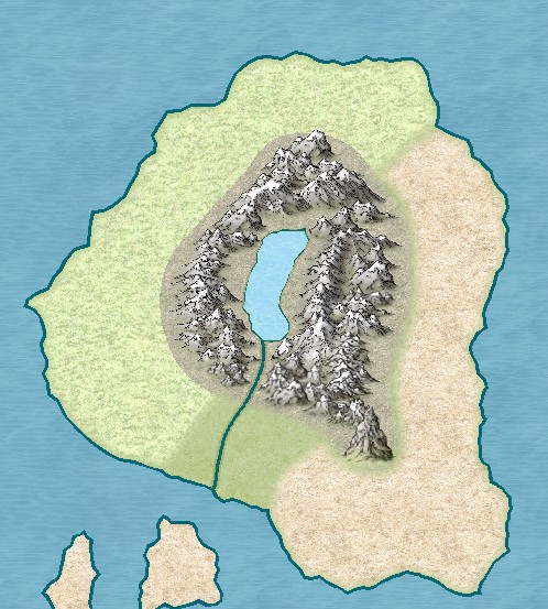
In the image you can see on the left light plains terrain on the same sheet as the terrain in the middle, mountain back terrain. The terrain on the right is wasteland and on another sheet than the other two.
They all have edge fade, inner as sheet effect with an edge width of 0.5units, 100% inner and 0% outer opacity.
As far as I understood, the effect doesn't occur between the left and the middle one because they are on the same sheet and I used trace so they are directly together. On the other side the two terrains are also directly together.
In both cases, I don't like the look of them.
Is there a way to make it look good? Basically, I want it to look as if one terrain is fading into the other, without the hard edge or the view of the underlying landmass.
I hope it is understandable what I mean and it wasn't too much of a text wall. :D
Sincerly
sickfried


Comments
The solution here is to use different sheets for different terrain types. (With edge fade on each sheet)
It's without names, because it was a little too much in my opinion.