Opinions please....

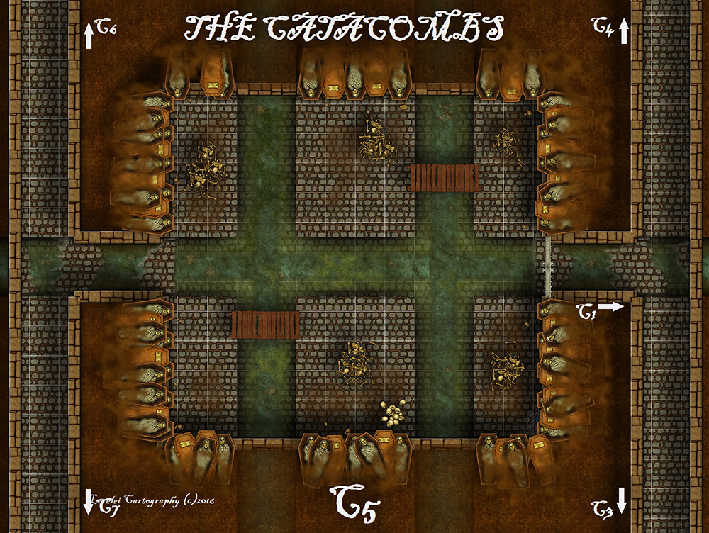
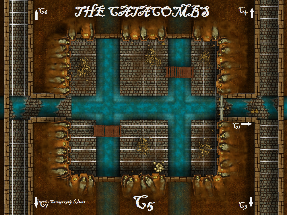
So i took Dogtag's advice and started playing around with the canals on my maps to give the water a "dirtier" feel, as they are under "ruins" and have been abandoned for some time before the newest bunch of nasties moved in. So, the water should look more stagnant and dirty. Im having a hard time keeping the "depth" look of the canals when changing the fill style of the water itself in some greener options i have. Anyway, these are two versions i've been working up....please opinions on which you all prefer. My opinion really doesn't matter as the maps are for my players and i certainly cant ask them yet! LOL Thanks in advance, as always for helpful critique.....

Comments

  • DogtagDogtag Moderator, Betatester Traveler
    edited March 2016
    I think the revised version looks terrific. I'm not sure what you meant by "having a hard time keeping the 'depth' look of the canals;" they look great to me. Looks like you added a few rocks or other debris in there, too. The color you used is great and really gives a sense of murkiness and decay.

    Did you use a single fill or did you layer several fills over each other?

    Absolutely wonderful. Adds an extra level of creepiness to your map!

    Cheers,
    ~Dogtag
  • Posted By: DogtagDid you use a single fill or did you layer several fills over each other?

    Thank you!! And yes, i used just two layers. However, in order for me to get that really nice depth i actually placed the canal above the water layer and adjusted some glow and transparency to get the look i wanted. It did prove a bit difficult when changing to the green color as that is a different fill style (from SS2, i think) and it didn't give me the same look as the blue with the same sheet settings. It was A LOT of trial and error late last night after my D&D session ( i drank way too much coffee and was WIRED for hours after everyone left, so why not tweak my maps at 1am? LOL)
  • Jay_NOLAJay_NOLA Traveler
    The revised one looks great.

    Love the dirty algae filled water.
  • Vote three for the revision - great job!

    I have not messed with the Dungeon Designer yet, I hope I can do as good as you when I do.

    :-)
  • Not sure which one is the revised version... But the one on top definitely looks murkier, dirtier, and much more real to me. The second one... The water is just too blue. Both beautiful though! But the top one gets my vote.
Sign In or Register to comment.