

[WIP] - Atlas - Doriant - Gold Coast - Gongodûr - Arbor Hollow - Dwarven Townhouses
 Royal Scribe
🖼️ 388 images Mapmaker
Royal Scribe
🖼️ 388 images Mapmaker
I've been toying with the idea of creating a subterranean dwarven city, and to test some approaches, I decided to revisit my village of Arbor Hollow to map our floorplans of some of the dwarven homes. When it's ready, I will submit it for the Atlas in a separate thread.
This set up maps will be limited to DD3 plus two annuals: Volume 15 from 2021 (primarily Darklands City and Marine Dungeons) and Volume 16 from 2022 (Creepy Crypts and Forest Trail). It's built on a Creepy Crypts foundation with extra fills and symbols from the others.
Open to naming suggestions instead of "Dwarven Townhouses."
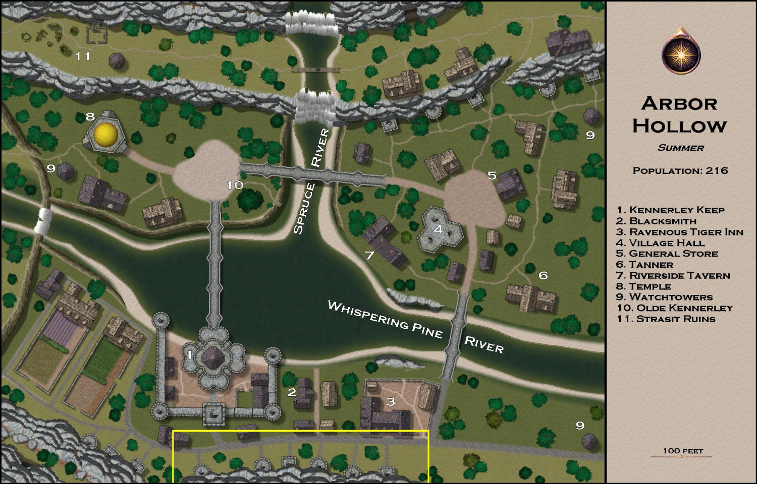
Arbor Hollow was designed for the village maps as part of the 1,000 Map Contest. I did Summer, Autumn, Winter, and Spring versions of the map -- all are in the Atlas but only summer was submitted for the contest. It's a village at the outskirts of a dwarven kingdom. I thought the village would have a mix of dwarves and humans living there. You'll notice in the map below that there are towers embedded in the rocky hillside. My thought was that these are the entrances to dwarven homes carved inside the mountain.
This will be six towers marked in the section in yellow of this map:
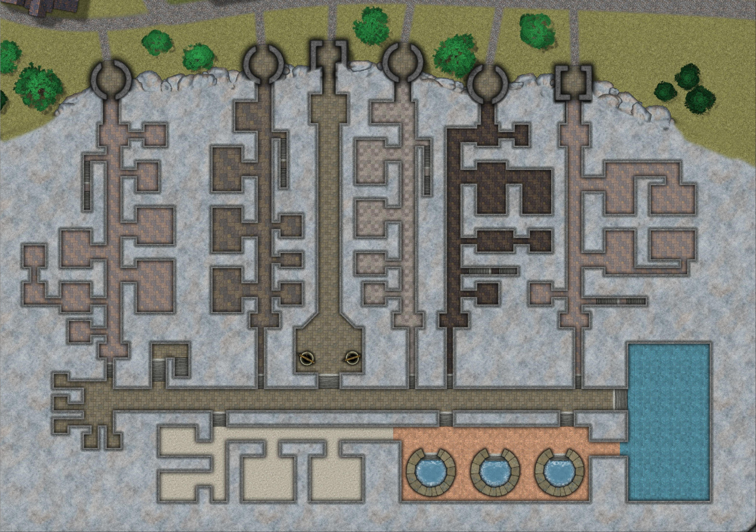
I thought these would be like townhouses, where each home has a private entrance, and each home has interior stairs to get to the upper levels of the home, but it's like a condominium complex with common areas behind the homes.
Here's a first pass at the ground floor level. I have not put in doors or furniture yet, so this is just the general layout of ground floor rooms.
Of the six towers in this map, five lead to private homes but the sixth -- third from the left -- opens to a passageway leading to the communal areas in the back (allowing for other villagers to use those facilities). On this floor, those facilities include two wells, a chamber with three geothermally-heated pools, a room that will have a cold-plunge pool, and dry and steam saunas. The common area also has a great staircase heading up, which will lead to other community features like a botanical fungi garden.
Each private home uses slightly different tilework to make it easier to visually see them separately. The ground floors will have rooms like dining rooms and kitchens. Each home also has an internal staircase that will lead to bedrooms on upper floors. And of course, each home has a back door leading to the common areas of the complex.


Comments
Very nicely done.
Looks pretty cool!
Revisiting this after time away working on other projects.
I was going to write text labels directly on the map, but I don't think there will be room. I may need to do numeric labels with a legend off to the side.
Added furnishings for the townhouses on this ground floor level. Each townhouse has either combined or separated foyers & vestibules for removing cloaks, wet boots, etc. They each have some sort of dining area, lounge, and kitchen. A few have separate larders or wine cellars. A few have bedrooms on this floor, either for servants or guests. (Household bedrooms are upstairs.) They each have a WC. And there are laundry basins in the back rooms near the backdoor to reach the common areas.
The common areas deep in the mountain include, from left to right, (1) public WCs, (2) stairs to upstairs common areas, (3) changing rooms, (4) dry sauna, (5) meditation room, (6) geothermal bath, (7) tepid pool.
And here it is with labels.
The font "color" on the legend is actually a gold fill from the Ship Deckplans annual (which comes from the same year as Darklands City and Marine Dungeons). The gold fill is on an inlay layer behind the black marble, and then the text is the magenta #6 color on that black marble's layer, with the Color Key Cutout effect added.
Looks good & golden!
Labels are never easy. I seem to spend more time on these, tweaking the font, colour, size, placement and effects, than just about anything else. These probably look fine on a higher-res image, but some - especially those on the palest stone background - are getting a little "lost" to my eye.
Oh, and on the "Private Residences" list, I think there's a missing space in the "10. Entrance" line.
I do see that as well Wyvern. Maybe an outside glow? Maybe a really dark purple to tie into the legend background.
Thank you! I do struggle with text labels.
Labels are simply perennially tricky, I think. There are just so many variables involved, not least where different background colours against which they may be displayed in the same drawing are involved. I know this isn't just an "us here" problem, as I see similar issues from time to time on professionally-published maps as well - including things like the UK's Ordnance Survey maps, for instance.
I don't think there's an easy answer, beyond just to keep experimenting and see what works better for you!