

A Hand-Drawn Fantasy Map of Jack Vance's Dying Earth
 Wyvern
🖼️ 293 images Cartographer
Wyvern
🖼️ 293 images Cartographer
Having seen several Forum topics in recent months regarding the creation, and recreation, of maps from various past fantasy settings, both literary and in role-playing games, and despite having several ongoing mapping projects for the Nibirum Community Atlas, I've lately become distracted into trying a map of the Dying Earth, based on the fiction of Jack Vance that used this setting. Vance's Dying Earth writings were one main fantasy influence on the original Dungeons & Dragons RPG, and they continue to resonate in numerous other games now.
In approaching it, there's the complication that there are no definitive maps created or authorised by the original author himself for the complete world he created, and the story descriptions are sometimes vague enough to make constructing one tricky. Prior to the post-pandemic period, there'd been probably no more than five attempts, all of which show sometimes considerable variations between one another, and sometimes split between different maps. This post on the Lost Delights blog from 2020 discusses the five, with image links.
Over and since the pandemic, there has been one more, by Doug Kovacs, created specially for the boxed set for the Dungeon Crawl Classics RPG by Goodman Games, following their hugely successful Kickstarter campaign to produce a Dying Earth setting for the DCC rules in 2021. There are some images of the map on the Goodman Games store page for the boxed set. Even so, despite this being perhaps the most colourfully lively and more nearly complete of all the maps, the vagaries of the tales mean all such attempts are based on personal interpretations, and thus none are truly definitive.
I'd had my own vague notions of trying to map the Dying Earth, going back more than 40 years to when I first read the stories, deterred previously by that vagueness. Having recently managed to secure a copy of the DCC boxed set though, I thought it might be fun to try to redraw the Kovacs map (and maybe some of the others later) as a CC3+ version. Hence this topic.
For those unfamiliar with the setting, it is in Earth's 21st Aeon (an unimaginably vast time ahead of our own). The following is a snapshot provided in one of the earliest tales, "T'sais", first published in 1950 in "The Dying Earth" anthology of six stories. "T'sais" is the third of the six. Pandelume, a near-god-like mathematician-magician, whose form must never be seen as it would cause utter madness, speaks:
""Earth," mused Pandelume. "A dim place, ancient beyond knowledge. Once it was a tall world of cloudy mountains and bright rivers, and the sun was a white blazing ball. Ages of rain and wind have beaten and rounded the granite, and the sun is feeble and red. The continents have sunk and risen. A million cities have lifted towers, have fallen to dust. In place of the old peoples a few thousand strange souls live. There is evil on Earth, evil distilled by time… Earth is dying and in its twilight…""
Add to that that the Moon is long gone, stars in the night sky are very few, that the world is filled with marvels and dangers both magical and technological (there is no difference between them) and has been visited by creatures and beings from what were once distant stars and galaxies, all too now largely long gone and forgotten, and you start to get an impression of where we are!
So, preamble done. Now to the mapping. I chose Ralf's Hand-Drawn Fantasy overland style, as it had worked very well for my attempt at redrawing the Blackmarsh partial world map previously, and this was going to be a similar project. The first complication was there's no scale on the Kovacs map (or indeed, on most of the others), largely thanks to the vagueness in the tales. So I simply went with an approximation of the ratio, and doubled the normal map area to 2000 by 1600 mapping units. Dropped-in a copy of the Kovacs map to trace on the normal BITMAP Layer and Sheet, and started drawing. This is an early screenshot:
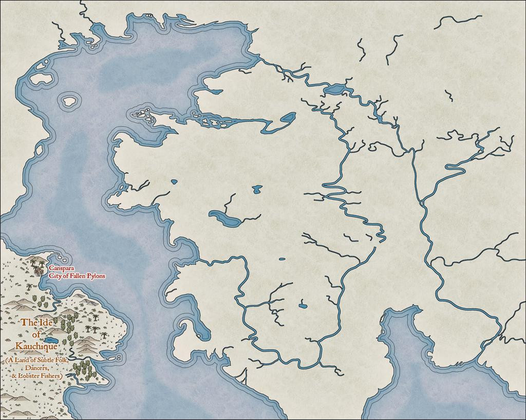
It was taken some way in to the mapping, as I'd had a couple of false starts by this point. At one stage, I'd thought it might be possible to split the main landmass in two along the line of that curious river that apparently connects the northern and southern oceans, but it proved much too tricky to get the river width to look right. Given that this style uses the Color Key effect to cut through the land to the sea, that wasn't really necessary anyway.
Most of what's visible here is a test, to see what works and what doesn't, and the odd-looking, truncated river lines will be tidied-up as mapping proceeds. It has been strange to stick with the default Effects settings that use the Percent of Drawing Extents Width here, which I'd ordinarily swap-out for Map Units instead, but as they work very nicely at this level of viewing, all seems well.
The next image shows how the river lines are going to be tweaked, added-to and adapted along the way, just in that Kauchique quadrant for now:
Other adjustments have been made too, in changing the deeper sea contours, and such processes are liable to recur frequently as the journey proceeds, given this is not going to be a rapid process, because of the detailing involved.
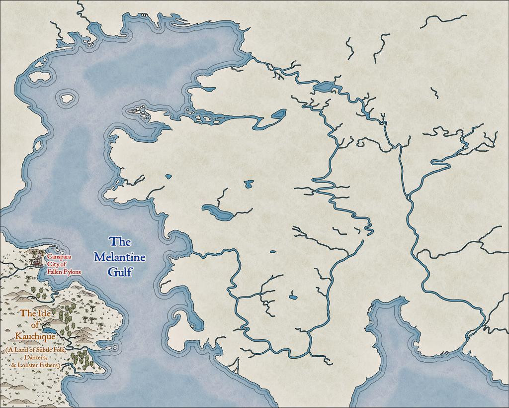
Somewhat strangely, I found I was adding the map detail much as if it were hand-drawn in reality, from left to right:
As each of these snapshots shows the progress from an individual mapping session, it took several days to get to this stage:
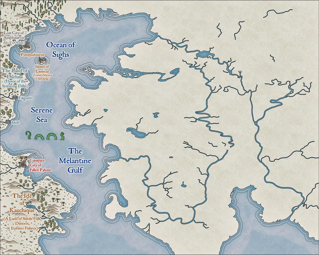
Which is where things are currently; clearly, with lots more still to do!


 and 2 others.
Comments
This is outstanding! I love that work, and it's great to hear that you're doing this.
Wonderful!
That's pretty awesome!
I like the progress
Really nice work!
Thanks everyone for the positive comments!
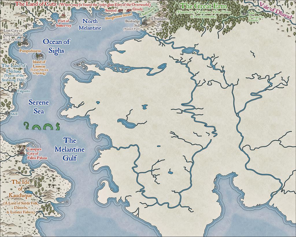
Progress update from the next couple of sessions today, heading south in the main landmass:
The perceptive may spot a new annotation saying "Pelgranes" in the Great Central Steppe - so yes, that is the same as Pelgrane Press (who have some peripheral connection with ProFantasy, I believe 😉), who also have their own, very detailed, Dying Earth RPG and its book-derived setting (first published in 2000; DriveThru RPG link), later including maps with actual scales on by Sarah Wroot (from 2002)! The maps are only available on Pelgrane's own website, however - link, on which site also are various free downloads about the game and its setting. Pelgranes in the Dying Earth though are gigantic flying creatures, with furry bodies, capable of intelligent thought and speech, apt to eat you just as soon as they can spot you, and swoop down to feed.
And so to the present state of play:
That amount of blankness though still argues for a lot more mapping to follow...
I really like how this is shaping up. This map style really has a lot of versatility.
My personal preference with rivers is to use the cut-out approach, so I was delighted to see this map style using it. Sometimes with other styles I add the color key effect to land and terrain sheets so I can do the cutout for rivers instead of their drawing tool.
The one downside is you need to remember to have a sea/water sheet below the land sheet you're cutting through, of course! This is an issue if you're doing a landlocked map, and changed the default sea-fill background to a land one during the New Map creation process. Not saying I've done this, but, y'know...😊
I have become very attached to this Hand-Drawn overland style; just something about it that's very appealing overall. I think my next Atlas maps are going to stick with it for a while too.
I was about to make the exact same comment as @Royal Scribe - I love the way this is shaping up! Just a fantastic looking map so far!
Heading further south in the main landmass area now:
Plus making tweaks to a few labels previously-placed. Every now and then, something just doesn't look right, or something's been forgotten. Or occasionally realising there's more space than was thought before, etc...
Everything here has been placed individually, incidentally, except for some of the areas of wasteland/steppe symbols, where the black outline drawing fill designs were used instead (mostly because few of those outline versions are available as separate symbols too - only the grass and dead trees, in fact). As those fills can look a little sparse, I did a mixture of adding some extra symbols by-hand, and duplicating the filled polygon to a separate sheet, then changing its fill type. There are several sheets for different terrain types in the default style setting, so there's a choice of picking sheets that do or don't have effects on with these - the black outline drawing fills don't usually need the edge fade effect some sheets like the mountain background terrain one has, for instance. As an example, for the Tundra, Lirrh Aing Wastes and Steppe areas, I began by adding a coloured polygon using the Desert Terrain drawing tool, and then just copied that polygon onto two or three more sheets to add the black-line symbol-fills (using separate sheets in case I needed to remove one after its "test fitting").
Down to the map's southern edge next, giving a chance to play with some sand dunes in the unnamed Desert (although I'd already added a few dunes to Kauchique in the early stages, these were more concentrated here). Not to mention sneaking-in a couple more sea creatures:
The results of the last session for this update finally sees the label added for perhaps the most evocative of the Dying Earth place-names, The Land of the Falling Wall, where may be found the dark-eyed necrophages and the great Walking Serpents (couldn't quite find space to squeeze in a label saying this, unfortunately, after a couple of failed attempts; at least I'll remember!):
I didn't actually realise until I was typing-up these notes and checking through the images, that for some reason, without having altered the image size or resolution, or changed the map effects, the sea lines just off the coasts are slightly different on this image to all the rest - fractionally thicker and further from the shore-lines. No idea why though! One more mystery of The Land of the Falling Wall, mayhap?
Last segment to complete - needing maybe just another couple of sessions...
Looks awesome, so close to the finish line!
Perhaps a space between Kaiin and The White City? Fantastic map
I was going to leave a discussion of some of the text items to my closing post on this topic, but since that's not quite ready yet, and as the subject's been mentioned, we can today take a closer look at...
The Kaiin Mutiny*
Using text in Campaign Cartographer can often raise issues, and is typically one of the most complex elements. Aside from variables such as which font to choose, the font size for particular labels (as only one size can be allocated to each text item), suitable colouring and effects, the placement point can often be the trickiest to get right. Text will tend to expand away from whatever placement point is chosen at different screen and image resolutions - if that's "Mid Left", the text will usually hold fast on its left side, expanding away to its right, for example. This can only be fully overcome by using the "Explode" command on the text, to convert it to graphic entities that will hold their positions correctly. While this has advantages sometimes, it has the serious disadvantage that the text can no longer be edited as text, so make any mistakes, and the whole rigmarole must be gone through again.
In this case, I was using two different font sizes, and thus separate text items, for many of the map labels, larger for the place-name, smaller for the notes. The Kaiin label was an especial problem, because at the place-name font size, there wasn't enough room to fit the full text line in due to "The Melantine Gulf" label. So I reduced the font size for "The White City" part, and set-up the two parts of the name-label aligned, but with the intended fixed placement points of mid-right for "Kaiin" and mid-left for "The White City". It looked fine, as this screenshot from the FCW file shows:
However, rendering the map image as a JPG at the normal Forum resolution, and it came out like this:
This is unusual, but I didn't spot it right away, hence why it appeared on the map images posted last time (and again in one of the WIP images still to come). Typically, once I think a map's completed, I do a trial printout on an A4 page, so I can check it for mistakes, rather than relying on just on-screen images. Which is where this little "delight" was noticed. Checking the FCW file showed that "The White City" had been given a mid-right placement point as well as the "Kaiin" one, which I'd guess was due to a mis-click on my part; luckily, easily corrected, as this sneak-preview of a later-stage-mapping image shows:
One further point about the map labels should be noted. As often happens with such labels that have effects on them, when placed over mapped features with a very similar to identical colour, that can cause the text to lose definition, or gain unwanted holes and marks. When I spotted that first, for the "Fer Aquila Mountains" label, I decided to duplicate all the on-map texts to a lower sheet without effects on it, which stopped the problem in its tracks. That did though help slow-down the whole labelling process subsequently, both in remembering to do it on a per-label basis, and when the label's placement point, font size, or appearance for multi-line texts, had to be amended after adding it. Which, of course, is partly why the Kaiin Mutiny was allowed to continue for so long 😉!
* A punning reference to the title of an old Humphrey Bogart movie.😎
Closing-in on the final stretch now, with only that southeastern quadrant to complete.
And lo! The coastal lines did resume their former appearance (again, no idea why, but I'm not complaining!):
There was also one new addition here, although it may not be all that obvious. It happened when I realised I'd not added the background shading polygons to the huge Fer Aquila to Black Maurenron Mountain ranges, or the Chaim Purpure one. That realisation came about after preparing the notes regarding these very background area fills previously! I went on to add a few more similar patches to the smaller clutches of hills elsewhere in places, helping to soften the landscape a little more (e.g. in Kauchique).
All of which brings us to the final version of the map, as luckily, those last areas needed fewer labels in them, which, as mentioned previously, always seem to take the longest to get right. A higher-res version of this is in my Forum Gallery:
This was all rather fun, and as good an excuse as any to revisit some of the tales, and explore both the Goodman and Pelgrane RPG materials more fully, to pull together the on-map notes for my version, for all it was heavily based on the Goodman Games map.
Naturally, on reflection, there are features here that seem a bit odd, due to how that guide map had been drawn. That "Great Central Steppe", for instance, seems neither very great nor central, but of course compromises have to be made when trying to pin-down on a map things that have been extracted from a literary source, where imprecision in describing such things was to be expected, and sometimes intended (because such details were often given by characters in the stories who may not have known the information anyway, or had deliberately altered it). You'll notice too that those two later sea creatures had to scoot aside as the map's title dropped into place!
No scale or compass rose were added. The scale issue was mentioned before, as not featuring on the Goodman Games map, which also had no compass pointer. Distances in the stories tended to be glossed-over a little vaguely anyway quite often (for instance, the distance between Canspara and Ampridatvir was noted as being a thousand leagues in one tale, although what constitutes a "league" here is anyone's guess, so essentially "a very long way" - rather like the real-world, as a league is a distance measure that's had different definitions at different times and places). I did trial a compass rose briefly, but the only suitable spot was in the lower-right corner, where it looked awkward without shifting the "Songan Sea" labels (so those then looked odd!), or making the rose too small to seem useful.
I'm thinking now of revisiting this in future, perhaps with similar reworkings of the alternative Dying Earth maps from elsewhere, and/or compiling a variant of my own. Though I really should get back to some Atlas mapping again now 😁...
That's a really handsome looking map, Wyvern. Well drawn.
Thanks very much, Sue! It's the style that does it really though - and that's down to Ralf!
I think you could make a beautiful map in any style ;) It just looks even better when you use a beautiful style.
Fantastic - and the style fits it perfectly.
Wonderful, great to see you giving the style a proper workout! :D
Just a really great map, Wyvern. Love it!
Thanks very much everyone!
I am not familiar with Jack Vance's Dying Earth, but this map -- like every great map -- is sucking me in and making me want to learn more about it. Adding it to my already long "to read" list.
@Royal Scribe : There are four books by Vance that comprise his Dying Earth stories, The Dying Earth (1950), The Eyes of the Overworld (1966), Cugel's Saga (1983) and Rhialto the Marvellous (1984), but if you can find them (try Amazon), you should probably read the tales in their more definitive versions, published in the past few years by Spatterlight Press, as Mazirian the Magician, Cugel the Clever, Cugel: The Skybreak Spatterlight and Rhialto the Marvellous, because these are the Vance Integral Edition (VIE) versions, with amendments bringing the texts back to Vance's originals, rather than what was sometimes published originally. There are 62 volumes with all of Vance's tales in the complete VIE collection (he was a very prolific author!), and you can find more about it on the Jack Vance Official Website here.
[EDIT: And it did finally occur to me that I should have changed this from a "Work In Progress" to a "Finished" topic - so I now have!]
Thank you, @Wyvern, I appreciate the recommendation.