

WIP Arboridia (Mercia) for Community Atlas
 HelenAA
🖼️ 19 images Mapmaker
HelenAA
🖼️ 19 images Mapmaker
The map is being drawn using Jon Roberts Overland style but I’m building the town using Jonathan Roberts Cities template. Up to now I’ve avoided the structures in the Cities template simply because I had got it into my head that I hated the shapes, so I decided to see whether I actually could use them to create a town with them, and I’ve come to like them but strictly on a very small scale! I’m also using colour to help differentiate types of structures, e.g Civic Offices and Harbour area as well as residential areas.
The map below is just a rough outline of the town that I’ve named ’Ridia. I build towns by placing the structures first and then put the roads in, the opposite to a great many of my fellow mappers but that’s how my brain works best.
By the way, were the two templates done by the same person?

Comments
It will be interesting to see where you go with this.
And yes - Jonathan Roberts provided the artwork for both these styles. His website is called Fantastic Maps if you are curious.
I thought it might be the same chap - the symbols have the same “feel”, in the same way as yours have the same “feel".
Actually Helen, I tend to do a few major roads (no more than 3) then add houses/buildings, then the other roads work themselves out. So I sort of do it your way too.
I place symbols allowing for roads or trees or whatever the map calls for! I’ve put a background on my current version just to prevent ’Ridia from suffering from urban sprawl!! I know more or less what forests will be where and the odd small village running along the rivers. . . . Cheated slightly by drawing over the coastline and rivers though. <shrug>
Yes Helen. I like Quenten, like to let maps evolve. Like Bob Ross, happy little accidents.
My current large city map was set with all the main roads. Almost done with building placement, now filling in minor roads and paths.
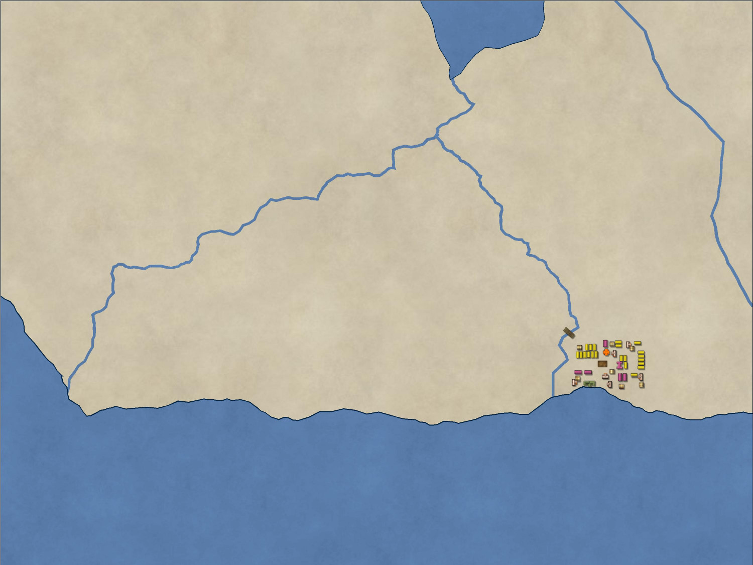
A local view of ’Ridia from yesterday-- half finished.
Today saw more building in ’Ridia. I think I’m about 2/3rds through now. I just pasted my notes of colours and symbols onto a box to see what it would look like. I’ll have to enlarge it for the final map I think because the below is a cropped screenshot. not yet got enough to export it and get a meaningful image. I’m really having fun with ’Ridia.
I need suggestions - I’ve been rebuilding ’Ridia over and over and although it looks fine when zoomed in, I either have it large enough to see when zoomed to extents which means that it swamps the entire bottom right corner of the map, or small enough that its in keeping with the visual scale of the map as a whole which means that nobody (not even me!) can see what’s where. The symbols down the left of the map are in preparation for a key, by the way.
Hi Helen :)
Perhaps it is time to consider the vast open area of the rest of the map, and start to decide where things like mountains, hills and different kinds of terrain should go?
I’ve moved across the map and am completing the other main river, and then I am going to do the centre area but the puzzle will still be there, if only the scale of the symbols.
The scale of symbol is usually conveniently organised within a single style, but where you have mixed styles the comparitive scales between houses and hills (for example) is at your discretion. It's a blend of what is recognisable for what it is, and what looks right to you.
A map symbol doesn't have to be accurately scaled to life. A good example of this is the size of overland mountain symbols, which are many more miles wide than a mountain could be in real life. However, they do need to be that big so people can see that it's a mountain range and not a line of squashed ants.
Yea just go hard on the rest of the map and see what happy accidents fall into place. I do that a lot myself.
Here’s my most recent export of Arboridia, it’s not complete by any means.
I’m aware of the need to darken the roads - hadn’t realised how much too light the lines are until I printed the thing out - and I need to do something about the text. I’m going to put more trees in, but I don’t like the Forest fill tool - way too dark for this map in my view - so it's going to be manually placing each tree.
All comments welcome.
Looking great. That Delta is impressive. I don't mind the roads at all.
If you aren't happy with that base tree tool then you can play around with the Draw function, Symbols in Area. Just make sure to choose the colour first. There are lots of variables, but helps you to get the look you want.
Knowing what tree you want first helps to navigate to it when you browse for the symbol.
Thanks for the tip about editing the tree fill, @Don Anderson Jr. I had great fun doing the delta -- zooming in, I used a fractal line and started with two main stems, then went down .2 and then after i’d put in enough lines, I went down another .2 and filled in some gaps. I could have gone on but you probably wouldn't be able to see them on such a small map so decided not to gild the lily. Instead I got all 12th century and put structures for Heloise and Abelard to live in, one each side of the river! Had fun trying to get the structures large enough to see and not too densely hemmed in.
You may be able to get the roads more obvious simply by widening the lines, and maybe increasing the glow effect on their edges. The pale colouring actually seems fine.
I very rarely use any of the forest fill tools, since trying to get the tree-density right if your map's not a typical size for the style takes too much time and effort for me. Plus I usually want to add features in the woods, so end up moving or deleting trees to accommodate them. Thus it's quicker and easier for me to just place trees individually!
Almost finished! Noticed I’d not put river names in after I’d exported this. And a few trees that must be uprooted....
Anything else?
Is that font used for the title a standard font (Either windows standard, or something that comes with CC3+ or an addon)? If not, it won't show up in the atlas properly. (CC3+ will default to Arial or something instead.)
A scale bar would also be nice.
The font for the title is Hans Hand - it's available via the More Fonts button in the text property. Its a downloadable, should I change it? Scale bars baffle me as i can’t always work out how far to put as the scale.
You can 'explode Font' to keep it as a symbol, though editing it becomes a headache. I did this for a few of my Atlas maps, eg using cuneiform script.
The fonts under "More Fonts" are all the fonts you have installed on your computer. They may be nice to use in personal maps, but they are not a good choice for atlas maps, since other users won't have thins fonts installed (including me), so everyone will just see a plain replacement font instead of the pretty one.
The best is to either change it, or do as Quenten suggests, use Explode Text [TEXPLODEMP] on it. This will convert the text into regular entities, which isn't dependent on anyone having the font installed. To ensure the text stays on the right sheet and layer, use Extract Properties [KEEP] on it first, before exploding the text. After exploding it, you may need to move it back into position using the regular move tool.
For scale bar, the value to put in is simply the length of the scale bar. If the map is correctly scaled, and you are placing the scale bar at symbol scale 1.0, most styles in CC3+ comes wit scalebars that are 100 long. But you can easily check this aftrer placing it by using the Info -> distance tool and measure the scale bar from end to end. If this doesn't (approximately) match up with the value, then just undo the scalebar placement and try again.
I think I’m going to replace the font. I can’t make up my mind whether the result of TEXPLODEMP is a graphic or not. if I move the result ’shivers’ as I move it, while normal text doesnt. Is that how to tell if it is a graphic?
You can easily check the entity with LIST.
If you use LIST on it and it shows a single text entity (2D Text), it is still text (i.e. not exploded), but if it shows a group with a lot of entities grouped together (multipolies, paths, splines, ...) it has been converted to basic entities.
I think I’ve managed it, Remy.
Later:
Here I’ve been thinking that Arboridia is a small region, but I had an almighty shock when I measured the distance of the map L to R to be told that it is 220 map units across, and when I put the scale bar’s width (30 map units) into my calculator to see the total mileage of 6,600 miles. I think I’m going to be halving it to 15 map units, but that’s still a lot of distance
A map unit is either a mile or a kilometer, depending on whether you have made a metric or imperial map, so 220 map units across means the area is either 220 kilometres, or 220 miles across. I'm not sure why you think it is 6,600 - unless I've jumped a vital piece of the conversation somewhere.
Ah, that’s why it was way out. I did wonder,, however numbers and me don’t really work. Thanks for setting me straight.
Anyway here’s the final .jpg
A very nice map! The main title is a little jarring to me, but I struggle to see reds "correctly," so that's likely just me.
No, I'd agree with that too @Maidhc O Casain, although to my eye it's the very strong drop-shadow on the title that's causing problems, as I don't struggle with specific colours.
How about this? The font is one that came with Annual 51 Jon Roberts Lucida Blackletter and the drop shadow is massively shrunk as you see.
I prefer the one from before, but with a reduced drop shadow.