

Suggestions for Tweaking this Map
 JulianDracos
Mapmaker
JulianDracos
Mapmaker
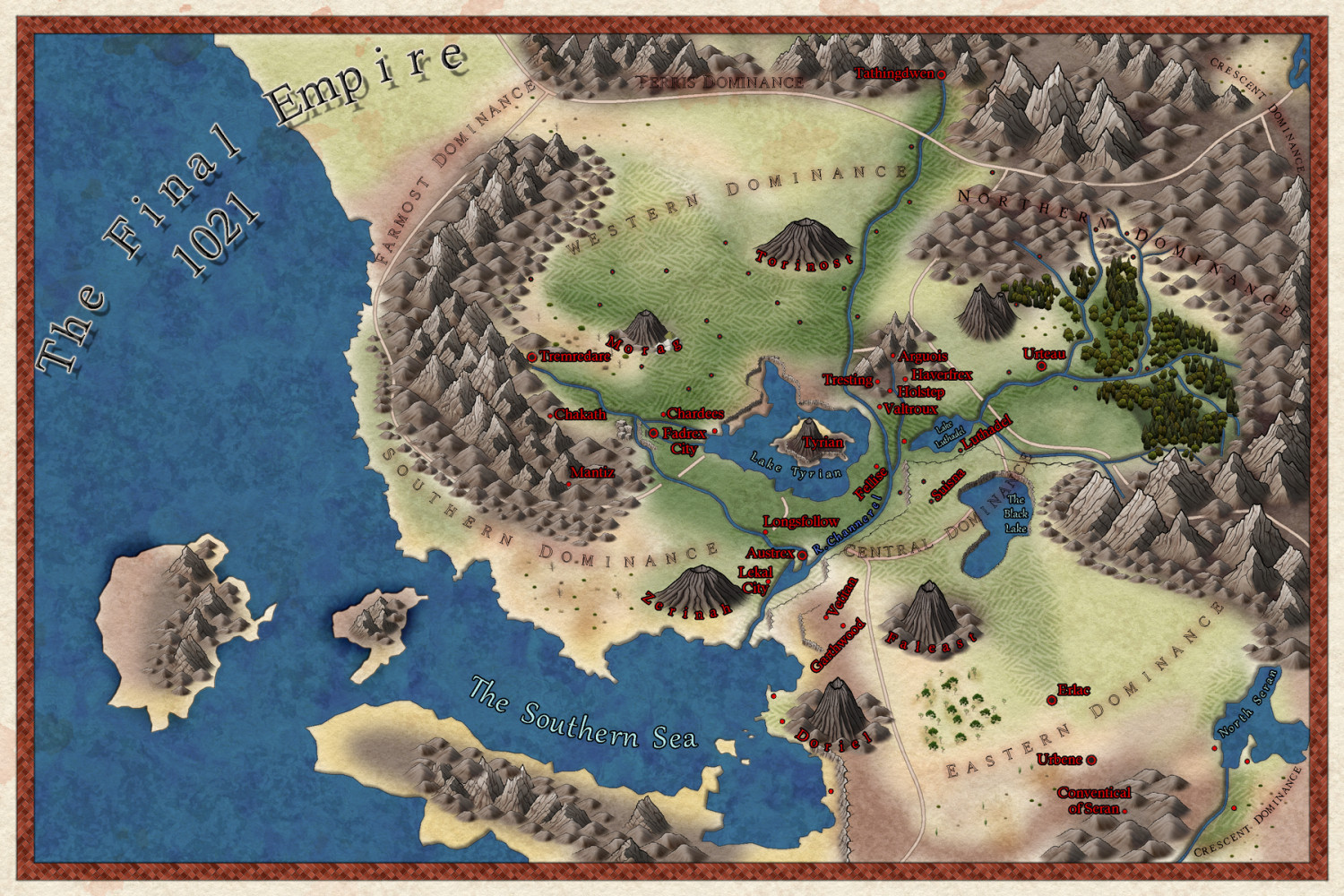
So I need to get this map out for printing for a birthday. I was unhappy with the scrub brush in darklands, so I went to Spectrum and used some of its symbols and then tried to color the land to be suitable.
Anyway, just looking for any suggestions on how to tweak the map such as changing font, colors, blending the terrain colors, effects, etc.
Tagged:


Comments
Overall it looks fine to me, though I would recommend using a regular straight title instead of a curved one unless you have your heart set on it. It feel to me like it's meant to be part of the map, rather than the title.
Maybe also a deeper contour in the sea away from the coast?
The title was originally just stacked and it looked odd. I will try to think of something else.
I totally forgot about sea contours so I will be doing that now.
I think it looks great. The only thing I would change would be adjust the glow around the red text to be a little smaller, or maybe change the color of the text to a more natural brown like in the border.
I agree with Sue - I wasn't paying close attention to the details on first glance and thought the curves title was.actually the name of that region of the map. When I read the actual words I thought it might reference what lies "off the map" to the NW. Then I read Sue's comments and your response and realized it's the map title.
Otherwise, I love the map!
So I made the suggested changes. I do wish there was a way to add a contour to the coast line to lighten it up, but I don't think there is a way with this style.
Try adding a new Glow to the WATER sheet, move it up to just below the Color Key and set it up like this.
You might have to adjust the extent of the water to take the edges outside the ribbon border so you don't get pale colours seeping in from the edge all around, but it should work. The drawback is that all the rivers will be that lighter blue.
I also really recommend moving that title back to the top corner where it was. There's a natural space for it there.
So I did the glow. I really liked it for the coast and the lakes. I did not like the rivers, so I left it off.
I moved the title back up. I felt the need to add a circle around it. I don't like I think having it in a circle.
If you don't care for the circle around the title, other options for the title might be to use the decorative banners from CA170, or a light-colored polygon behind it with a transparency effect.
I like the map but the red text is very hard to read even when zooming in on the image.
Maybe make the title background a filled circle instead (still within the bevelled ring)?
For the red text labels, try a white or pale cream-coloured glow instead of the black one currently.
I'd be inclined to tweak the various "Dominance" labels so they don't run so close to features on the map in places, and change the glow or colouring so those in the darker areas (top and top right, on and beyond the mountains) stand out a little better.
Text and titles are always far trickier to get right than almost anything else!
I had this sent to the printers before anyone raised issues with the red text. I will find out on Tuesday as to if the red was a bad choice or I should have changed the outline color.