

[WIP] Fantasy Coastal Fishing Town - looking for feedback
 MarkOlsen
🖼️ 6 images Traveler
MarkOlsen
🖼️ 6 images Traveler
Hi all,
I'm looking for some feedback on this map. It's in sort of a late draft stage at the moment; it's pretty much laid out how I want it, I'm just fine tuning at this point.
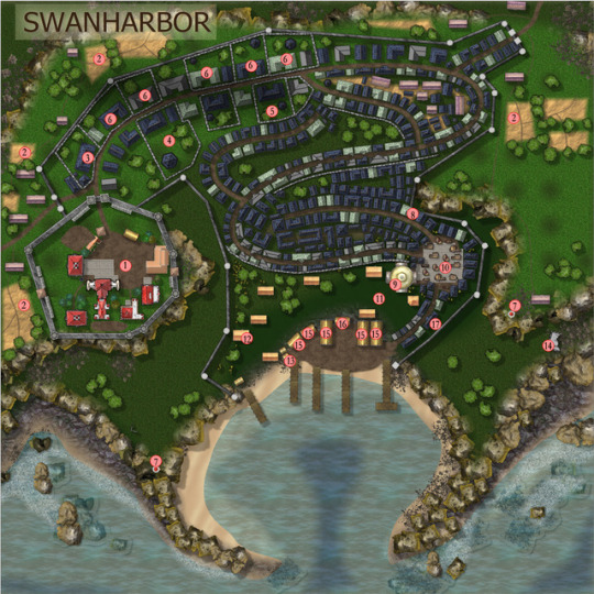
It's a seaside fishing town in a fantasy world, with a population of about 1,000 (the town, not the world). Not shown are a couple small fishing villages in either direction along the coast and about half a dozen farming hamlets within a dozen or so miles inland but most of its goods come directly from the sea or via sea trade.
I followed a tutorial by Shessar on doing the cliffs (although I used my own rock and boulder images) and am super happy with them, so thanks Shessar!
Issues I have to fix still
Some roads not connecting
Some walls and buildings overlapping
One section of dirt in the castle is on wrong layer, rendering above stables
Need to move docks to different layer, their shadow is out of scale and it looks like they are flying
Possibly change the ground right in front of the docks to a stone or wood plank fill
Weird "dots" in bright grass - probably a tiling artifact of the seamless grass texture I used
Farm buildings are huge; need to fix scaling so it doesn't look like the farmers live in mansions
Questions I am pondering
The lower right section of the town wall follows along inside the cliff - should I just have it go TO the cliff and use the cliff itself as a natural wall there and then start again at the top of the next level?
The top right corner of the wall looks weird to me - maybe instead of a narrow section jutting out, it should curve more smoothly to the section "below" it on the map?
Is the shape of town readable? It's supposed to be sort of a steep bowl down to the dock area: lowest at the docks, then rising to the left, the right, and the top of the map. So there are three basic levels: the dock/beach level, the middle cliff level and the upper ridge level, then it drops precipitously at the "back."
Did I use too many different styles of building? I'm especially uncertain about the fact that I used such a different symbol style inside the castle from the bulk of the town. My tentative explanation is that it was built by a previous civilization in a style that is no longer used and the more "modern" town grew up around it, but I am wondering if the difference is too visually jarring.
Thoughts on any of those three items would be especially appreciated, but I am open to any constructive criticism.
Thanks for looking,
Mark
I'm looking for some feedback on this map. It's in sort of a late draft stage at the moment; it's pretty much laid out how I want it, I'm just fine tuning at this point.
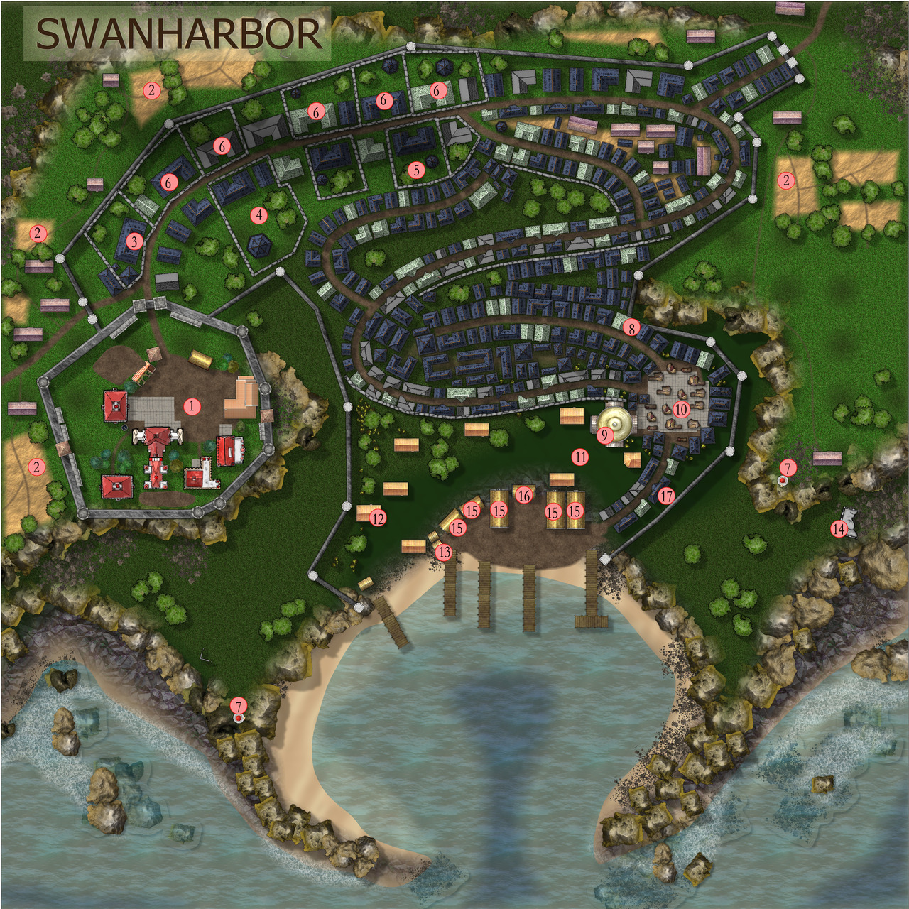
It's a seaside fishing town in a fantasy world, with a population of about 1,000 (the town, not the world). Not shown are a couple small fishing villages in either direction along the coast and about half a dozen farming hamlets within a dozen or so miles inland but most of its goods come directly from the sea or via sea trade.
I followed a tutorial by Shessar on doing the cliffs (although I used my own rock and boulder images) and am super happy with them, so thanks Shessar!
Issues I have to fix still
Some roads not connecting
Some walls and buildings overlapping
One section of dirt in the castle is on wrong layer, rendering above stables
Need to move docks to different layer, their shadow is out of scale and it looks like they are flying
Possibly change the ground right in front of the docks to a stone or wood plank fill
Weird "dots" in bright grass - probably a tiling artifact of the seamless grass texture I used
Farm buildings are huge; need to fix scaling so it doesn't look like the farmers live in mansions
Questions I am pondering
The lower right section of the town wall follows along inside the cliff - should I just have it go TO the cliff and use the cliff itself as a natural wall there and then start again at the top of the next level?
The top right corner of the wall looks weird to me - maybe instead of a narrow section jutting out, it should curve more smoothly to the section "below" it on the map?
Is the shape of town readable? It's supposed to be sort of a steep bowl down to the dock area: lowest at the docks, then rising to the left, the right, and the top of the map. So there are three basic levels: the dock/beach level, the middle cliff level and the upper ridge level, then it drops precipitously at the "back."
Did I use too many different styles of building? I'm especially uncertain about the fact that I used such a different symbol style inside the castle from the bulk of the town. My tentative explanation is that it was built by a previous civilization in a style that is no longer used and the more "modern" town grew up around it, but I am wondering if the difference is too visually jarring.
Thoughts on any of those three items would be especially appreciated, but I am open to any constructive criticism.
Thanks for looking,
Mark
Comments
I am assuming you mean sheets, not layers? Sheets in CC3 are the closest equivalent to layers in PS or GIMP. Its easy to confuse them if you also use bitmap editors a lot (as I do), so now you've started referring to them as layers I will have to be careful I don't start calling them layers as well :P
If you have an Edge Fade Inner sheet effect on that lighter grass it may be that you also have a single pixel in that pale grass texture that is slightly transparent in itself. The EFI will then treat that pixel as if it is an inner edge and fade away from that as well. There is another possibility, but it looks too regular to be Transparency Acne. I'd bet on the transparent pixel. Solution is to open the fill in a bitmap editor and remove the alpha.
If the dots move around and appear and disappear at different zoom levels, then it could just be a highly unusual perfectly regular case of Transparency Acne, where the EFI sheet effect on the paler grass is getting confused by one or more pixels in that pale grass texture that are a bit close in value to the underlying pixels of the darker grass. You can check to see if it is by hiding the sheet with the darker grass on it. If the dots disappear, then you may need to add a sheet between those two grass sheets, copy the pale grass polys onto it, change the properties of the polys on the new layer to solid mid grey fill and add the same sheet effects as you have on the pale grass layer.
I can't really see what you mean about the wall.
The land form looks fine as described.
If you are trying to do a pure map (an OS sort of map) then you might want to have the buildings expressed in one style, but I think you are going for more of a photorealism effect. If you look at a real town no two roofs are the same, so variety is the key
The transparency/edge fade was the issue - I thought the png I used was solid but when I opened it up in Photoshop and put an obnoxiously bright pink under it I could faintly see it through a small section of the image. Thank you for thar, that was easy to fix.
Maybe the wall issues are just me. I'm starting to think that making maps in CC3+ is just like any other kind of art: the longer you look at it, the more little things bother you and you can get yourself into an endless cycle of tweaking and never be done.
I'm glad you got the spots sorted out. its actually more common to see Transparency Acne than it is to see a fill with unexpected alpha.
And you are dead right about finding more and more issues the longer you spend looking at a map
Cant really see how to get to those buildings without going through another building.
But its a really impressing map.
I am maybe nitpicking too much, but there is not much else i can find thats not excellent.