

City rooftops project - part I
 Loopysue
ProFantasy 🖼️ 39 images Cartographer
Loopysue
ProFantasy 🖼️ 39 images Cartographer
Is it ok to use the same fills and frills as a PF style, and to mimic everything - even down to the roof ridges and the black outline?
I don't know.
I guess it wouldn't matter if I was only going to use these for myself, but when I started drawing these little houses I was going to use them in Sanctuary and upload them to the Atlas.
Hmmm...
I've abandoned this project for now, since I don't think its right.
Sorry everyone! I know I said I would make a set. The trouble is that for Sanctuary I really needed that set to match the existing styles. I will carry on using shaded poly constructions instead. You can still have those when I've finished the city and uploaded it :)


Comments
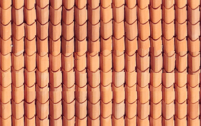
One of the problems I've been having with Sanctuary is that its kind of southern Mediterranean/north African latitude, and there aren't any roof textures like Spanish barrel tiles. So I tried to make one.
I don't think it really goes with any of the other textures I'm using in Sanctuary, but I'd like to know if anyone else would be interested in a new set done with this texture.
(The roof ridge is terrible, by the way. That's not how its going to look when I'm done with it)
I don't know what stage the plans for a community art collection are at, but I'm kind of hoping that everything will come together in such a way that by the time I finish making the full set I might be able to upload it to the collection and use the actual buildings in Sanctuary - where they are badly needed.
And it doesn't matter if it goes with the other textures or not, I would use it at the drop of a hat.
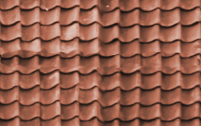
I hadn't realised just how bright it was.
Ok. I've toned it down a lot, and sorted out the ridge and a chimney. Any comments/suggestions?
Its still oddly fuzzy. If you look at the wooden building above it - how clean the lines around the tiles are?
I agree it looks a little fuzzy
There's still some work to do on the texture to make it work properly. I think the problem is the amount of texturing I've put on the tiles. Its kind of drowning the more delicate lines defining them.
That's the theory anyway ;)
That's a 1500 pixel texture, and its crystal clear. For some reason, though, its breaking down when applied to a shaded polygon. I must have some rather pale/dark pixels in it that are causing problems. Its either that or the texturing of the tiles.
I'll try applying a levels node to the texture to trim either end of the colour range, so that nothing is too close to either white or black.
Levels nodes have a tendency to muck up the colour in strange and unexpected ways, though, so I may have to play around with it quite a bit more.
An interesting effect here - the original has really dark roof flanks(?), but the moment I converted it and its map file into a symbol it turned really pale.
That took an awful lot of messing around! LOL!
I'm wondering if I did something wrong that it went so pale?
Well, in fact I have several problems relating to the drawing and how to make the roof ridge stand out more etc, but this particular problem you can see below is one I can't solve by myself.
When I reflect my newly made symbol the shading also flips over and is the wrong way around. I've obviously done something wrong, because none of my other symbols have this problem. I just don't know what.
That said, your new creations are quite beautiful as well. I hope you'll keep adding to them.
One last comment. More of a question, really. Would someone with a hay roof (or similar) have a chimney? I honestly don't know, but it seems dangerous to me? Please don't take it as a criticism. I was just curious.
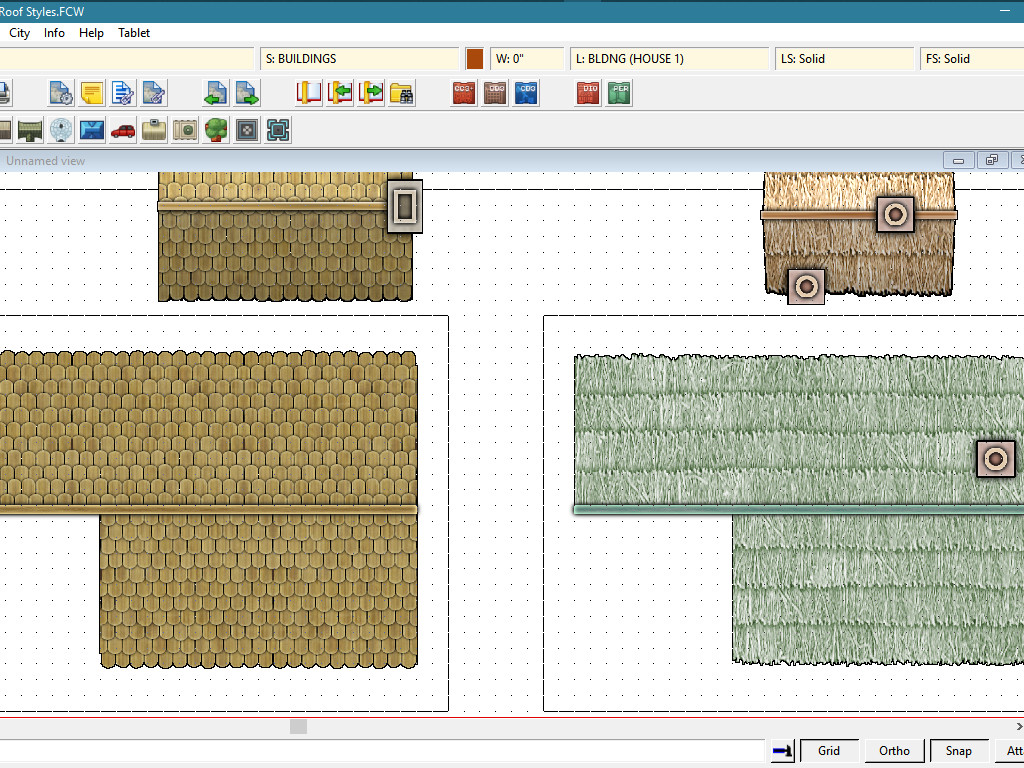
The first image I showed included unaltered houses from the main CD3 styles dotted around the ones I was working on, and which I carefully cut in half so that they could not be used. The building in the rectangle is the one I drew from scratch using the fills available in CD3. Initially I was deliberately trying to make them look like the PF styles because I wanted to mix and match them in a map without them looking odd, but a couple of hours after I started I realised it wasn't a great thing to do if I wanted to share them. So I stopped.
Can I take it as a compliment that I managed to make my wooden skillet and lean to house look so similar to the CD3 wooden building that it might have been mistaken as a modified symbol? :)
There isn't a set of buildings done in the reed style. I drew that one from scratch as well, and extrapolated what it might look like based on the existing thatched style immediately above it. But again - I was using the PF fills to make it.
That's why I abandoned them (they are now deleted), and moved onto creating my own style with my own fills, which will hopefully be compatible with the PF styles to increase the variety. I just need to sort out a few things, like this strange problem with the mirroring not working properly, and the uncomfortable way the roof ridge just doesn't look right, and the way the lines defining the edges of the tiles are disintegrating somewhere between a perfectly good texture and the render.
I hadn't really thought about the straw and chimney issue before now. Maybe if a house had a roof made of loose straw it would be quite a risk to have a fire without a stone chimney to insulate the thatch from the sparks and cinders, though I've learned quite recently that stone age roundhouses had no chimney at all - not even a hole in the roof in most cases. The smoke just filtered out through the thatch. I guess the weather must have been much worse back then, and the thatch almost permanently damp from the rain. I do remember it being explained to me that there was a lot more rain in the UK a couple of thousand years ago. That's why most stone age settlements are located much higher up the slope, or on the tops of hills, whereas we tend to build our modern towns in the valleys by the rivers these days.
No. Don't apologise - I've learned something new and interesting today.
Thank you :)
I'm still having a problem with reflecting house symbols. But I've just discovered that it may be a glitch.
This is my test symbol reflected, alongside one of the Bitmap A thatch cottages, also reflected.
As you can see the PF symbol is also reversed. Has it always been this way? I mean, has it always been the case that if you reflect a shaded symbol the shading is also reflected? I don't remember if I had this problem before and just got used to it being that way (therefore remembering never to reflect them), or if this is a new thing.
[Image_11106]
The ok ones are on the right, as you can tell by the roof shading matching the shadow.
I'm a bit confused, but that sounds like its not the done thing to reflect a building.
Ok, I can live with that. I just need to make sure I don't design this set with a bias towards one side or the other - favouring more detail on the right or left, or having a subconscious feeling about which way round things 'should be', but draw them all equally. Maybe I will just draw them and flip every other drawing over to make sure there's no bias.
I've finally figured out how to resolve all the little issues I was having with the actual drawing, and while the texture is still a little hard and a bit dark (I'll work on it some more), I've created the first draft symbol to the kind of quality I was aiming for.
Now I've just got to perfect that fill so its not so contrasty and over-sharp, do the other 40 symbols... and the extras... and a windmill, watermill, several variations of tower, and a few ruins... and then all the varicolour symbols...
Shouldn't take more than a couple of days :)
Seriously, though, I've learned a lot about making symbols today that breaks all the rules I've always taken for granted in general digital art. The biggest one of those is that antialiasing anything is bad, because any semi-transparent pixels around the edge of a shaded symbol turn white!
Yes - I take back all the things I usually say about rendering things at twice the final size and reducing them to reduce the blemishes and errors. The best way seems to be to draw the things in CC3 exactly to the final scale, render them out at 40 pixels per foot... without any antialiasing at all... delete the background with a nice pin sharp mask that doesn't use any antialiasing either, then put the image and map file together and that's it.
I'm making the map files in CC3 and rendering them ready-made. That's what the boxes are for in the earlier images - to define the exact extent of the render area for each one. All I do is duplicate the image drawing and turn the relevant bits of it the right colour for the map file. Then I don't have to mess around for hours in GIMP.
[Image_11111]
[Image_11112]