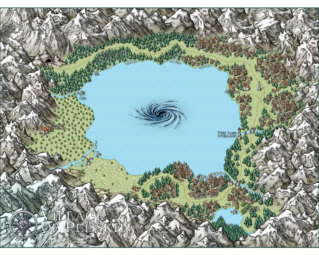
Feedback Wanted: Lake Village
Hey there!
Got my hands on CC3+ a few days ago, and although I was scared of the steep learning curve I had heard about I was absolutely thrilled when I got to use the tool - it's awesome!
I started off by mapping out one of the first places of my D&D campaign; the village of Plissken (ruled by a kind and just Medusa).
You can find the full-size map here: https://i.imgur.com/iqz62UI.jpg
Generally, I'm looking for all kinds of feedback, tips and tricks you think would be helpful.
Thanks for taking your time!


Comments
I do have a few very minor suggestions if you don't mind.
First and foremost, I hope you know that you can upload your maps directly to this forum. That's what the attachments bar down below is for.
But as for the map itself, I only have three minute suggestions.
For your Title, and for the compass - Both are light colors on top of light colored mountains. This can make them hard to read, especially for someone's vision that isn't perfect!
The next is more of a question. Does the cave lead to the outside world? If that's your entrance and exit, you might want to label it as such, so people can see how to get to this wonderful little village. If not, then I didn't see anyway to get there!
Overall though... I would say you have remarkable insight! It is an absolutely beautiful first map, and I would love to see it displayed here so that others could enjoy it!
You certainly seem to have got the hang of it very quickly. I can see we are going to have to watch out for you in the future :P
@LadieStorm: You're definately right that it blends into the mountains! I didn't think of using effects, that's something I have to look into. I've seen so many beautiful maps here using effects to greatly enhance the look.
The cave is indeed the entrance, this is a sort-of Shangri-la place so it's meant to be very secluded. I'll go ahead and label that so it's clear!
My maps always seem to have some issue with the right visual scale between moutnain/forest/waterway/towns after a year of fiddling and you seem to have gotten it pretty spot on right out of the gate.
Besides the comment about text readability that has been pointed out, I do find myself wanting to see a little something more in the lake to break up all the flat blue and to maybe blend the whirpool into it a little more.
@Loremaster_D: Agreed! It's an awful lot of blue with not a lot happening. Does anyone have ideas or tricks on what symbols/effects to add to a large body of water to make it more interesting?
@Quenten: Good thought! I just learned that you apply effects to each sheet separately, so I went ahead and added some blending and bluring to the coastline. Thanks!
I haven't used Schley for some considerable time, but I think there is a tool for drawing water contours
Finished some adjustments from the feedback. Also realized I could keep going forever - there always seems to be something to improve upon each pass!
Posting the "final" (time to move on to the outside world!) version, a big thanks again for the time to give feedback, learned a lot from fiddling with the tool some more.
Attaching the map, full-size version can be found here: https://i.imgur.com/m66Vr1t.jpg
I really am in awe that you created this on your first map. It is a great concept, and beautifully executed.
If I were to change anything, it would be to gradually scale up symbols as you move towards the front, in order to provide a bit more perspective. It's not needed. I love it as it is, but it's something I always consider in my maps.
Can't wait to see what you do next.
If you can do this with what you've learned in such a short space of time, I really look forward to seeing what you do in the future... Fantastic job!
DMG
DMG