

Olde World Style Map WIP
 ScottA
Surveyor
ScottA
Surveyor
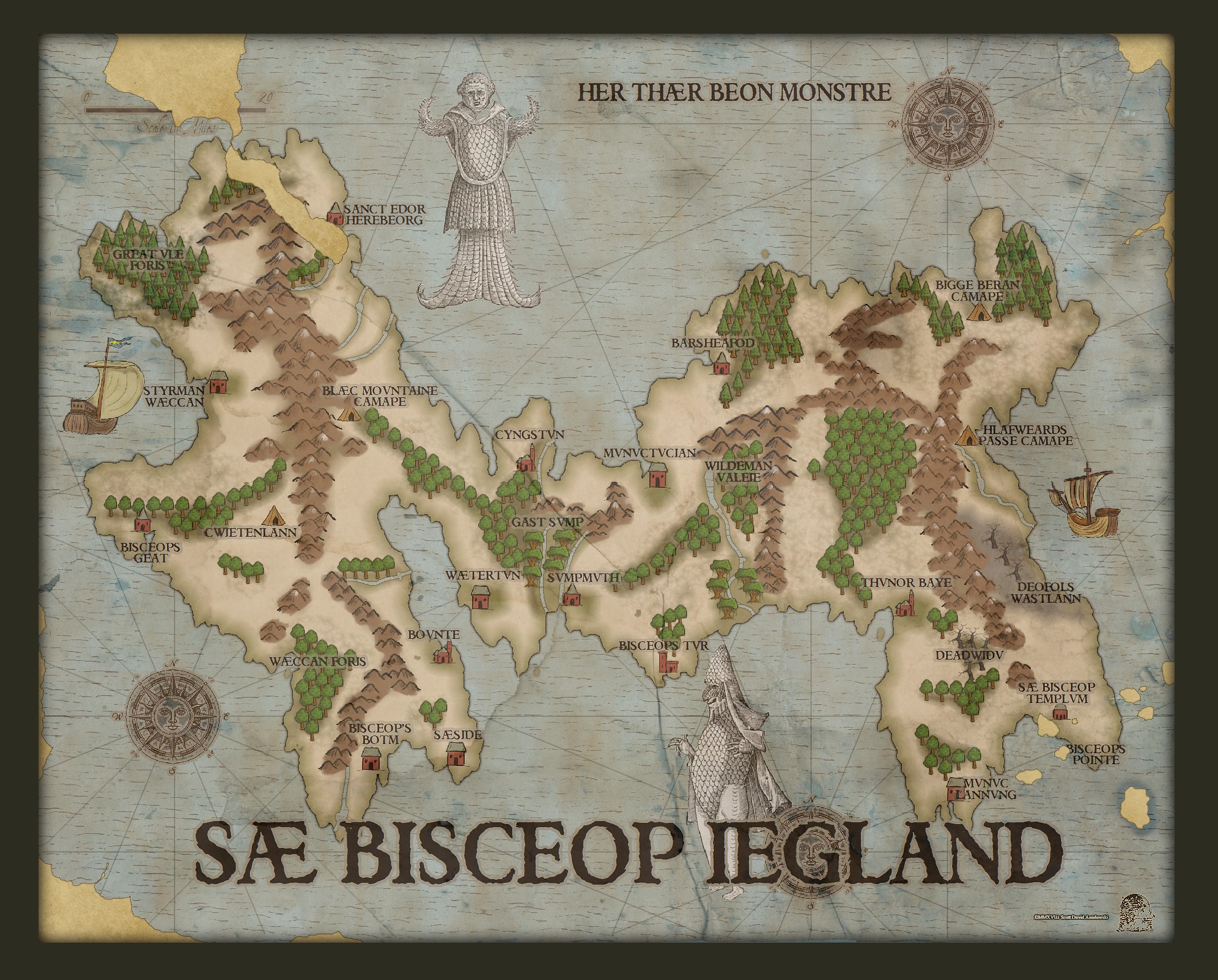
Something I'm fiddling with for a challenge over at the Guild...
 ScottA
Surveyor
ScottA
Surveyor
Comments
I used a couple different styles. The base style is the Here Be Monsters but I used the ocean from Empire of the Sun as it is more in keeping with the actual style. The tree symbols are from Havenland while the rest are from Here Be Monsters. The old compass roses and the pair of fishmen are my own.
Just a thought, in addition to Tonnichiwa's idea about a wood background, may be consider a very slight drop shadow — just enough to provide a small outline.
FWIW, I really, really like this map, and the subdued color palette.
Cheers,
~Dogtag
I agree with the others - a wooden table top background would be less confusing.
(And now I'm itching to make you one, but I know you will probably do one of your own and be the happier for having done it yourself! LOL!)
An alternative to the drop shadow is a very subtle dark glow to lift the paper generally from the surface so it doesn't look stuck down with glue on the sides without the shadow. You could do both, but be as minimalistic about the effect as you can, or it will look like the map is flying a couple of cm above the surface.
EDIT:
In addition to all of that, you could use the parchment as a fill to texture the map itself and make it look like its drawn on the parchment. But to do that you would have to import the parchment as an actual png fill, not a background image.
The font is called Weathered.
There is a very slight black glow to the "torn" paper, but I'll experiment with shadows and glows to see if I can't make it more obvious.
There is an image of an old torn piece of paper on top of the whole image but I had to reduce the opacity so much that you only get hints of it. I did try different textures but none seemed to really work for me. I'm still trying different things out.
About that problem with having to have the torn paper image so transparent that it doesn't show...
If you remove the transparency from that sheet, move the sheet to the very top of the map, and then add a Blend Mode set to Multiply you might have a bit more luck with it showing up in all its glory. It might show up so well that you have to reduce the opacity setting in the multiplying Blend Mode effect to tame it just a bit
Doing it that way the texture will cover the entire map and everything in the map will look printed onto it. That has an immediate unifying effect, evening out any difference in styles between the different symbols you have used.
This map is truly fantastic, and in my book, the best in the competition to date.
I am just sharing an idea that won a challenge for me a while back
Its about this problem that Scott mentioned earlier: "...There is an image of an old torn piece of paper on top of the whole image but I had to reduce the opacity so much that you only get hints of it. I did try different textures but none seemed to really work for me. I'm still trying different things out"
Transparency reduces the entire texture so that its practically not there at all, but if you use a Blend Mode effect instead of a Transparency effect, and set the Blend Mode to Multiply, all the white will be knocked out of that paper image, leaving only the creases, stains and other darker marks that make it interesting to look at.
If you knock out the white on that paper sheet that way it won't hide the sea at all. It won't hide any of his beautiful map. But it will make the actual texture of that paper clear, and blend them with the map so that map and paper become one. It may even work so well that Scott might have to reduce the opacity setting in the Blend Mode to tone the paper texture down a bit.
Its the same principle used by Ladiestorm in her watercolour map, only here it wouldn't change any of the colours (because the paper is essentially white as far as I can see).
Its pretty hard to describe the effect. Its just something you have to try so that you can see what it does for yourself.
I used this effect in my Glyphs of Kaylaric (a hybrid CC3/GIMP map) to impose the texture of the parchment scroll onto the part of the map I drew in CC3, which had no paper texture in it at all. In GIMP you just change the layer mode to Multiply, but it does exactly the same thing as using a Blend Mode on a CC3 sheet.
- Consider increasing the width of the wood planks. Presumably boards used for a table, wall, or whatever the map is lying against would be several inches wide, which makes the map seem larger than I'd expect.
- Consider using a different, more subdued color, preferably something more tan or grayish-brown. Even a medium-dark brown may look better than the bright orange. Think John Roberts Dungeon wood floors vs. DD3 Color wood floors.
- Play with the glow a little? I like the clearer outline it presents but maybe lighten it a smidgen to more gray than black? It seems pretty stark. On the other hand, that could also be due more to the contrast with the vibrant orange wood color than the glow itself.
As always, those are just suggestions. The map itself looks great.Cheers,
~Dogtag
Also, the more I look at it, the more the other map colors looked a lot better, imho. Whatever happened to the map makes this version seem translucent or semi-transparent? The ocean wave texture kind of looks like wood grain that's bleeding through, I think, and this version of the map looks dark and kind of dour. The symbol backgrounds, like the brown behind the mountains, look heavy and less organic to the map than they did in the lighter version. The previous version had a charm to it that this one seems to be lacking, to me.
But, again, this is an amazing map and far better than what I can do myself, so bravo, sir.
Cheers,
~Dogtag
I'm agreeing with Dogtag a bit: I like first version 'better', but I like them both heh.
Cal
I think you may need to decrease the opacity of the Blend Mode to about 10-30 % - if that's what you've done with the torn paper. and now that the wood is a lot paler you might also need to tweak that glow up a bit more to separate the paper from it?
Just suggestions
The contrast between the map and the table is an important factor, so the table would look better a bit darker than it is - a lot darker than the paper.
Reducing the opacity of the Blend Mode should lighten the paper, but the wood will also need to be made a darker.
An example: https://www.cartographersguild.com/attachment.php?attachmentid=102047&d=1512565861
This map (The Glyphs of Kaylaric) managed to win a Main Challenge, even though the torn edge leaves a LOT to be desired compared to yours. The paper and table are very nearly the same tone - the same overall average 'greyness' on the scale of black to white. Apart from taking the time to redo the frayed edges of the scroll, one of the most important things I would do differently if I ever redrew this map is to have the table waaaaaay darker
However, now that you've swapped out the previous wood texture for a new more reddish version there's a colour illusion effect in play that you may not be aware of. Objects that are red look closer to the observer than objects that are pale blue. Its to do with the way our brains learn to interpret distance in a natural view. If you think about it you will probably see it straight away - how everything on the horizon is generally paler and bluer.
This new wood texture has a lot of red colour in it, even though that colour is very dimmed down. The map has a lot of blue in it, so the tendency is to see the map as being further away than the table, which is most noticeable where there are holes in the map. To me those holes now appear to be chunks of wood that are sitting on top of the map.
You can get rid of this unwanted colour illusion by spreading that outer glow a bit more, and by either reducing the redness of the wood or making it a whole heck of a load darker than it is.
The important thing is the contrast. The map has to be a lot lot lighter than the table. That was what was wrong with my map - the one I showed you as an example. There wasn't enough contrast between the map and the table.