

Community Atlas Wolfsbane Moor WIP
 ScottA
Surveyor
ScottA
Surveyor
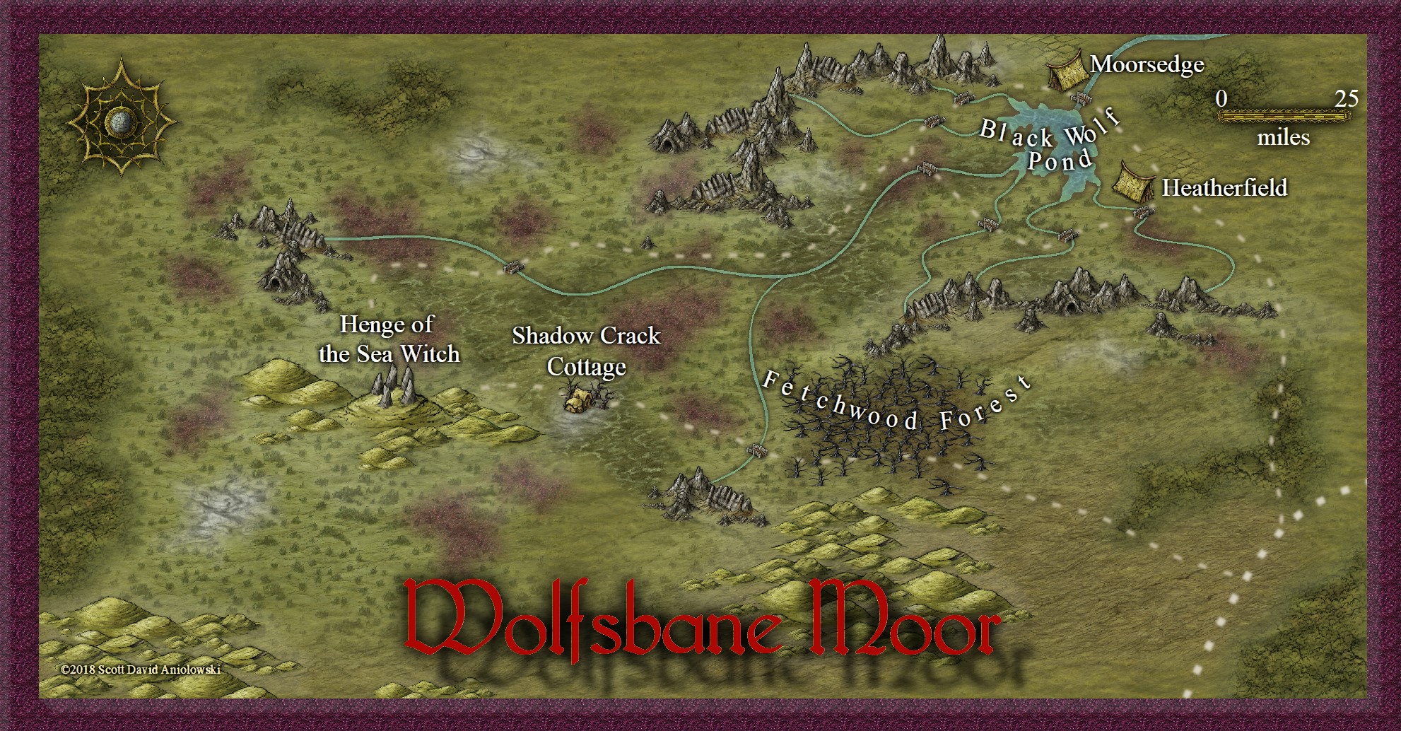
Didn't think there were any moors in the atlas so as I put one in one of the regional maps I just did I thought I'd do a closer look. I don't know... needs something. Not settled on the frame, either. Might be too much with the heather fields...?
Comments
The roads seem very large and, thus, fuzzy, on this smaller map. Hrm. Also, Black Wolf Pond is appropriately creepy, but at ~25 miles wide, "pond" seems an odd moniker. Unless its another odd Britannic irony. Lastly, It looks like you double-dipped the title in different shadows. Perhaps consider removing the more displaced of the two?
This is another wonderful map. All the more impressive given the short time you took to make it. The HW style is well-suited and was a great choice.
Cheers,
~Dogtag
The sea is just to the right of the frame edge, and this is how it was labeled on the regional map already posted to the atlas, so sea witch it remains...
We do have lakes in this country. They just aren't the size of freshwater inland seas like the lakes you are used to in America :P
Very nice map, and a lovely touch of originality.
In my case the jury is out with the frame. Picking the colour of the heather is nice, but The bevel may be a bit much.
You could do away with the bevel perhaps, since heather doesn't naturally come with a bevel, and edge the frame with a simple line of darker heatherish colour to make it more like a braid border?
Yes, that's it, exactly. I wasn't sure if using the same fill and color for the map as for the heather patches was too much.
(I wasn't very clear about the visualisation I had of it before)
The title looks a lot better, even though I'm not convinced by the drop shadow effect. I think the dark glow is enough... isn't it?
Fonts and frame aside, how does the actual map look? Does it work? Too much? Not enough? The new little ponds/swollen creeks along the fen vs the original single lager pond/lake..?
Ok I'll stop going on about it now! LOL!
The rivers are a little straight in places, but otherwise the map is lovely
I'm wondering if you simply fill the frame with heather fill, and give the poly a plain heather-like outline and take off that bevel it might look a bit different to the usual bevel-edged frames?
This is where the big secret I keep holding back comes out....
I don't like bevelled frames - unless they are trying to look like traditional wooden picture frames (stained, varnished, broken, scratched, carved or otherwise as long as its wood).
There! I've said it now.
But at least you can understand my fixation on frames - I'm trying to free everyone of this strange compunction to have the obligatory bevelled frame :P
A frame around a map doesn't always have to be a bevelled thing at all. It can be anything you like - a simple line, a scaled bar... a flat border of heather, or even (yes) a wooden frame of some kind that is (yes) bevelled to look like its a real wooden frame. I did that on my Merelan City map. The frame was wood, stained black and bevelled with a smooth curve all across its surface - like a flattened half cylinder in section. It was a devil of a job to get it to look half good, but I got there.
I was wondering about a couple of the streams being too straight, myself. Rivers and roads still bewitch me. That's an easy fix.
Roads then have to try and navigate the terrain the rivers have carved with embankments, cuttings, bridges and so on, but generally where they aren't following the terrain they are straight with tiny kinks where regularly used junctions have distorted them a little. I find them easier to draw, but not much.
But maybe you need to do 2 versions for people who don't.
The title looks a lot better without that shadow.
All in all another masterpiece
Sue: Thanks, I figured you'd like this version better. But I'm not doing two different versions just for a frame! lol! ;P Those who like it like it and those who don't don't... This one works better. Actually, if it weren't going into the Community Atlas I might have made a new fabric-patterned frame for it like the red and gold dragon one I did for that map I did for the Guild a few months ago.
I was hoping someone would try to guess the heather fill... its the HW jungle texture, color adjusted.
You can do some interesting things with the grassland texture as well. I've got grass that goes deeper green near the rivers, and gradually dies off to orange/yellow as you go up the mountains and towards the tundra on one of my regional maps
I love everything about it but I especially like that it captures the theme to perfection. I will be using this map somewhere in my high level campaign for sure!
Let's just say that we have quite a few amazing artists and mappers here, all of whom we respect and admire.