Command Spotlight - Line Styles and Properties
 Monsen
Administrator 🖼️ 82 images Cartographer
Index
Line Styles and Properties
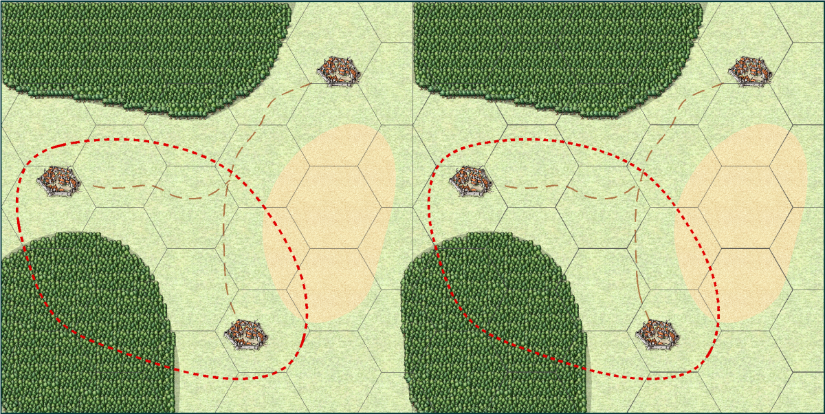
One of the issues many people are having when they use the various line styles in CC3+ is that things doesn't always look the same when they export the map as it did on their screen. Let us start by looking at an example.Below, you can see a screenshot of a demo map I made. Notice that the left and right sides are nearly identical. Note that this is an actual screenshot, and not an export.

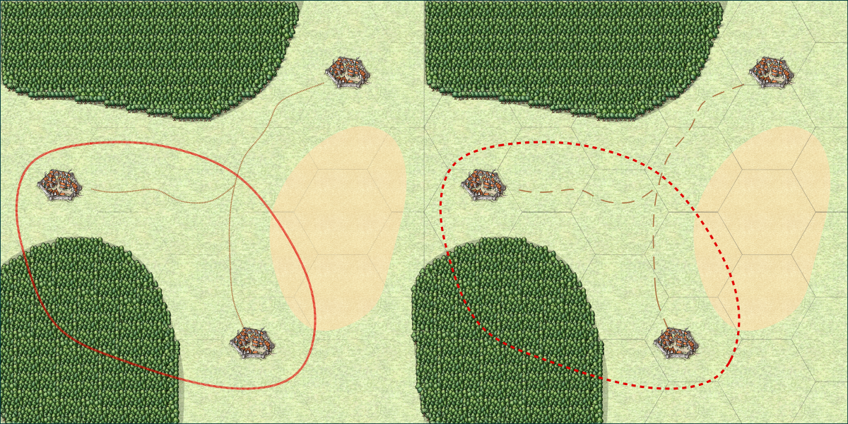
Now, this is the result of a high resolution export of this map. Notice how the various lines on the left side look quite different now.

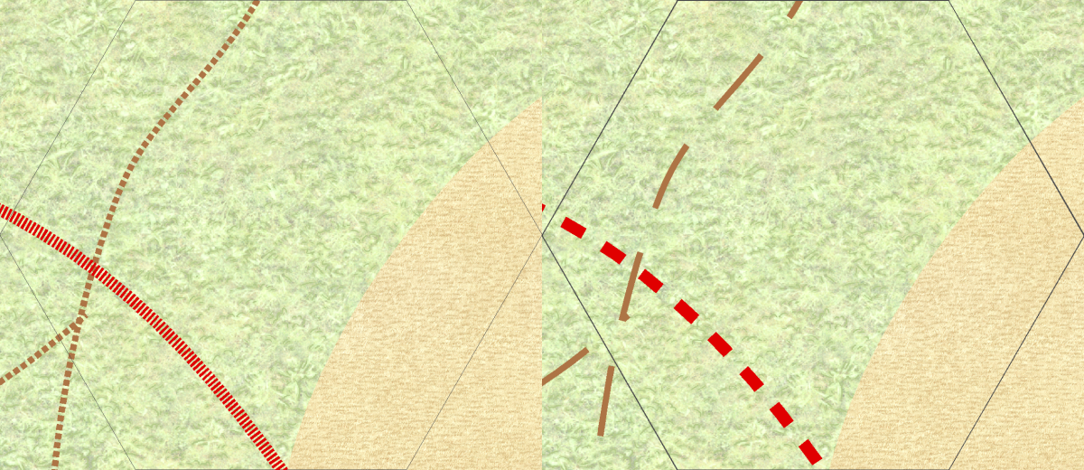
And here is a closeup, to better see exactly how the lines look in this export

What happened?
Now, as you can see from the images above, in the right-hand version, the images looks the same both on screen and in the export, but in the left-hand version the lines look radically different. The grid is almost invisible, and the road and border seem to use very small and wide "dots" instead of the longer segments seen in the screenshot at the top. Let us have a closer look at what is causing this, and how you can make this work properly yourself.The Grid
Looking at the images, the grid looks very similar in the screenshot, but in the export, the left version almost disappears. The reason this happens is due to line with. The secret here is the difference between lines with a width of 0 (called 0-width lines), and lines with a width of greater than zero. CC3+ treats a zero-width line as a line that should be drawn just wide enough to be visible at any zoom level. That means that on the screen, it will always be 1 pixel wide, no matter how far you zoom in or out. But, that also means that it will be 1 pixel wide on exports and printouts too. And for a high-resolution export, 1 pixel is extremely tiny, usually so tiny that you can't even see it if the map is zoomed to fill the screen. This is just one of the ways a static image is very different from a CC3+ map.Just to throw some maths in there. My map was exported at 10000 pixels wide. That means that on a normal computer screen (1920 pixels wide), the line will be just 0.192 pixels wide. Now, a monitor cannot display partial pixels, so the computer needs to determine if it should show it or not. And remember, if the monitor shows the pixel, it means that there is one pixel of something else that isn't going to be shown. So, what does it do with a 0.192 of a pixel? In most cases, it won't be displayed at all. Fortunately, a computer can interpolate, so that tiny fraction of black will actually cause the nearby pixel (that is being shown) to darken a little, thus giving a faint hint of the grid that is supposed to be there. Resizing an image has the exact same issue, and also with printing. A printer actually have a very high resolution (600dpi is most common, but 1200 and higher dpi are also frequently used). So a typical sheet of paper is 210 by 297 mm in size. Converting that to inches , that is 8.27 by 11.69 inches, and multiplying that by 600 dpi means the sheet is 4960 by 7015 dots. So a 1-dot wide line will only be about one fivethousands of the width of the paper. That is a thin line indeed.
On the right, the grid is instead set up with a width of 0.03 map units. This means that the line will be scaled in relation to everything else on the map. 0.03 map units is pretty thin, but in contrast to the 0-width line, it will keep its width in relation to other map entities. This means that it will get wider (relative to the view window, not the map) as you zoom in and thinner as you zoom out, but it will always be the same size relative to the map. So if the line is the size of a tree at one zoom level, it will still be the size of a tree when you zoom in, and it will still be the size of a tree when you export or print. The 0-width line may look better at certain zooms when you work on your map in CC3+, especially as you zoom out, because it will always be visible, while the 0.03 wide line may actually disappear when you zoom out in CC3+, but the 0.03 one is the one that will look visually the same no matter if you do a high resolution export, low resolution export, or printout.
There is also a setting in CC3+ called pen tickness. Just forget about this immediately. It is a setting intended for printing on plotters, something that is still used for large-format technical printouts, but unless you are actually using one, you won't need this setting (and if you are unsure, then no, you are not using one. Just leave the pen thickness at 0, and always rely on the line width setting. In older versions of CC, this was one of the values visible on the status bar, but for CC3+, it has been removed since it isn't normally used, although it is still available behind the scenes.
Road and Border
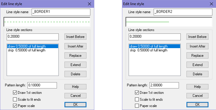
The situation with the road and border have similar causes to the grid above, but for these lines, it is actually the length of the pattern that is the problem, not the width of the lines. These lines are already using a width larger than zero, and if you look at them and ignore the tighter pattern you'll see that the width is actually correct in both the left and right side of the export.To understand what is going on, let us see how the line styles are defined. you can edit line style definition by clicking on the LS: indicator in the status bar. For the screenshot below, _BORDER1 is the style used by the border in the left image, and _BORDER2 is the one used by the right.

The most important here is that the left line style has Paper Scale enabled, while the right one don't. Basically, paper scale makes the line change based on the resolution of the output (screen, print, export), while having it off makes it follow the map. Otherwise, the pattern is being defined the same, except for the pattern length which is different. The great advantage to using paper scale is that it will fit our current view, which means it will work on both a small sized local map as well as a world map and still look reasonably the same on screen, but the downside is that it won't look the same on exports and prints as it did on screen. When using a line style with this setting disabled, you are going to need to adjust the pattern length manually for every map, what works in one map size won't work in another. But the advantage of this approach is obviously that it will look the same both on screen and when exporting.
In closing, I would like to point out that the observed differences differ between printing and exporting. Printing have some issues, exporting others, but if you make sure to don't use 0-width lines and don't use paper-scale lines, you should end up with a map that will work great for both cases.
I have attached my sample map, but note that I tweaked the values to make everything look the same for my screen resolution. If you view it on a screen with a different resolution, or just change the window size or zoom, you'll find that the left and right side may not look as alike as they did in my screenshot, but you can still experience the same issues when exporting/printing as I have shown here. Tweaking them to make the left and right side identical wasn't strictly necessary, since the point wasn't comparing the left and right side, but comparing them to their respective export results. Having them identical made it easier to compare though.


Comments
I do confess to having a bit of a time with line widths, but now I understand how it works I shouldn't get that any more
Thank you, Mr Wonderful Monsen
But the big advantage of working with paper scale off is that you see the result in the map immediately, no need to export it to see the result, so you can much more easily use trial and error and just tweak it visually.
Question on the grid lines. Is there a rule of thumb for grid line widths? Maybe something like 3% of the hex/square size?