

Game map input, thanks

Hello,
At the end of the day I'm looking for ideas and ways to improve the look and feel of a map created for a game.
I think they can still look nice and I've a love for map making when it boils down to it.
I have CC2-Pro experience. I did buy CC3 and did download the newest patch if that helps.
So if you have comments, ideas, thoughts, whatever please fire away!
The maps do not need to be pieces of artwork like many of you can create, but I'd like them to be both useful game wise and pleasing to the eye.
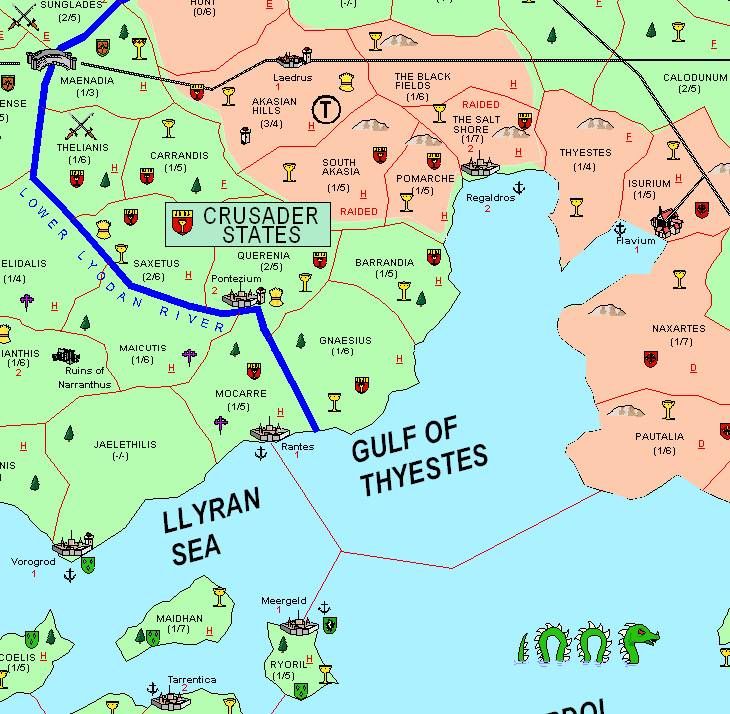
Image 1
This map is a sample of another campaign and another GM. He did fairly well, I'd like to improve upon it.
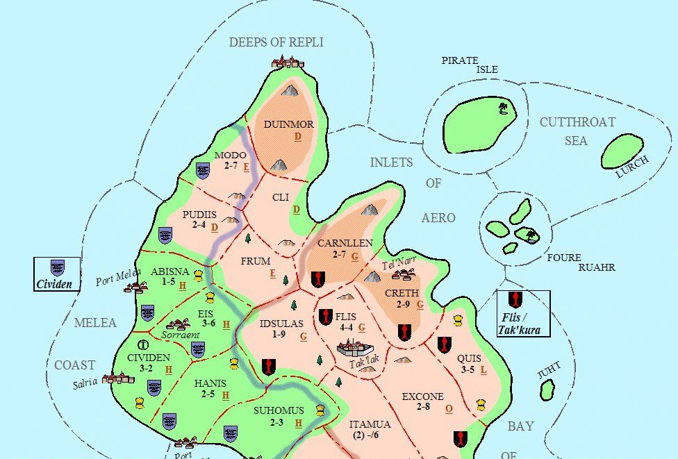
Image 2
This is a piece of my old map from CC2-Pro above from about 2005. Its improved, certainly looks better but gets a bit cluttered again.
There are probably some interesting simple things that could be done to improve the looks too.
Image 3
This is the newest Piece as of Feb 24, 09. I think its coming along very nicely.
Hopefully some of you may have ideas on settings or fonts.
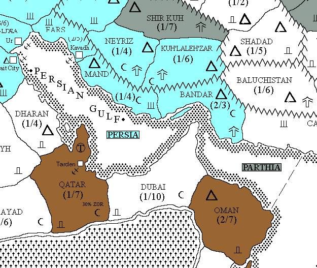
Image 4
For reference sake all of the Campaign Cartographer maps used are far superior than a typical gaming map.
This image here shows what is used for Cities, Mountains, shore, coloring in a nation, etc.
Thank you in advance.
JJ
At the end of the day I'm looking for ideas and ways to improve the look and feel of a map created for a game.
I think they can still look nice and I've a love for map making when it boils down to it.
I have CC2-Pro experience. I did buy CC3 and did download the newest patch if that helps.
So if you have comments, ideas, thoughts, whatever please fire away!
The maps do not need to be pieces of artwork like many of you can create, but I'd like them to be both useful game wise and pleasing to the eye.
Image 1
This map is a sample of another campaign and another GM. He did fairly well, I'd like to improve upon it.
Image 2
This is a piece of my old map from CC2-Pro above from about 2005. Its improved, certainly looks better but gets a bit cluttered again.
There are probably some interesting simple things that could be done to improve the looks too.
Image 3
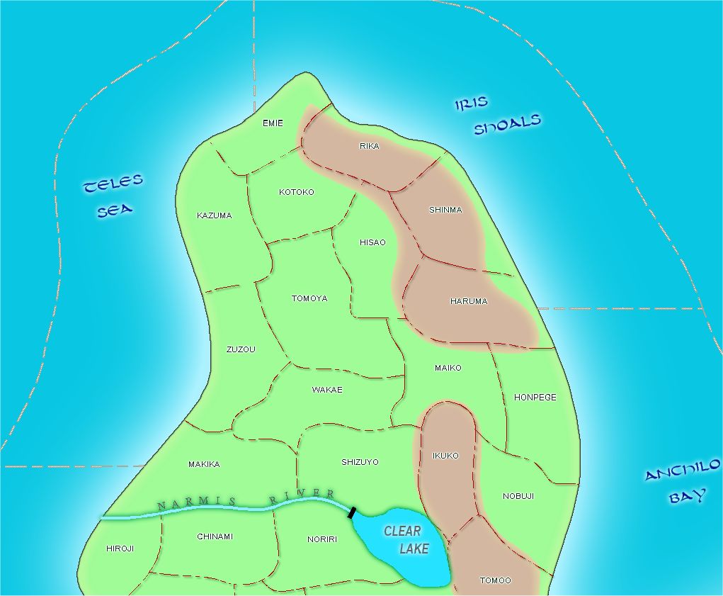
This is the newest Piece as of Feb 24, 09. I think its coming along very nicely.
Hopefully some of you may have ideas on settings or fonts.
Image 4
For reference sake all of the Campaign Cartographer maps used are far superior than a typical gaming map.
This image here shows what is used for Cities, Mountains, shore, coloring in a nation, etc.
Thank you in advance.
JJ