Community Atlas - Dunor Region

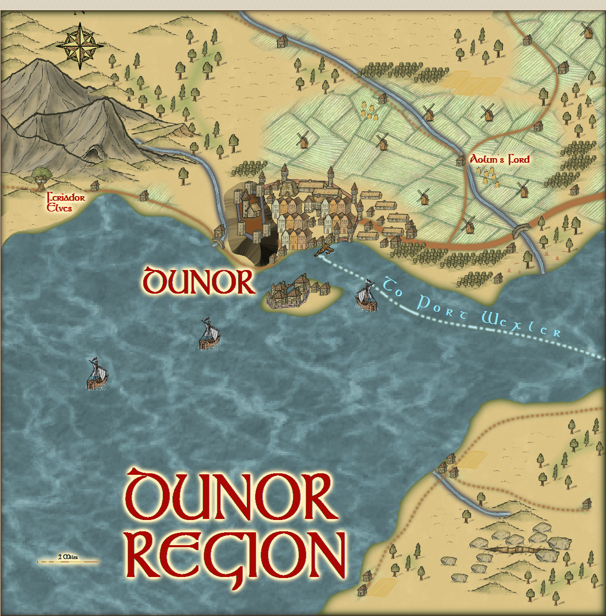
Here is the fifth of the Dunor Valley local maps. It does incorporate Dunor City, already done By Hadrian VI, and I have used his map as a guide to the scale of the city. Not too easy though. I hope he and all of you, can accept the abstract view of Dunor City. I want to do as much of the Dunor valley with this style in 20x20 mile squares. At present, I aim to do 2 more to the west of this one, and 1 to the East of Tiergeist. I haven't reserved them in case anyone wants to do something different in the area first.
Anyway, here is the map.

Comments

  • I think I have finished. I'll leave it 48 hours till I send it to remy Monsen, so please get your comments and suggestions in by then.
  • DogtagDogtag Moderator, Betatester Traveler
    edited December 2017
    This looks really nice Quenten. The hill with the keep/manor is nicely done but I think it's a really jarring mismatch for map style. I think it would look better if you use the hill and/or cliff symbols instead. Less so, the farmland fills, which also stand out to me. I think those are more related to the color, which seems somewhat off to me, I think. I would suggest maybe trying a Blend Mode (Overlay, maybe?) effect with a slight transparency setting to see if it helps to blend the colors in a little. On the other hand, it could also just be my eyes.

    I really like these local maps you've done, though. They look great and like something adventurers might actually possess or see themselves.

    Cheers,
    ~Dogtag
  • I have already toned down the hill, and the farmland fill is what I have used before on the other maps, but I can use an overlay or Hue/Saturation effect. I'll try it and see. I guess it is a bit cheeky to do one with Dunor city, but I have tried to keep the proportions as per Hadrian's Map.
  • I have adjusted along the lines suggested by Dogtag. Any comments?
  • At first I wasn't sure, but now I do like the new color for the farm fields better than the original. I think you've found your home with this local area style, Quenten; it's some of your best work.
  • DogtagDogtag Moderator, Betatester Traveler
    edited December 2017
    Hrm. I think it looked better the other way. Maybe a different effect instead (e.g., Adjust Hue and Saturation)? I was thinking, before, of a way to use the fill style but tweak the color to be more in line with the style's palette. This looks to me like my suggestion was a swing in the wrong direction.

    And the reason I suggested a change to the hill is that I think it's really out of place in this style. It's better suited to a more top-down view, and the map already uses hill symbols. It just looks really out of place to me, is all.
  • Here is a revision - what do you think looks better? I have used only the cliff symbols from the Style, and also 'covered' the river mouths where they enter the sea, so they didn't look too artificial. I have kept the fields as they are, because they look like wheatfields to me.
  • The castle on the hill looks much better, now. A couple of suggestions: The river source near Gerhalt's Gap should be extended so it flows behind/under the hill symbol, so you avoid showing the squared-off end of the line. Also for the river by Mt. Greta.

    You've really opened my eyes to the possibilities of this style. :)
Sign In or Register to comment.