

CG Oct/Nov Lite Mapping Challenge: Spyrmenchi Island
 LadieStorm
🖼️ 50 images Surveyor
LadieStorm
🖼️ 50 images Surveyor
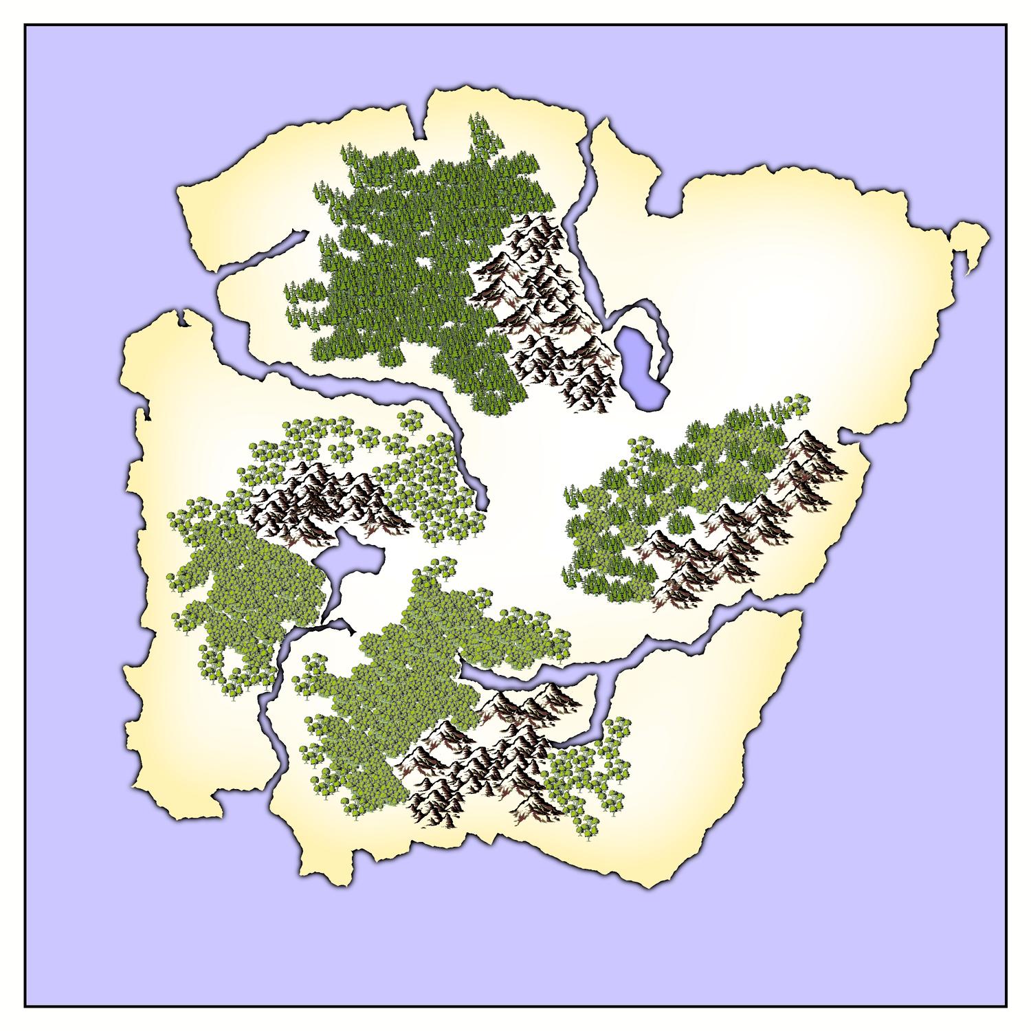
This is an experiment. It's probably going to turn out looking horrible, but that's okay with me... because I'm straying into something different. At least for me. I've started with one of the four island shapes we were given to work with. I chose the boxy one. I'm using Mike Schley's ink, at least to start off with, because I wanted the blank slate of the black and white. But I'm not staying with the black and white...
Comments
I would go for a dark 'muddy' yellow more than a mint green, as its more of a natural vegetation colour. The mint green is nice, but its not very natural.
Most conventional topographical maps use a colour system that echoes (though not very accurately) the colours of the natural world, so that the lower levels are the same kind of yellowish green like natural (uncultivated) grass, the mid levels are a sort of brownish colour like tough grass and bare dirt, and the higher levels are sort of greyish like bare rock. Then of course the highest level is usually white, like snow.
You might find a colour more like the colour of the deciduous trees you already have there is more harmonious with the rest of the map - a dark yellow green with added transparency.
I also cut back on the hills for this island. I decided that what I had was way too much, and I may cut back more as I progress. But here are the changes so far:
You said something over at the Guild that triggered an experiment I'm still working on - something about originally wanting to be able to turn the white parts of the symbols coloured.
Its not that difficult. This is how you do it.
To counteract the acid brightness of the colours in the map fill the background with some kind of light muddy or pale greyish fill. Then Actuall move the Background right to the top of the map over all the symbol layers (except perhaps the trees which are already coloured and don't need any more), and add a single sheet effect to the background sheet - a Blend Mode effect, set to multiply - leaving the opacity at 100%. This will let the black lines of the symbols show through, but not the white, and so will colour all the symbols as if they have been drawn straight onto the background.
Then, if you want to add shades of green, brown, grey, or whatever colour you want on top of that to indicate topography just add a sheet for each colour, and set each of them up with another blend mode effect, but this time set to overlay.
I'm working on a very small example to show you what I mean.