The New Kingdoms of Rythia WIP

Hi all. This will be my first post here on these forums (and hopefully all the code works out to display this - there's no readily visible preview function here it seems).

Here is a map for the east coast of one of my continents for a homebrew fantasy RPG setting. It's a fairly large section - about 2000 miles by 2000 miles. The forestation is modeled after that of the pre-Colonial Americas. I'd love any feedback and criticisms ya'll might have before this goes live to my players in a week.

New Kingdoms

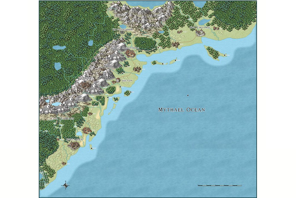
Higher resolution here
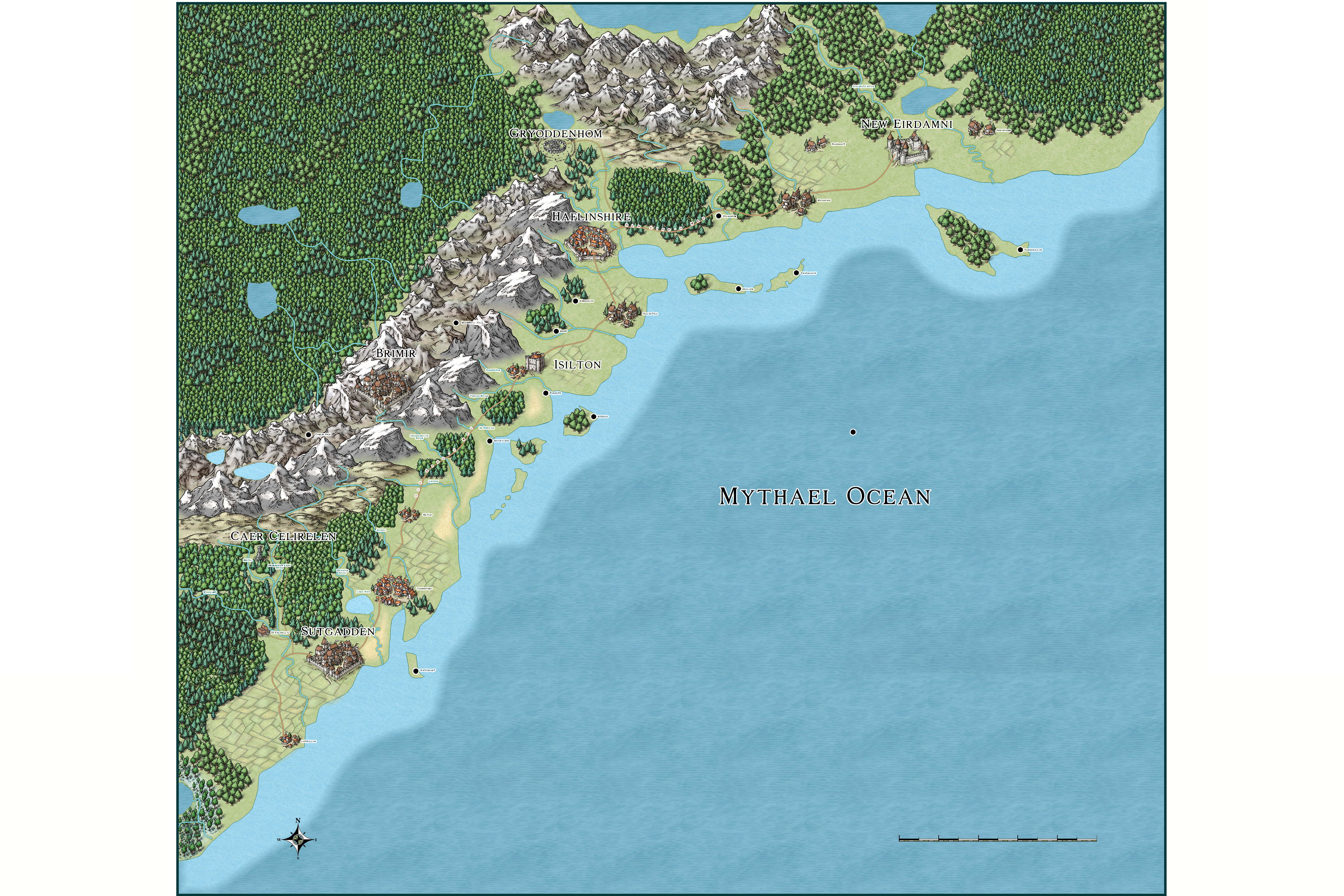
Comments

  • A very impressive post - first or not. Have fun in your game.
  • That's a great map, fine work. The only criticism I can make is that I can see the lines of the forest fills, which breaks the illusion a bit. Other than that, well done.
  • Yeah, the forest fills are bugging me as well, but it's more of a pain to delete them than it's worth at my current skill level - I just got CC3+ a little less than a week ago, so I'm still learning a lot of the ropes. I've been throwing in a few pine and deciduous coves to try to break up the monotony.

    On that note, thanks for the props. This isn't quite my first map (I've been doing about a map a night since last Tuesday) but it's the first one I've been somewhat happy with as I'm refining my technique.
  • Nice map! From noob to noob, welcome! Hope you're having fun with the program, I know I am! :)
  • LoopysueLoopysue ProFantasy 🖼️ 39 images Cartographer
    Great job :)

    Forest are, I'm afraid, only as good as the amount of time you spend making them. Fills are fine for small extents, but as you have discovered already a bit more input is usually required to make the larger forests work ;)

    Not all styles are the same, however, and as you experiment you will find that some styles have better forest fills than others. It all depends on what you want your map to look like.
  • I found that by using only the smaller tree symbols (copses etc) and single trees was best. You can always sort out wrong overlaps by using Symbols - Sort Symbols in Map. I was made aware of this by my friends on the Community Atlas - check out the difference between Artemisia and Helmonte, with the second being the approach I mentioned above.
  • Quenten, I've been finding something similar as I experimented making a player handout map in the ink version of the symbol set. Copses and single trees really don't take all that long to place, even for a large area like that, and look much more natural.
  • LoopysueLoopysue ProFantasy 🖼️ 39 images Cartographer
    You might find it looks a bit better if you scale the fill up a bit so that the size of the trees in the fill and the size of the individual tree symbols is roughly the same. At the moment the fill trees are a bit on the small side.

    You can do that by clicking the window in the top bar where it says "FS:...", selecting the tree fill, and increasing the numbers in the x and y boxes (same amount for both)
  • LoopysueLoopysue ProFantasy 🖼️ 39 images Cartographer
    edited June 2017
    OR, you could use smaller tree symbols?

    However you do it, using a combination of symbols and fills is never going to be as great as doing the whole thing with tree symbols. I'm just trying to find you a quick solution if you're in a hurry to finish it.
  • Sue, using the MS single tree and copse symbols (there are about 6 of these in different sizes) works best. I don't use the fills in the MS OR Herwin Wielink styles anymore. That way, all the tree sizes are the same.
  • LoopysueLoopysue ProFantasy 🖼️ 39 images Cartographer
    Interesting. I find the tree fills in HW are so good that I don't actually use any tree symbols in that style at all - but then I do tend to map entire planets all in one go with HW, so there is a scale factor to be taken into consideration.

    I would probably use the tree symbols if I was only doing a relatively small area :)
  • Fortunately, I've discovered a relatively painless way of selecting and erasing the forest fills by hiding the other sheets before using the selection tool. I'll be posting an updated map either tonight or tomorrow night.
  • LoopysueLoopysue ProFantasy 🖼️ 39 images Cartographer
    Looking great :)

    Why is there a spot in the middle of the Mythael Ocean?
  • This is a really nice map, what's the scale? There's no numbers on it :) I wanna know how big this area is!
  • It's the dreaded Black Spot, Sue. :D
    Like the forests now. What was your method in the end?
    Looking forward to further additions. Great cartography.
    And have a think about doing a map for the Community Atlas.
  • Loopysue - The spot is there for easy copy-pasting so I can label the smaller (and less "noteworthy", setting wise) towns faster with a consistent size. There might be a simple dot symbol in the set somewhere, but I haven't found it yet.

    pixelkitteh - yeah, for some reason the scalebar doesn't seem to like displaying numbers - I don't know if that's just the Mike Schley scales or if there's something I'm overlooking or not setting. It works fine for the CC3 standard maps. The map is about 2350 miles long and 2500 miles wide, including the ocean.

    Quenten - I alternated between the deciduous trees 1 and pine trees 1 symbols. Focused the deciduous trees a little more near sources of water, more on pine trees further out. Also did heavier pine trees in the south and deciduous trees as you progress north. All in all took me about five minutes, even with that vast of an area.
  • Nice map! Good job adjusting the forests....i am not a fan of the bitmap tree fills, as they seem too boxy for my taste. I enjoy painstakingly placing every single tree, as evidenced by my Malajuri map in the Community Atlas! LOL. My only critique is the font - im having a hard time seeing it.
  • pixelkittehpixelkitteh Traveler
    edited June 2017
    Posted By: mcommini2pixelkitteh - yeah, for some reason the scalebar doesn't seem to like displaying numbers - I don't know if that's just the Mike Schley scales or if there's something I'm overlooking or not setting. It works fine for the CC3 standard maps. The map is about 2350 miles long and 2500 miles wide, including the ocean.
    Awesome thanks! That's a good sized map! The forest looks great now, and I particularly love your mountains. I really like your settlement names too, I tend to use really simple obvious names and like "Woodsbury" and "Rosebridge" lol, I like that your names, whilst some are simple, most have some character to them, it's impressive.
  • Lorelai- is the font any easier to see in the high res version linked at the end of the original post?

    Pixelkitteh- thanks. Some of the names are from a language I created some 15 years ago, some are hybrids, and some like "Sutgardden" are pseudo-Germanic.
  • A fellow conlanger? Wow. I love creating languages too.
  • LoopysueLoopysue ProFantasy 🖼️ 39 images Cartographer
    mcommini2 - I used to have trouble with my auto-correct trying to make 'lobelia' out of Lorelei, but I think Lorelai is a much prettier accident :)

    Speaking of names - I find it really difficult typing your avatar name, since I have dyslexia. Can I call you 'commini' (its the initial 'm' that muxes me ip), or do you have a name you wouldn't mind me using?
  • @mcommini2 For me, yes. I have to really zoom in pretty hard to read the font of the smaller villages - maybe try to bold the font? make it slightly larger? Although, it has been said, i have also complained to my fellow cartographers here on this forum that my eyes aren't what they used to be! LOL.
  • Apologies to Lorelei! I can't blame autocorrect for that one, even though I was using my phone :D

    Loopysue - commini is fine, or Mike works.

    Quenten - I really wouldn't call myself a conlanger. The "language" is really more of a vocabulary at the moment. I had attempted a grammar for it at one point but lost the notes I had in one of my many moves over the years.

    Lorelei - I could certainly make a map with larger fonts. At the moment the map is more of a regional map to give me a good overlying view of the land, the smaller fonts are there to make it easier for me to create smaller kingdom and city state maps from this one in the future.
  • This is a great looking map! Great job on making the forests better. I am in the same boat as Lorelei, I place most of my forests by hand.
  • JMunsonIIJMunsonII Traveler
    Nice map! I can imagine lots of spiders in those forests... :D
Sign In or Register to comment.