

Community Atlas - Continent B
 HadrianVI
Surveyor
HadrianVI
Surveyor
Hi
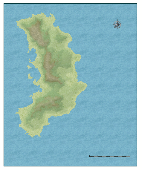
I started with Continent B for the Community Atlas this afternoon.
This is what I got so far. I copied the Continent onto a CC3+ Map of roughly the same size.
Then I adapted the continent as well as some of the contours and added a slight lighted bevel effect to give it a realistic look.
Cheers
I started with Continent B for the Community Atlas this afternoon.
This is what I got so far. I copied the Continent onto a CC3+ Map of roughly the same size.
Then I adapted the continent as well as some of the contours and added a slight lighted bevel effect to give it a realistic look.
Cheers
Comments
Note that if you center the continent a bit, it is not very far eastward to continent K. Not that you need to include it on this map, but you should be aware of it if you do any major work on the sea side of things.
Most likely I will use the free space on the right side to make a map legend.
BTW: Am I free to invent names for places ect.?
In the meantime I added rivers, lakes and deserts.
One can hardly see any of the symbols when zoomed out.
I'm also noticing several village symbols on your map. Note that a map of this scale, generally only the largest of cities would normally be visible.
The distance between the two larger settlements at the coast is roughly 600 miles. Therefore it seems plausible to me that there would be some settlements in between that have more than some thousand citizen.
I can, however delete the symbols and try a bit a larger size.
Everything has a nice look to it so far though.
I'll have to figure out what scale works best. The problem is, that the larger the scale is, the harder it gets to place the symbols around the rivers.
Is there a way to tell the tree symbols to go onto the symbols sheet instead of the tree symbols sheet?
As it is, they either fall beneath the mountains or weirdly on top of them.
On most atlas scale maps that I've seen cities that are built up around a river, like London for example, the spot marker is usually placed right on top of the river line. This is not to say that what you are doing is wrong, but just that I think you are worrying too much, perhaps, about whether or not the detail of a city marker/symbol is actually visible at full screen size view.
Arranging trees and mountains can be quite tricky. I don't know how everyone else does it, but with Schley I tend to use at least two tree sheets - one for behind the mountains, and one for in front of them.
If this was a HW map I'd use the forest fills instead, but I haven't done enough Schley maps to know if there are any forest fills in that set, or how suitable they wold be.
Although I prefer not to place Cities on top of rivers, this was not my foremost concern. The problem I had was rather related to the placement of mountains. When I tried to use larger mountain symbols I had a hard time placing them without cutting off the rivers.
I also tried two sheets when placing trees but I couldn't figure how I could place trees directly on another sheet than the one that has been preset. So I had to change the sheet manually which was quite annoying since it is not quite easy to pick out individual trees from a forest. Therefore I wondered if there was a way to get them directly on another sheet when placing them.
Also, I thought about using fills instead of bitmaps but I didn't like the ones from the Schley style and wasn't to get the ones from HW working on this map. So I first decided against using them. So I went ahead with the bitmap trees (As in the first attached map).
Since it didn't look well enough when zoomed out, I decided to try it with the Schley fills anyway (second attached map).
What do you guys think? Which one works better? (Both are far from finished)
Regards,
Hadrian
1. Click options at the top op the Symbol catalog and uncheck symbols choose their own sheet. All symbols will no go onto the currently set Sheet. Rememer to reset it when you are finished.
2. Name a new sheet something Like SYMBOLS TREES BACK and set it to current. Symbols will ignore their default sheet and go onto a selected sheet that begins with SYMBOLS.
I like the look of the second map too but the rivers' source will need to be worked with; they look too abrupt at the moment.
Thank you for your replies. I also prefer the second map, at least from this point of view.
@Shessar: Thank you for the explanation.
Also, I will work on the rivers. I didn't go too much into detail yet, because I initially planned to use the mountain symbols. Therefore I assumed that at least some sources would be covered by Symbols. Those rivers whose source is not somewhere up in the mountains are actually quite thin. I'll probably have to reduce the glow on the river sheet in order to make the difference visible.
@Quenten: Thank you. I used the same method as in my 13th Age map, which I learned from the "shaded relief" tutorial from the 2008 annuals, I think. It is actually quite simple: I just drew another "mountain background" and placed it on a separate sheet. Then I added a "lighted bevel" effect to the sheet and changed the first value ("bevel size") to 550 which equals 10% of the longer side of the map. Then I chose an intensity value of about 50% (the contours have an intensity value of about 5-10%). I also added a "transparency" and an "edge fade, inner" effect.
I only followed the tutorial in a rough manner. In the tutorial they also add a texturize effect and I am not sure whether they used a transparency effect or if they dealt with transparency just by using the edge fade inner effect. What seems to be important, however, is not to draw the mountains in a too broad/wide manner. The result appears to be best, when drawing long and relatively thin ridges.
Cheers
BTW, what is the name of your continent?
I haven't figured that out yet:)
Thanks for your replies. I had a though weak and was therefore not able to spend as much time with this map as I would have liked to.
However, I took some time tonight and improved the sources of the rivers as well as the forests and the farmlands.
Further I replaced the symbols for the towns and cities with mere circles. I think this helps to emphasize the size of the continent.
I also placed some names, but I will still have to work on the texts.
I hope you guys like it.
EDIT: If you let me some criticism in, i´d try to do something with the rivers. Maybe they´re too thick or they shine too much, i dunno but they don´t fit that well with the rest of the map. Just my 2 cents.
I think the rivers are either too wide or the wrong color. I can't quite decide which, but when I look at your map I have a hard time seeing past the rivers.
@Quenten: Thank you.:) I'll rework most of the Names and I'll figure out another way to line up the city names.
@Monsen: Thank you.:)
@Medio, Shessar, Lorelei: Thank you for the feedback. As Shessar adviced I had already reworked the sources of the rivers. But they do indeed still look quite odd.
Since I wanted to avoid changing the width of the rivers, I tried to rework the effects and the fills. My suspicion was that it was either the blur or the glow effect that caused the weird look of the rivers. I also assumed that the rivers would look a bit smaller without the outer glow effect. Therefore I deleted the glow and the blur effect and replaced it with only a slight bevel effect.
The second amendment I made was changing the fills of the rivers. First I tried the same fills that the Schley Style uses for lakes (Sea_MS). It looked much better when taking a closer look but the rivers became almost invisible when zoomed out. Therefore I tired the standard "water dark bitmap" fill.
What do you think?