FINISHED: Erdan
 Medio
Surveyor
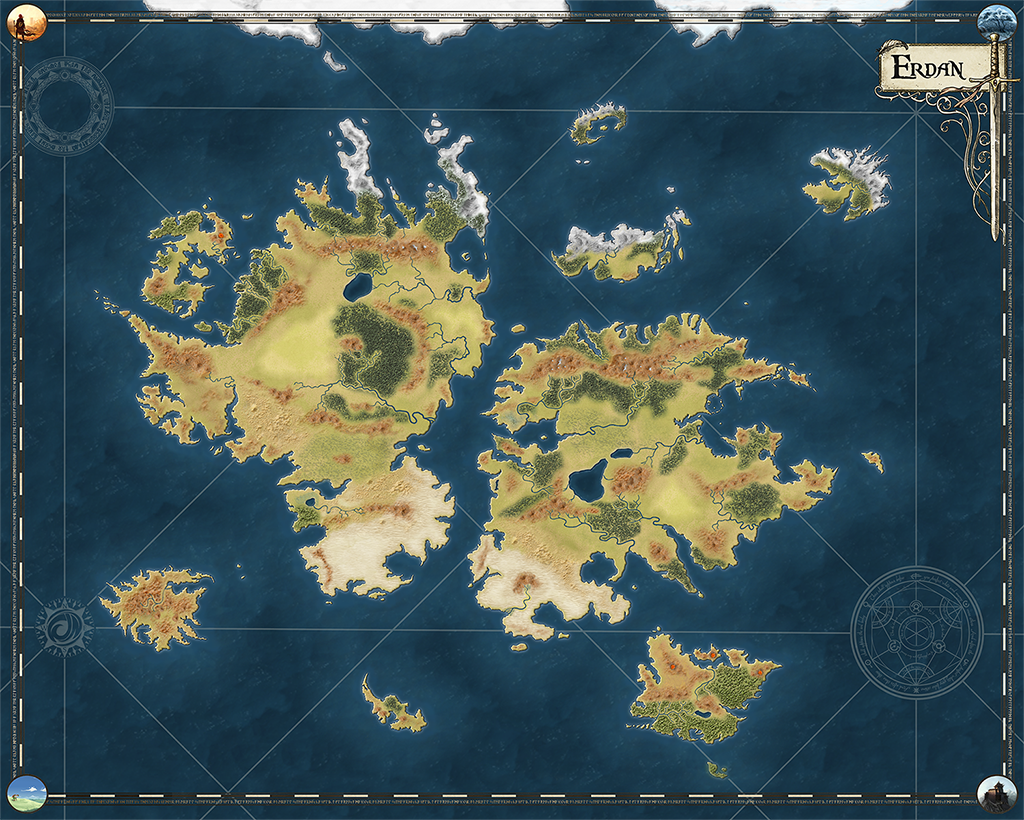
Hey all. Well, it´s done. Been many hours of job tweaking the map but it´s finished.
This is the map my players will see on my upcoming D&D campaign.I already did an Erdan map but i wanted something a bit darker and overall better looking, more serious, so i started using the 13th Age style. I used a different forest texture than the 13th Age style, and i also varied the mountains and hills icons and textures, plus i decided to use such icons as textures using transparencies and so. I consider the Annuals as a great starting point but i always tend to do things as i really want and sometimes it doesn´t fit exactly to the Annual style. 13th Age is spectacular for such kind of world maps, gives a different, not cartonish look which it was exactly what i wanted.
I finished the map using PS as i´m used to work with it and the last effects are done faster in PS. I think i could do all the job in CC3 (except maybe symbols construction) though... I missed using CC3+, i´d problably won´t use CC3 anymore meaning i will have not to use some Annuals until they´re prepared. Simply, some things take too much time and it´s harder to watch the map looks without effects on.
Most of the symbols not in the Annual are either taken from Internet or made by myself. The final product let me quite satisfied.
If you wanna check a higher res map (actually i have a 66 mgs PNG), whisper me.
Hope you enjoy it...


Comments
Cheers,
~Dogtag
Already shown to my friends and they just press "like" button (we use a Facebook group for my campaign) ... meh. Oh well, one of them was nominated country level on digital photograhy so i guess he won´t be much impressed... he will die first. :P
EDIT: must say that both maps look really much, much better on higher resolution (these are 200 pixels/inch, in 300 and with bigger image size is really noticeable. I already downloaded a 12455x9965 png with 1200 pixels/inc which is incredible, for printing purpouses.
EDIT: changed some colour on the labelling.
Thank you for sharing!
~Dogtag
I answered this (if any ever wondered about):
"Good thing you mentioned that island... it has a meaning that it´s not full covered with ice at should be. There is where the elves lived. Eleves, if put in enough numbers and with time, produce naturally a special "magic" which changes the soil and the climate around them, that´s why the island has was much warmer than expected (something like Shangri-La, for taking a real world myth reference).
I wrote "lived" because some few years ago a demons horde coming from the North (in my last campaign the world, which was sealed, was finally opened and connected with the universe but that meant the Lower Planes also appeared, and in the North there is a place where the snow is black, and there is a Gate to the Abyss) who killed most of the elves and made all others be refugees in other kingdoms. Now the land slowly is losing that special condition and northern part starts to get frozen as it should be. Not all them will do, as there are a few number of elves which resist the horde in there, in the middle island.
This makes the rest of the elves in the world to be nomadic and all them are searching for a way to recover their homeland. Male elves which are aggresive looks for riches so they can hire an army (or two) which lets them do it. Female elves (very scarce as most of them were in their homeland when the horde suddenly attacked, meaning they´re really treasured by male elves. Elves have difficulties on breeding, and with less women this makes the elves situation in Erdan a bit critical), which are more paused and with a talent for magic, are searching for a more esoteric solution. Don´t need to say roleplaying an elf in my world is simply awesome (in my humble opinion, that is)."
NOTE: larger resolution map here: https://www.cartographersguild.com/attachment.php?attachmentid=92430&d=1486632802
I especially like the shape of the continents for they seem very realistic. The mountains are also very beautiful. How did you achieve that?
This map just inspired me to try and create my own world in the 13th age style.:)
The mountains... ok, i did the following thing.
First, i didn´t want to use the standard 13th Age mountains which are great but fits more on a more dry land. I wanted a "brown" mountains so i went to Photoshop and i played abit using Hue/Saturation till i got the brown i wanted. Believe it´s not hard at all heh. I think to remember you can do this easily aswell with CC3+, i´m not sure though. Learning CC3+ is my next task.
Then my base is a bakground of such brown hills. The sheet containing them has the following effects (in CC3):
Edge Fade, Inner with parameters: edge width 20, inner opacity 100, outer opacity 0.
Transparency. opacity 90%
Note that you could really put that transparency on the Edge Fade but doing it this way got a better look.
Then i used the mountain symbols to add some peaks. I used Photoshop again and with the same Hue/Saturation i put the same brown colour. Note that here i forgot to add some transparency to the mountains edges. In CC3 you cannot use Edge Fade on symbols unfortunatly. This means that some symbols are too sharp if you zoom enough. I will correct this when i have time.
Lately, i took some mountain symbols are drawed snowy peaks. How did i that? Quite easily in Photoshop. With freehand i drawed what i wanted to be snowy (usually areas around the peak), which gets selected, and then for the selected part and using Hue/Saturation in the Light parameter, i leveled it up until it gets quite close to white. I would draw again a freehand zone even closer to the peak and made them totally white using the technique before. As you can see, i´m not a PS artist and i just used my intuition to work it. As the symbols are quite small, it worked perfectly and most important, i didn´t need much time.
I got all the tools and the rest is just wise placement.
The funny part is that standard 13th Age mountains, the texture part not the symbols, were great to create arid zones. I put them with some Edge Fade and Transparency and they are the parts close to the deserts and in the Nirac continent, the lands which form the "Erial de Ashanar" (translated Ashanar´s Wastelands), giving a rocky look which i loved.
Hope it wasn´t a too long wall of text.
What I find most disturbing is that you still wanted something better than your original map! I think my cartography's in trouble...
To be honest each time I watch the map I see failures and I want to improve it.