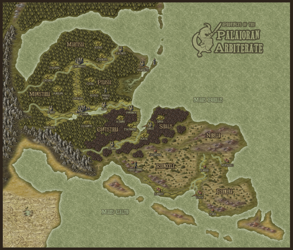
Herwin Wielink style map

I decided to bite the bullet and grab CC3+ a few days ago. This is my first (and possibly last) attempt at the Wielink style. I needed an improved reference map for a novel I'm writing, and I got a bit carried away.

Unfortunately there's a chunk of desert in the bottom corner which looks kind of crummy.

Comments

  • MedioMedio Surveyor
    Your coastline is great at the northern part but could be a bit more worked in the southern one; maybe that´s why the desert doesn´t look like you would want.

    Otherwise is a promising map. Carry it on!
  • LoopysueLoopysue ProFantasy 🖼️ 39 images Cartographer
    Hello C.Dowell :)

    Welcome to the Profantasy Forum

    I've already commented on this map over at the Guild ('Loopysue', aka 'Mouse'), so you already know that I think this is an excellent first map,

    Well done :D

    As a matter of curiosity, did you encounter problems making your map, and that's why its 'probably your last'? Or is it that you just wanted to do this one map really badly, and then its the writing to sort out?
  • I think this is a very nice first map. While I'm not fond of the desert fill, myself, I quite like the look of your scrub lands to the SE ("Rienccela," at al.)
  • Posted By: C. Dowell...I got a bit carried away.
    Yep, Campaign Cartographer has this effect!

    For the desert, you might try adjusting the scaling of the fill (left click on the "FS" box at the top right of your CC3+ screen, select the appropriate Bitmap Style from the drop down list, and change the "Scaled Width" and "Height" parameters; it'll need some trial and error to see what, if anything, works better in this regard). Or you could add some additional symbol features, such as dunes, or some of the "reef" symbols from the "Coast/Sea" symbol options - they'll work as small rocky outcrops on the desert fill - to make it look a little more "real".
  • I have had the pleasure of getting to know this style over the last few months for some commission work. The desert was an issue as well. I tried grabbing desert styles from other sets but could not find anything that worked well with the style. We ended up going with the bitmap fill that you used for Permera, Nibelia, and Rienccela. Don't be afraid of thinking out of the box. Try shading and other styles.
  • The other thing I could do is just eliminate the desert altogether. It serves no purpose in the story itself, and I don't know why I put it there.

    Unfortunately that doesn't solve the ugliness around the bay to its north, where the coast meets the mountains.
    Posted By: LoopysueHello C.Dowell :)

    As a matter of curiosity, did you encounter problems making your map, and that's why its 'probably your last'? Or is it that you just wanted to do this one map really badly, and then its the writing to sort out?
    The latter, mostly.
  • A few hills to make the transition from the mountains less abrupt. Especially around the small peninsula and the bulge to the Northwest.
  • LoopysueLoopysue ProFantasy 🖼️ 39 images Cartographer
    You could put a couple of inselberg mountains in the desert? Those are the flat topped ones called 'Mesa'. Tabletop style mountains.
  • edited January 2017
    If you have the Symbol Set 2 for DD3 there is a pretty decent sand bitmap fill (Sand Light). I use it often....just use the Hue/Sat to get the shade you like as it is a bit yellowish at first
  • MedioMedio Surveyor
    edited January 2017
    Indeed it´s a good bitmap. Humm gonna check the SS2, i bought just the SS1 thinking i wouldn´t have uses for it as i don´t have DD3 but maybe i was wrong...
  • Great idea Lorelei! I never used the hue/saturation before. ?
Sign In or Register to comment.