

WIP Herwin Weilink Perspective City
 Tonnichiwa
🖼️ 16 images Surveyor
Tonnichiwa
🖼️ 16 images Surveyor
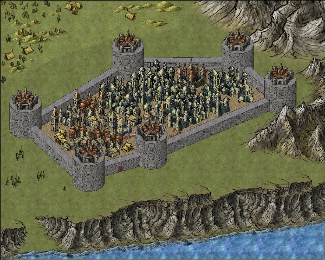
Hi everyone, I just thought I would show you one of my current projects. This is a Perspectives city that I am working on in the Herwin Weilink style using both the Perspectives 3 set and some of the symbols from the Herwin Weilink overland set and one of Shessar's wonderful doors. Oh yea, I also added some merchant stalls from the Alyssa Fayden annual.
It isn't done yet and has a lot of work to go but I just got to the point where I thought it was pretty enough to share, so I hope you enjoy it.
It isn't done yet and has a lot of work to go but I just got to the point where I thought it was pretty enough to share, so I hope you enjoy it.
Comments
Thanks JimP. I'm still not even sure if I like this whole thing yet but I thought I would at least show some of it.
Thanks Barliman, It's turning out to be an interesting experiment.
Looking good!
The only thing I would suggest as an alteration so far is to use an HSL effect to tone the walls and tower drums to a more browny-grey to match the colour of the stone element of the symbols - make them look like they have been built in the same kind of stone?
I would change that total grey to some other colour first if you can, otherwise it will be very difficult to add or adjust a colour where there is none to start with. Try one of the brown shades.
A note on the way the saturation thing works with that effect - it seems to me to be set up the wrong way, so that positive numbers actually reduce the saturation. Its not a fault, but bear it in mind, or it is easy to get confused about what you are doing, since you need to adjust three variables to synchronise the colour of the wall with the colour of the stone material used in the symbols.
Assuming you use a pale brown to start with it would be a good idea to get the hue right first, then get the right tonal shade (the light and dark of a thing), and work on the saturation last - remembering to go into minus figures if you need the colour to be more intense.
I also think that some buildings closer to the front wall (and partially hidden by it), would help make to two feel in the same place.
I really think those towers are humongous. Is you want to go full fantasy, maybe you can try thinner towers, that only grow broader at the top, like that for instance:
Finally, I think some sizes could be tweaked. Those tents at the back look huge. They would be fine as a symbol to represent a village made of tents, but if they stand as a real tent, I think they should be scaled down. Finally, I think that the back tower appear the same size as the front tower. This is normal since they are drawn by a tool that focuses on isometric projection. But with the other symbols that look more hand-drawn, more natural, I think it could be nice to simulate some sort of perspective by slightly reducing the size of the objects at the bottom.
Yup Gathar, you've mentioned just about everything that I still need to do to this map, hehe, all of that is why I wasn't done with this map. Sadly, I would love to get more of a curve like the one in your picture as the tower nears the top, however, so far that has been very difficult for me to do without this starting to look like something from Minecraft. I know I can draw my own poly's and extrude them so they look right....except that I have no idea what angle to draw it at so that when it gets extruded it looks right.
But this was a throw away project of mine that a friend saw and loved so I decided to keep going with it all day yesterday. And it finally got to the point where I posted it because I thought it looked nice enough. It's nice but it isn't anywhere near where I want it to be yet. That will probably take some time to learn the proper angles and how to arrange everything on the right sheets so they overlap in the right places.