

Chain of mountains question
 Loopysue
ProFantasy 🖼️ 39 images Cartographer
Loopysue
ProFantasy 🖼️ 39 images Cartographer
Would anyone be interested in developing a set of connecting symbols that create a chain of mountains?
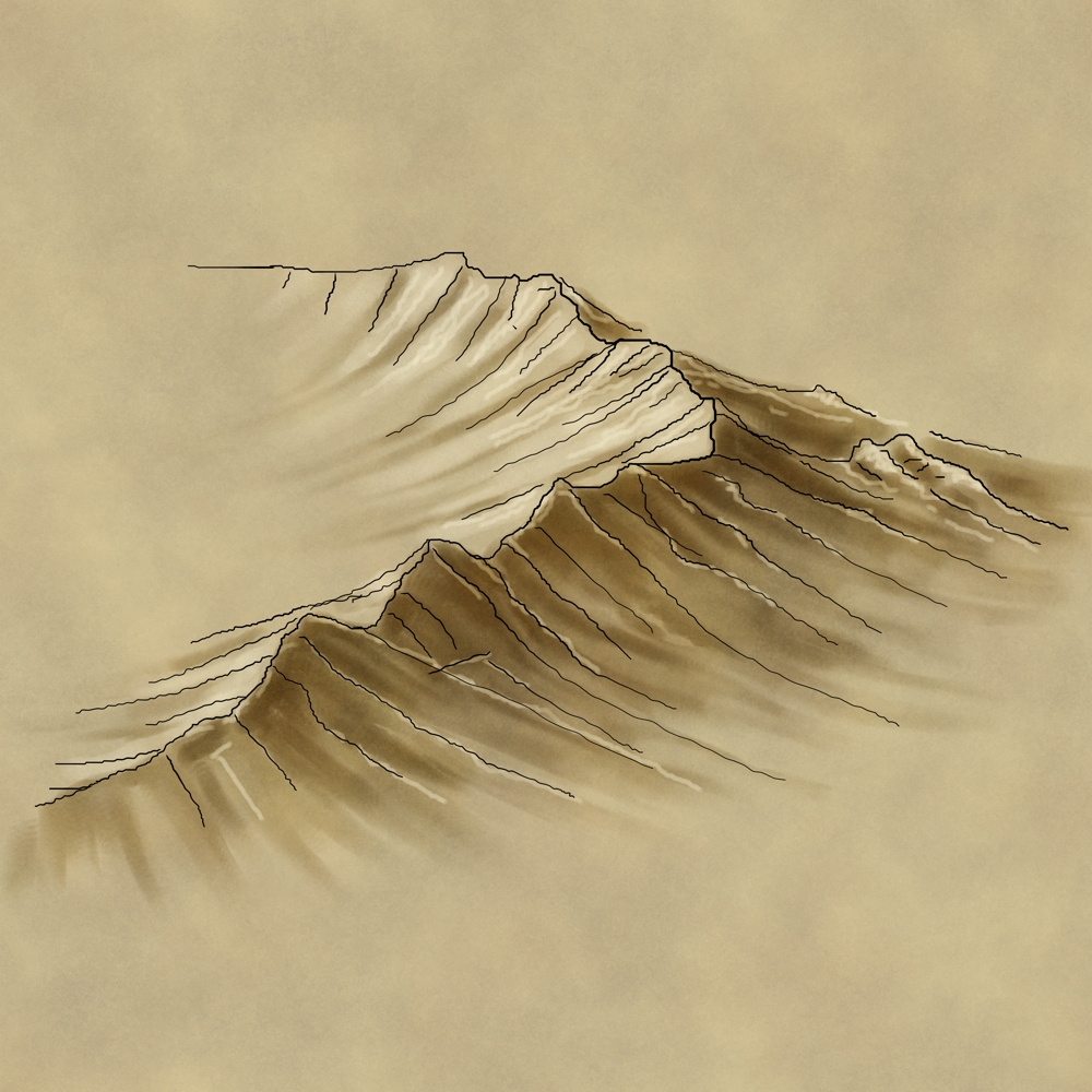
Visualisation: A set of symbols that could help us do things like this (which I drew in GIMP):
[Image_7231]
It has occurred to me that given the theory of connecting symbols (read in the TOME) this should be possible... kind of... but I'm not sure if it would really work.
Visualisation: A set of symbols that could help us do things like this (which I drew in GIMP):
[Image_7231]
It has occurred to me that given the theory of connecting symbols (read in the TOME) this should be possible... kind of... but I'm not sure if it would really work.
Comments
I'm getting a Wacom for Christmas, so I should be able to make the drawing a lot more professional in a few weeks time
1. If you have a number of variations on a straight symbol of the same length, will random selection work with a set of connecting symbols, even though the TOME advises against it?
2. If you have straight symbols that are shaded either on the left or the right but not both, and you want to use them either on up or down lines on the map but not both (to simulate the correct lighting direction), would that even be possible?
I think forest connecting symbols would be relatively easy, maybe (once I get the tablet to draw the things that is).
Its the mountains that are the problem. How did you cope with the fact that they are shaded on one side, and would turn around and be the wrong way to the direction of light if you drew a nearly closed circle of them?
I have this vision of being able to just draw a line for a mountain chain as described in Shessar's Mountain tutorial, but to have that line convert to actual mountains that make a convincing ridge. If the technique could be resolved and I knew what kind of thing I was trying to draw, it would make the realisation of that dream a little easier to bring about.
Are there any existing examples of what I describe in any of the annuals?
(I don't have any of the annuals)
I could really do with some kind of starting point with this.
One idea might be to just connect the main line, then make some symbols that are meant to be placed on either side of the line, depending on which way the line goes, that add the details.
I f you could drop me any useful details of how they really behave that would be great. Thanks
The website they give is http://www.vintyri.com/vintyri/toolsnj.htm
I suspect that this is no longer valid though and we should probably just use the site as listed at the top of the forums.
I can hardly wait to get this Wacom!
I was hoping to develop an ISO style set of connecting symbols first, but now that I've seen those images I might turn my attention to that kind of mountain range in the future
I like very much
This is where I learned how to draw mine: Fantastic Maps - Johnathon Roberts tutorial on ISO mountain ridges
Johnathon Roberts seems to be a widely acknowledged expert in the matter over at the Guild, and even if you choose to carry on with your own style (which is really very attractive), watching his tutorial is kind of mesmerising
Do you know if there's a way to vary the line width with a pressure sensitive Wacom in CC3?
(Funny story - I don't have the Wacom yet, so I had to set the line width variation to 'velocity', which meant that I had to draw really fast to make the line trail off into nothing. Of course, this resulted in a huge canvas as I practised whizzing around drawing a set of mountains that were larger than most of the continental maps you can see on the Guild. It also resulted in some rather over-enthusiastic arm flourishes, one of which swept an entire pint of orange juice straight off the edge of my desk! The moral of that story is - be sure to clear your desk of all potential hazards before you decide to follow suit, or you may just end up spending a quiet but exhausting half hour cleaning the floor, or... if you clock it going in the opposite direction... crying huge lakes of tears over a badly drowned laptop.)
I'm glad you like the color but I think there is too much yellow in it myself. I was trying to make some mountains with a slightly green tint on the ground beneath them and also to try to find a way to tint the white lines running down the mountain so they weren't so bright. I'm not sure I like the end result.
You really should be more careful with those strokes Sue...lol...you are liable to end up knocking more than orange juice over.
Thanks for the tutorial from John Roberts. I'm not sure if you know but he has done a number of the Annuals here for Profantasy.
Even though the line width can't be varied, I think it might still be worth at least having a go at drawing them directly into CC3, even if the symbols I/we make are made in GIMP/Krita/Artrage for a more professional finish.
Colours - I just select the colour by clicking the swatch in the top bar. Lines are automatically drawn in the selected colour. The fatter more blurry lines I would draw on a sheet with a very large blur effect, possibly with an additional blend mode set to about 50% transparency and 'overlay' to mimic John's PS mountains.
JR making mountains for us? That figures. No wonder PF mountains generally look so good
Thank you for telling me how you would do that Sue, I will have to give it a go. I honestly think that while I may not be able to change the pen width in an instant, I can at least change it for each line that I draw, so for instance, in the mountains that I just made in Artrage Studio, notice how the top line is thicker, and then the lines going down the mountainside are smaller? That we can do. It would take a long time and be tedious, but probably very worth it when we are done if what you have said about how to add color to them works.
So what do you think Sue, should I post this blue mountain range at the Guild?
Another way to add shading of a more irregular shape would be to use a sheet with a transparency effect followed by a blur effect, and draw polygons of solid in whatever colour you like. That's another technique that worked quite well in the GP map
I'm not trying to replace anything that's already been drawn by the way. It just occurred to me that we could do with a set of connecting mountain symbols that would allow us to draw instant mountain ranges for world scale maps. The HW mountains I prefer to use are beautiful, but they are really best suited to regional maps, and have a tendency to disappear into a haze of detail if they are reduced enough to be used on a global scale map.
I only have Schley and HW because I have don't have any annuals at all, so it would be interesting to see the same city done with a symbol set that I've not seen before, but don't let it distract you from your other projects
I like your ideas for drawing our own stuff. It's one of my favorite features of CC3+
I'm currently trying not to get distracted by a new set of houses I was making (originally for Merelan city, but now far too late for that), finishing the Road to Tiamis, and going to bed (its just gone 4 am... again!)
I think I will have to let the bed win now. I'm just not really thinking all that straight!
I will continue working tomorrow, after doing my duty with a bit more of the Christmas day left overs. I think a nice clear turkey noodle soup is in order after all that pudding and cream I've consumed over the last couple of days
I like the warmer colours better.
I can see I'm going to have to up my game.
Just you wait till I get my hands on my new tablet!
Haha, ok, well I really can't wait to see what you do with your new tablet.
So this is adding all of the white lines in CC3+
I've still got to add darker lines so it is shaded a bit better but I'm glad I can do this in CC3 and have it look decent.
When I did this kind of thing with Gymnopus P I used 2-3 sheets for highlights, and another 2-3 sheets for shade - each with varying line widths and different blurs on them to break up the regularity.