

Regional: Archandus: work in progress
 Calibre
🖼️ 22 images Mapmaker
Calibre
🖼️ 22 images Mapmaker
For your critique and advice:
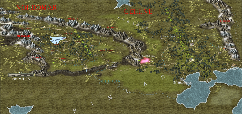
First, this is a regional map in my ongoing campaign which I run on a MUSH. I use the maps for my players' reference. The nomenclature is Tolkien-based simply because I like the language.
Second, I am a trained graphic-artist (traditional as well) and typographer, though as has been stated many times, CC3, et al, does not operate like the programs I've been trained on heh heh.
Third, Rivers and Roads: yeah, I need serious help.
Fourth, if someone can give me a step-by-step of how to attach the .FCW, I will do so.
thanks
Cal
Comments
'Lesser sea of Flux' ? Or does it say more than that ?
Yes, JimP: Lesser Sea of Flux
What colors would you suggest?
thanks
Cal
A light red, if you want to keep it red, would work. But not a pink.
A rectangle of white under it would help to. That would need to be on its own sheet.
I made an example where the red lettering overlaps the edge so you can see the contrast.
Of course, you can adjust the size of the white rectangle to match better the lettering, but not too close.
Thanks, JimP. Fixed.
I'll experiment as you suggest. I wish I could show you what it looks like in the original PNG, but it's way too large for this forum.
My primary failing is, as you see, the Rivers and the Roads.
I love this program, but it's fighting me! heh heh
thanks
Cal
Cal
thanks
Cal
IMHO the text would look better if it was all white, and had a black glow effect on that sheet to lift it off the map and make it clear and easy to read.
The red is very jarring against the green because its more or less but not quite the opposite colour, and opposites always jar if they are placed right next to each other without some kind of buffer zone (like a glow), or one being much less saturated than the other to the point of being very nearly grey. Grey would fail to stand out in this case, however, so go for white.
The lake on the left side, can't even make heads or tails of it.
Most of the ones that cross from land to water are tough.
The red text is tough too. I mean it would probably look better zoomed in, but at this resolution those are really difficult and I am looking at them on my 55" tv. So that picture is coming across at 2' x 1'
Loopysue is correct that a white text with a black glow, (or black text with a white glow} is the best option for visibility. Here is my favorite example of this.
I'm going to try it. I believe I did white with a black outline overall before and reverted to red because it reminds me of a map I saw as a kid of Europe heh.
Could you guys help with the rivers and roads? with suggestions, I mean...
thanks for the critique, guys
Cal
scale bar is thrown up there because I'm taking rectangle PNGs for player maps and needed it there temporarily
everything southwest of Gelion is deliberately left undone to not spoil surprises for players; likewise to the north
Observations:
I notice the map really looks better in smaller rectangular PNGs which I pull out for the guys when we play heh.
The green highlight contour keeps changing color back to standard palette even though I keep changing it. Not sure why. I save the palette and color keeps reverting.
I really suck at rivers and roads :P
thanks for all the advice!
Cal
:S
Cal
At the scale it is here, the white lettering is definitely far more readable, but I think you need to increase the black glow around it a bit more for this scale.
I don't understand why on earth you seem to think you have a problem with roads and rivers. Perhaps if you show as a close up extract of the problem we might be able to say a bit more?
I agree with Loopysue too regarding your roads and rivers query, as I'm also not seeing what problem you have with them that you're needing help to solve. The changed river lines now stand out just fine; the roads might benefit from a colour change, or maybe just an increased external glow, to help them stand out a little more, but that's about the only thing I can spot. Again though, this does depend on what you most need the map to show. For instance, if the rivers are navigable, you might want to show them more clearly than the roads in some cases, especially where the players may be travelling along them, rather than going on foot.
Crazy roads can serve great purpose to, a game master can think, why does that road take a wide turn. Maybe it skirts soft ground, could be an ancient battlefield with ghosts and undead. Possibly a wizard has lands and a tower and wants nowhere near his experiments.
So I for one think the roads are pretty darn good,
Makes you think, really, if in a thousand years time the road I live on will still be marked by similar vestigial remains.
As for the rivers/roads: well, I dislike the default look with the HW style, so just used smooth paths of varying pen widths on rivers. The problem with that is that the lines stay the same size regardless of zoom level heh. Roads, I used the default and just changed color and added outer glow and transparency. So, when zoomed in, the rivers in areas look like thin lines while the roads are overly large. Also, had to freehand the waterfall. But, if you guys think it looks ok, well, I'll stop whining now
Cal