

Labelling and Text Suggestions
 LordEntrails
Traveler
LordEntrails
Traveler
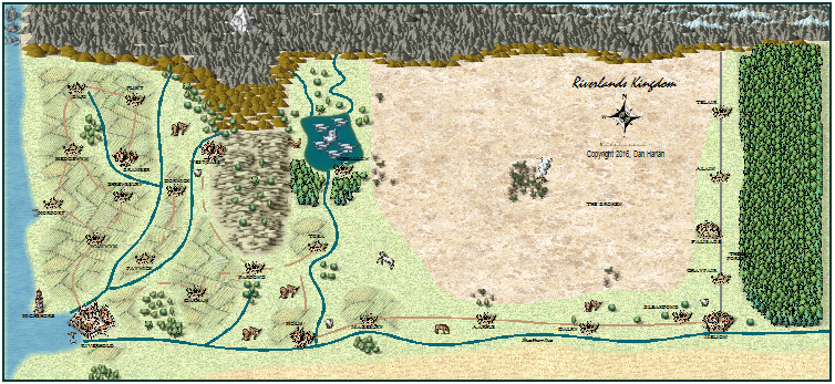
First map I've done in many years and I'm unhappy with the text and labelling. I'm hoping someone could make some suggestions on fonts, sizes and effects that would make this look better.
Specific labels that look horrendous are;
- The forest (how do I get a cleaner background or someone to get the text to stand out from the trees?)
- The plains (The Broken). Just make this larger or a different font or...?
- The river (Silverthorne River)
And, If I'm doing it right, sheet effects are on (CC3+).
First attachment is a small overview (low-res, for reference).
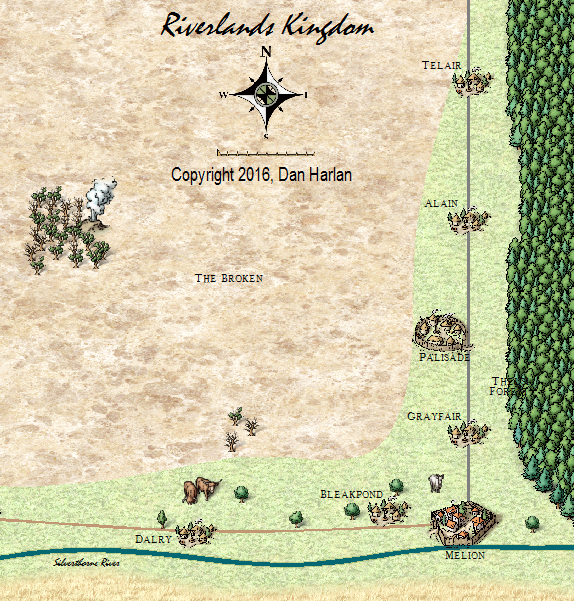
Second attachment is the area the examples are from.
Specific labels that look horrendous are;
- The forest (how do I get a cleaner background or someone to get the text to stand out from the trees?)
- The plains (The Broken). Just make this larger or a different font or...?
- The river (Silverthorne River)
And, If I'm doing it right, sheet effects are on (CC3+).
First attachment is a small overview (low-res, for reference).
Second attachment is the area the examples are from.
Comments
1. Try not to use too many different fonts in your map, since the font has a powerful effect on the style and flavour of the map. Where you need to vary the labelling, use instead variations of colour and size, or italic, upper case, or bold versions of the same font. I tend to use one font throughout, but some people use one font for land labelling, one font for ocean labelling, and another for the title/legend. Rivers and lakes for example could be labelled with the land font but italic and/or blue.
2. Use fonts that are easy to read. Spidery fonts may need to be made larger simply because they are harder to see.
3. Restrict yourself to using the more fancy fonts for the title, and try to stick with plain ones for labelling (unless you are trying to achieve a particular effect, or mimic a particular style)
Apart from those very basic rules of thumb, you can help make the labels stand out more by adding a glow effect to the TEXT sheet that is the opposite colour to the text. For example a very pale glow for dark text, and a very dark glow for pale text. However, you should be careful how strong your glow is, because a massively overpowering glow can make the label look worse, not better. I tend to use a 1-5% glow with a blur of 10 map units. You would be surprised what a difference that makes!
Time for me to go read about Effects, not sure I know how to change or control those yet so let me go see if I can figure out how to do what you suggest.
Oh boy! You are going to have just so much FUN!!! LOL!
Enjoy!
On the standard the text I did; Glow, white, strength 45, blur radius .2 map units
On the forest text I did; Outer Glow, white, 85%, range .5, blur .5 map units.
I even learned to create a new sheet. Lots to learn here
Over time you will learn a lot more. I'm still learning. There are the standard ways of doing things, and then there are the less conventional ways you can discover by experimenting
You can open the user manual easily from within CC3+. Just select Help>User Manual from the menu bar.
Cheers,
~Dogtag
I did add a regular to the Forest text after posting that image, helped to clarify the text a bit more than what is shown.