

Need some tips on how to map this

I am trying to recreate this map but I am having a very difficult time doing so in CC3.
Could someone give me some tips on the following issues with the attached map:
* would this be a dungeon or city template?
* I couldn't trim the building properly
* How do I make a building look like the one in the drawing?
* How would you go about making those walls?
Any help is much appreciated.
Note: I have CC3 with DD3 and CD3 including the annuals
Comments
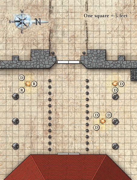
First, let's deal with the walls. These look pretty simple- you should be able to do the thicker areas with a simple polygon using a grey flagstone fill, although the middle section with the doors looks like it's a more traditional wall. I'd guess the doors are either Symbol Set 2 Bitmap B, or they're custom-made (i.e., just black outline, white fill rectangles).
As for the building- that's more complex- but not as bad as you might think. The first thing to realize is that it's multiple shapes, and there's likely things under it. The doors make that pretty likely, too. I'd guess there's a wall underneath it making the general outline of the building, and that's what that door's attached to. But what about the roof?
The key thing there is that you've got one bitmap fill- looks like red bricks- that are at three distinct angles. I'm new at this so I may be doing this the hard way, but to me that says that there's three different shapes there- a polygon in the middle and two triangles for each side. Furthermore, there's the two ridge caps, which are not tiled- so I'd guess those are also separate items. If you just draw in the shape of the roof, you'll get horizontal red brick everywhere- that doesn't look right. So here's what you do:
First, draw three template shapes, where you want them to end up. The two triangles and the central polygon. Move these up into the courtyard to have more room to work on them. Now rotate the two triangles so that the edge that would hang off the roof is horizontal. It doesn't have to be perfect, but the better you can do it, the more realistic it'll look. Once they're properly oriented, you're ready to start on the roof itself. Create three shapes, each on their own sheet. We'll call 'em Left Roof, Middle Roof, and Right Roof. The reason they each have their own sheet will be obvious once we get to that part. Draw these shapes to match the templates, so the brick fills horizontally. Now rotate the right and left sections back to the way they should be- that should rotate the bitmap as well, and you'll end up with a realistic roof effect. Once you have these three shapes in place, you can create a fourth sheet, Ridge Caps. Draw those on that sheet. If you aren't picky you could just use the wall drawing tools and the corners of the roof will be a bit odd- or you could do them as polygons that follow the shape of the roof edge. Honestly it's probably not going to matter too much- you'll see them but nobody else will likely notice.
Alright- so let's move on to the sheets, shall we? The Wall sheets look to have two Glows, both black. One is strong but short- it makes that black outline. The other is lower intensity and reaches further. You've also go a very slight bevel- possibly a light bevel. The same bevel exists on the doors- so you will want that on the Wall Effects layer as well. For the roof, the walls beneath it will take care of the glows- our problem is in the fact it acts like a bevel- but we've got three separate objects. Solution? Glows. The Left Roof sheet should be fine as-is. The Middle Roof sheet I'd add a slight black or grey Inner Glow to, something that'll fill the space and just tint it a bit. The Right Roof sheet needs a little darker tint- I'd alter the color rather than the intensity, personally.
Now on to other bits. The statues don't look like the things from DD3- or do they? They don't look like anything from the Temples set, but they do look like things from the Skirmish catalog, done entirely in grey and set on top of circular symbols for bases. Both these bases and the statues look like they have a drop shadow or wall shadow effect to them- although slight. The smaller statues lining the path to the building are likely more of the same- either a different critter or the same one scaled down enough you can't tell. The fires should be simple symbols, I think from Elements, and the icons representing people are just shapes with a black outline and text on top of them.
For that faded effect on the background, I think your best bet is going to be to find an appropriate texture and then do one of two things- either fiddle with the Background sheet, or do something like in the March '07 Annual, using an intermediate sheet to fade-to-white everything beneath it.
Hope that helps- or someone who actually knows what they're doing comes along to make better suggestions.
I think also the polygon wall shape may have been drawn over a simple wall, which may be 6" or 1' thick.
I think Profantasy has a great community.
I could be wrong, but that'd be my guess.
I drew the one below in less than 30 minutes, using your original image as a trace outline. I didn't spend too much time with the effects, so you'll notice that the columns cast a shadow but the statues do not. I also did not create the correct depth to the bevel on the walls. In addition I didn't take any time to correct the lighting for the building. For the building I used the HOUSE command from CD3 and adjusted it to look similar. Given enough time I'm sure that we can duplicate that map completely.
I've included the FCW file here.
Thank you so much.
If you start taking a look at each of the sheets and what effects are applied you'll be able to figure out how to modify it even more to fit what you need. Like I said that was a quick one, the more you play around with CC3 and it's effects the more you start appreciating the entire package. The Global Sun effects are some of my favorite. They really do allow you to make the objects seem more realistic.
Keep mapping and I hope this goes well for your game.
If you are trying to print this to scale use the zoom window command with the same coordinates. When you print make sure that you have Active Window & All active sheets selected. Your scale should be 1" = 5'. That will keep your grid to the correct size, and every object to the 1 sq = 5' scale.
Hope that helps.