

Two level staircase help
 Lorelei
🖼️ 46 images Mapmaker
Lorelei
🖼️ 46 images Mapmaker
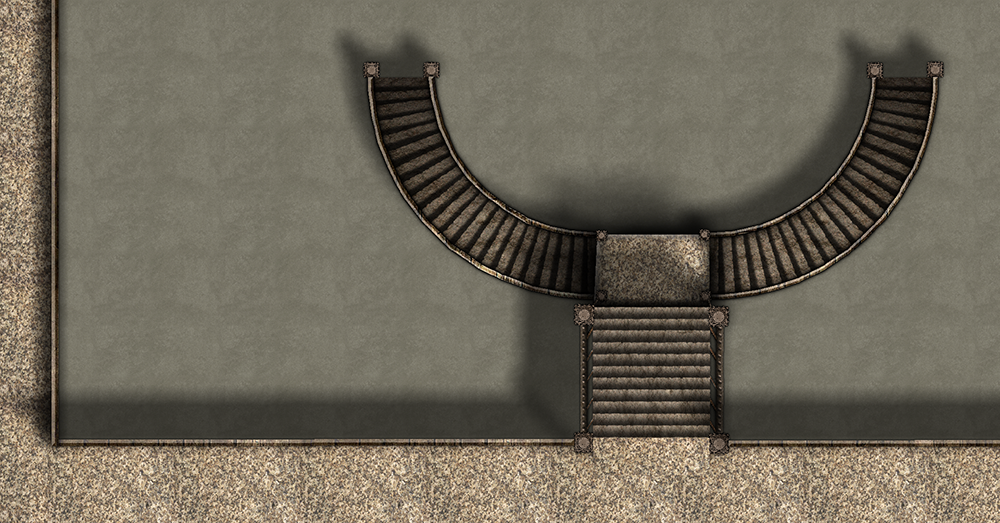
So I am working on a new battlemap for my campaign. This is the interior of a small walled castle. I am trying to create the impression of a circular staircase, a landing and then another staircase leading to a balcony encircling the Great Hall. Im not sure about this. One minute i look at what i've put together and im thinking "it's totally awesome, completely believable" the next i'm thinking "it's crap". Please, some other perspectives would be great. And any suggestions would help!!!! Maybe some columns peeking out from the balcony???
Comments
You could use furniture on the balcony and smaller of the same symbols on the main floor. That will trick the eye into seeing it as a multi-level room.
I'm confused, and speaking confused as well...
Like JimP says, other things in the environment might provide a better reference point for automatic visual comparison.
Some years ago I saw an opitcal illusion site. They showed two lunar craters next to each other. Viewed from one direction, they were typical craters, sunk into the surface of the Moon. Viewed from another direction, they looked like they were popped up out of the surface. All due to the shadow direction.
I'm hoping it will be more use than a lengthy description - and please bear in mind that the way I interpret things isn't always the same way that other people interpret them.
Watch that shadow on the stairs just as they approach the landing. Those steps should have the same light on them as the landing, or they will always look like they are going underneath it. I think you are right about maybe having to create your own shadows. The effect shadows are good, but they don't really work in such a complex and beautiful 3D presentation.
I really like your textures.
This version is the best yet, but maybe its time to start putting anything else in the room that you intend to be there... because now that the shadows are working their way towards 'normal', and no longer distracting me from the rest of the picture, I'm getting this weird Asperger's thing with patterns again, and even though other people would never see it (even if I pointed it out to them), I'm getting a big smiley face, with the stairs as the amazingly manic smile! (I'm sorry).
I wanted you to see the kind of mess I get into with shadows on stairs, by making a proper idiot of myself and trying to generate a better looking set of stairs. lol
I haven't finished working things out with the shadows on the stairs even, never mind drawn the rest of it, but I have to go and see my mum just now, and will be back later.
No matter what you do with the shadows cast by the stairs as a whole, it is the shadows on the stairs themselves that are giving you a headache. (They certainly gave me one when I was trying to work it out). The shadows on the original generate an illusion such that the middle of the stairs seems humped up. The top of the stairs needs to be lighter.
It has taken me a couple of hours to generate this image, because my ancient copy of CorelDraw hates Windows 10 (or vice versa - probably both), and keeps ceasing up at the first hint of a feathered shadow. If you have a more modern vector graphics package you could probably do this in just a few minutes.
I don't have access to the same texture file as the one you used, for either floor, so I made one up that was similar to the ground floor. With the actual texture file at your disposal you could put any texture you like on the steps. If you are interested I will see what I can do about the banister rail, just to finish it off a bit.
I could upload the file for you, but I would need to know what to save it as so that you could open it and use it to generate your own staircase bitmaps.
It became something of a minor obsession in the end.
If you are interested in having the vector file (which is rather large) I will need an email address to send it to - you can whisper me if you want.
OR - if you want the staircase but don't have the software to sort out the vectors yourself, if you send me the texture you want I will send you back a finished png of the staircase.
If you decide you would like it, but want the whole set, I can do that for you easily enough. I've done all the difficult bits already.
If you don't like it - don't want it, or whatever, just say 'no thanks'
If you want the file let me know what format you want it in, and an address to send it to (whisper me that part unless you want the world to know your address). We're talking about the vector file here. I can save as Paintshop, and other variations. Let me know what you want.
If you want the bitmap completed, I need the texture file to make it the right colour for you, and a copy of the original bitmap you used so I can make everything the right resolution and size.
I'm loving everything you have so far.. but I have one small issue of my own with the stairs. I promise, it's just a little one!
The stairs that lead from the landing to the balcony, I'm sorry, but they continue to look like an extention of the balcony to me... and I think I even know why. When you are looking from the balcony down the stairs... the perception should be of those stairs narrowing as they head to the landing, and they should be equal width of the landing.
But your stairs stay the same width. This tends to make them look flat, because there isn't any depth to them. Now... how to fix that problem? I will admit, I have no clue... as you said, these are png symbols, and I'm not experienced enough to know how to manipulate them to make them narrower at the bottom than they are at the top. Another thing that might help... is some shading on the side. I have a new dundjini symbols now... and i've noticed some that seem to have light on the stairs, to help denote up and down... here's one
The shadows on the curved set are actually very fake. When I tried to make them realistic (all going in the same direction away from the light source in the south) I ended up with the same problem as the original set, as the shadows got longer as the stairs swung around. I figured then that what was needed was a simple 'bean can' approach (as my old art lecturer used to say so dismissively. That is, a shadow that isn't real, but just tells you that one part is higher or lower than another. Cartoon shading... but it works a lot better than trying for realistic, believe me.
Thanks for the ideas and the image. I feel the itch to do something about that top flight of stairs coming on :-)
BUT - it is also proof that you have already got the shadows on the stairway as a whole perfectly acceptable - including the slightly denser shadow beneath the landing as compared to the stairs
The only thing I would suggest is that you might consider removing the shadow on the upper flight altogether, since judging by the wall shadows the light is coming directly from the south, and would only cast the shadow that lies north of the stairs. Alternatively you could put a very vague shadow under the upper flight that's the same both sides, to indicate the general lack of light under the stairs. Having the edges more vague would also indicate greater height than at the bottom of the stairs, since shadows are generally more faded and fuzzier the further they are from the object that's casting them. That's only a suggestion, however. It looks reasonably acceptable the way it is.
Also... I do seem to have missed the shadow off the bottom stair altogether. My version now looks like it has a flat plate of marble embedded in the floor at the bottom of each stair. If you decide to salvage that part of the image I sent you, you could remedy the problem by placing a rectangular block under the foot of the stair on each side and using that to cast a shadow.
I feel happy... when others are happy
Even though I can easily see what needs to be done to tidy it up, my technical skill is insufficient for the task. If you haven't got the tools to do it yourself there may be others here who know exactly what I've done wrong, and can put it right for you if you lend them the bitmap.
I'm not going to upload the staircase to the forum generally, because (apart from being really HUGE at 7-8 MB) it is, as I have just said, imperfect in many ways. Besides, since it was tailor made for the situation using textures you loaned me for the purpose, I think it really belongs to you now
Thanks for the textures, Lorelei. As for the staircase, however, I haven't figured out how to shrink it to such a size that I could even upload it (lol). If anyone expresses a wish to have it, I will have a go with it. Mind you, if you can sort out the image transparency and reduce the size, there's no reason why you can't upload a better version in time - a Loopy-Lorelei production
Which means you are a better artist than you keep making yourself out to be