

Errispa 4
 Loopysue
ProFantasy 🖼️ 39 images Cartographer
Loopysue
ProFantasy 🖼️ 39 images Cartographer
We're back... to the original land mass!
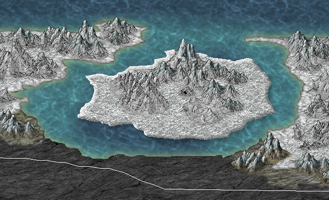
Does this island look like its floating to you? (It's meant to)
Does this island look like its floating to you? (It's meant to)
Comments
I have seen it both ways, but I prefer to have light water close to land and dark farther away.
That said, I have yet to find way of doing that for my maps that looks good to me.
As such, I have not done any shading for my water yet.
I love the overall feel of your map though - it looks nice. :-)
I would love to bathe in the glory of having made something beautiful without anyone else's help, but I couldn't really take any of the credit for the natural beauty of the Herwin Wielink style :-)
Excellent maps!
I am trying in vain, however, to get the dark sea to blend in like you have on your maps...using same bitmap. I can do such blending with land contours all day long, but, so far, how to do so with background sea + default dark sea is ignoring my efforts.
Can advise?
The method used to obtain the effect in this map is exactly the same as the one I used in my Errispa 3 map.
I uploaded an example file for that thread when a similar question was asked, so now instead of uploading the same one again I will go away for a few minutes and try to work out how to link from here to there.
http://forum.profantasy.com/?PostBackAction=Download&AttachmentID=5729
Once you have downloaded it and retrieved it from your download folder you will quickly see that all I have done is make use of the sea contours exported as part of an FT3 world export, changed the texture to sea, then adjusted the colour, hue, saturation of each layer (in some case pushing them to the extreme), then used huge inner fade borders to create smooth transitions. Between the layers.
The ellipse is an extra effect that has nothing to do with the ocean or the world, but just seems to make everything look better. You can move it around or make an entirely different shape. In my mind its like a flash across the ocean - a very unrealistic flash!
Hope that helps
EDIT: Don't forget to switch on the sheet effects, or all you will see is an entire ocean of one texture, as far as the eye can see
Cheers,
~Dogtag
I promise to read all the sticky posts again soon
And....so sorry for your loss
Don't feel bad Dogtag. I would have said the same if you were being such an idiot and I didn't know there was a reason.
Thanks for the thoughts, but please, no more. Thanks :-)
It has long been part of Errispan legend that when the forefathers arrived there 200 years ago from their present date and time, the villain who scattered the colonists fleet was killed in the crossing, but that his followers where cursed by the great god Rusaar for their crimes against humanity to live forever, and yet be unable to touch the ground of the world they would have as their own. For this reason, the guilty faction of the Zorrani were-hawk tribe (known as the Aeurin) are condemned to fly forever at the boundary of space in the northern extreme, where lies an island that floats... Being 'not of the land' it is the only place they may come down to rest, from time to time.
For many different reasons the expedition to find the missing vessels of the colonists fleet, and about whom the story is written, need to find the Aeurin if they really exist. That is why the floating island has to float, or it won't relate properly to the story I'm telling.
I'm not sure that it looks right. I haven't put any actual land underneath the floating island, and I have also given it a very slight shadow to make the water look darker. The result sn't quite what I wanted to achieve, because to me it now looks like it isn't really part of the map any more.
Any advice would be welcome
You are right. The island is bevelled, which was causing a distracting glint at the water level on the closest side in the full resolution image (you can't see it in the image above because that is only 10% the original size). To get rid of the glint I actually reduced the bevel, and surprisingly it looks quite a lot better than before. (Yes, I know! I was quite surprised myself). I think reducing the bevel has also brought it back more to the continental scale of the rest of the map. I must have been dreaming again - about beautiful three thousand foot cliffs of rainbow refracting ice to fly around between! lol.
There is a patch of deeper water under the island anyway. I'm thinking of getting rid of it so that its not so distracting, but I very much like the particular shade of blue it was obliging enough to shine for me... lol
I have also been fiddling with the shadow - what do you think? Better? Worse?
I know its not right. I think I might have to get rid of that beautiful blue patch, but I'm not going to do anything in haste when I like the colour so much.
Be back in a couple of hours when I've made a decision
What do you think?
Thanks for your help, all of you
Even if it isn't quite perfect just yet, it certainly looks about twice as good as it did to begin with
I will have another look at it once I've established the surrounding area in a more finished format, so I can judge just exactly how dark to make it in comparison :-)
The island already has a drop shadow - just not a very noticeable one.
Vintyri has suggested making it more opaque. I will perhaps also make it longer than it is, since the majority of the shade is currently expressed by the coincidental presence of a deep spot in the ocean.
- Since you are the waterfall queen, maybe a waterfall from the island into the sea would help understand it is floating?
- Another possibility would be a add a few clouds to the map, and have one of them be hidden bellow the island?
Right now, I see easily there is something special about the island, but I'm not sure that without you telling first, I would have understood that the "something special" is that it is floating...
I haven't done very much to it since the last image, but the shadow is now more opaque and noticeable - as suggested by Vintyri a couple of days ago.
I'm thinking that it is now definitely looking as if it's floating in the air... and was considering using ripple marks (a bit like a cartoon drawing of something wobbling) lol!
EDIT: Wobbling - as in, floating on the water