

My first map attempt

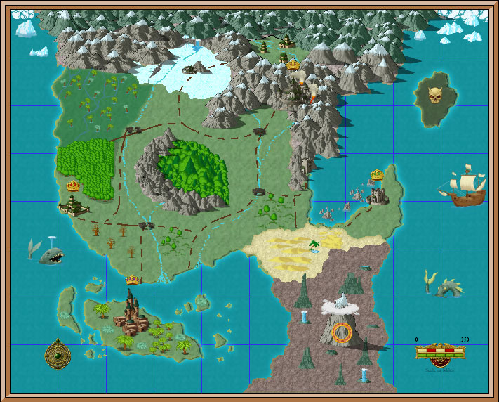
So, this is the map I made while learning the software. I feel decently proficient, and think that my next attempt won't take so long. One of the funniest moments for me was when I realized that I was "coloring" the mountains (and other symbols.) At first, I couldn't figure out why all my mountains were this peculiar gray color, but then I figured it out. I sort of like the effect it created, actually. My most frustrating moment was when I was trying to draw my continents and the lines I drew kept on "moving" towards a grid, which at first I thought was a flaw of the software. However, I manged to figure out it was actually a setting that was turned on (where indeed, the fractal land mass tool was locking on to a grid), but only after spending an hour of frustration trying to draw my landmasses in organic shapes. Looking back, I wish I had made the shadow lands in the south on a different layer then the desert, because their boundaries are ugly and I couldn't style them well. I have to say that Joseph's tutorials helped immensely, thank you.
Beyond the funny colored mountains, the exaggerated scale of some things and the lack of text, does anybody have any critiques or pointers for me? Also, two questions of my own. How do I make the roads more even dotted lines, and how reasonable are my geographical features? (realistic to complete unfettered fantasy.)
Beyond the funny colored mountains, the exaggerated scale of some things and the lack of text, does anybody have any critiques or pointers for me? Also, two questions of my own. How do I make the roads more even dotted lines, and how reasonable are my geographical features? (realistic to complete unfettered fantasy.)
Comments
Other than that, I see that you have no problem in making your map diverse by using alternating symbols and textures. That's what made this pop out at me. However, most maps have a set theme, and this, as it is, doesn't seem to really have one. It lacks consistency.
But for a first time, it's not bad. Keep up with the good work and continue to make maps. You can only get better at it!
As for the geographical features, two things stand out...
1) In the centre of the main landmass there is a mountain range with trees to the East. I may be wrong but this tells me the prevailing winds are from the West (The mountaind shield the ground to the East allowing it to remain damp and ecouraging growth). Nothing wrong there, but bear that sort of thing in mind if you want terrain to look "real".
2) I notice a swamp to the West of the main landmass. There is a river flowing along the Eastern edge. Swamps are usually lowlands, so perhaps the river would flow into it, perhaps feeding the damp ground?
I expect someone will give a differing view, but these are my thoughts on a good first attempt and the questions you asked.
Bonzer