Quick City Test [CD3 B Style]
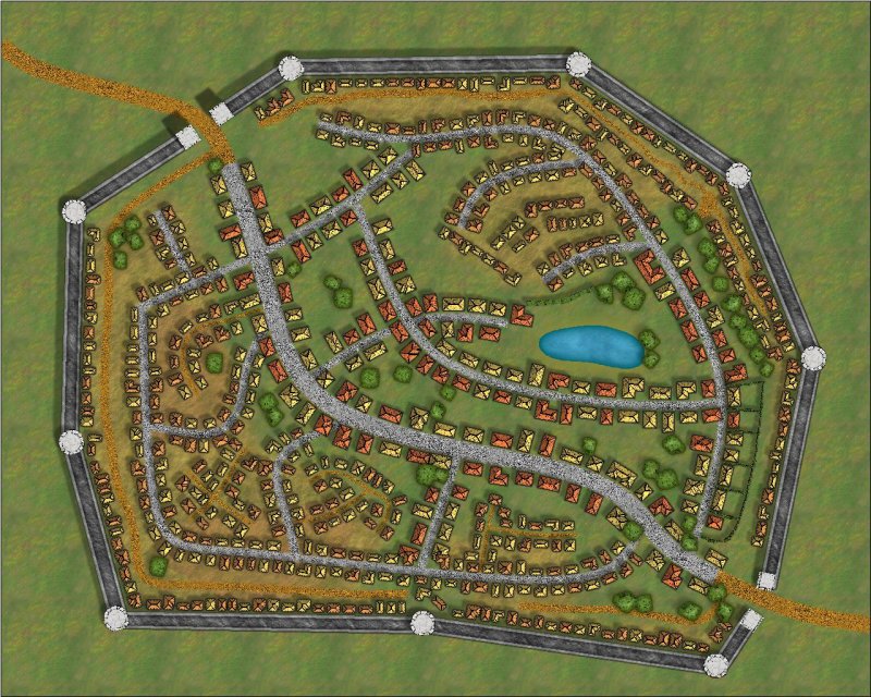
I thought I would try to make a [fairly] quick city in CC3+ to test the power and limitations of the "auto street" feature in CD3. Below is the result. I'd love to say I threw it together in just a few minutes, but it probably took me between one and two hours of tinkering, all told (I lost track of time). Still, that's pretty quick, even for a simple city/town. Keep in mind that I've never really made an actual city map, even though I've had City Designer since it came out. *sigh*
Anyway, I used CD3's Bitmap B style and two different auto street settings. The default setting gave me the larger, "nicer" buildings. Then I monkeyed with the settings to get smaller, closer, more squalid buildings. I tossed in a few trees, some shrubbery to wall out the undesirables, and a pond. Then, for kicks, I added a new sheet for a "slummy background" and threw some 50% transparent dirt around the poorer buildings.
For a "quick" test with no real design or ambition, I think it demonstrates how powerful CD3 really is. I mean, there's very little planning or talent on display here and CD3 still managed to make a map that's both usable and pretty good-looking, if not exactly art (Clercon, Ralf, and Gandwarf have no competition here). But for that very reason, I thought this was worth sharing, to show folks who may be holding off on using CD3 that they should just dig in! The results are pretty amazing, I think.
(Click for a higher resolution version)
 Cheers,
~Dogtag
Anyway, I used CD3's Bitmap B style and two different auto street settings. The default setting gave me the larger, "nicer" buildings. Then I monkeyed with the settings to get smaller, closer, more squalid buildings. I tossed in a few trees, some shrubbery to wall out the undesirables, and a pond. Then, for kicks, I added a new sheet for a "slummy background" and threw some 50% transparent dirt around the poorer buildings.
For a "quick" test with no real design or ambition, I think it demonstrates how powerful CD3 really is. I mean, there's very little planning or talent on display here and CD3 still managed to make a map that's both usable and pretty good-looking, if not exactly art (Clercon, Ralf, and Gandwarf have no competition here). But for that very reason, I thought this was worth sharing, to show folks who may be holding off on using CD3 that they should just dig in! The results are pretty amazing, I think.
(Click for a higher resolution version)
~Dogtag


Comments
I have not messed with City Designer yet - I am engrossed in my regional maps right now.
I will be looking for culturally "fit" buildings for mine since the "world" is very diverse.
I also need "fantasy" buildings that will fit well with my world.
I am really looking forward to exploring this great program.
Thanks for sharing Dogtag!