

wip: regional campaing map based on annual b/w template

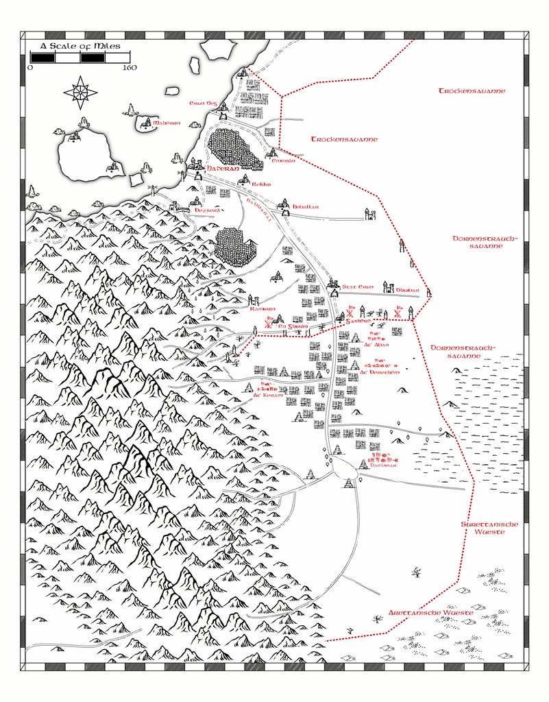
I am currently working on a regional overland map for our newly started fantasy campaing. The map shows two neighbouring countries, one based upon medieval Oultremere, the other on ancient Mesopotamia.
I used the annuals nice b/w template, but I am not really happy with the map as it is now.
I used the annuals nice b/w template, but I am not really happy with the map as it is now.
Comments
It looks good so far. Well done!
Regarding the mountians: The area is part of a mayor mountain range that crosses through large parts of the campaign world (similiar in range and altitude to the Andes, Rockies or the Himalayas) and I wanted it to show. So i used different symbol scales starting from the central peaks outwards. Maybe I should redo them as well.
I´ll redo the mountain ranges as soon as I find the time (only a few weeks to finish my PhD thesis...). Oh, and please ignore the strange name versions in the lower part. I do not have the cuneiform fonts on my laptop.
1. Make mistakes on the map..
This might seem a bit counter productive, but there is a reason for it.. a hand drawn map will never be 'perfect' even the best drawer makes mistakes and those mistakes add to the feel of something being real..
2. Less is some times more..
Not really an issue here, but something to keep in mind unless your doing a really really highly detailed map, less can often be far better then more.. It's taken me a lot to learn this but especially with older maps.. the information on those maps was gathered from existing maps or eye ball accounts.. so there are often wide area's that are missing etc..
3. Fractial/Wonkyness is your friend..
Another one that isn't always understandable with out seeing or trying it.. very very very few maps done by hand which is what I consider the B/W map to be btw.. are 'perfect' when it comes to lines etc.. not to mention nature itself very very rarely makes a 'perfect curve' with CC the fractual ability gives you a real easy way to get around this.. as you can quickly add 'jitter' as it's called in 3D to a line.. thus making it look like the hand had a faint 'shake' to it or that the river etc etc has small twists and turns.
------
I'm not picking on your map which btw as mentioned the last one is great I just figured I'd post those up where people could see them.. there talked about in other places.. the Tome etc..