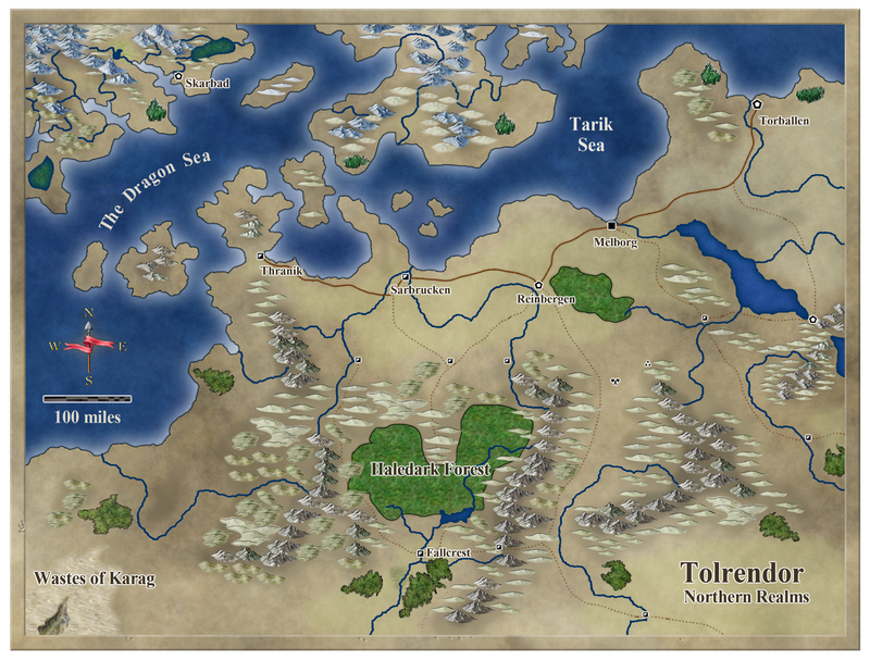
An April Annual Map
Here is a map I recently made using the April issue of the (always wonderful) Cartographer's Annual. So far I'm on track with my 'Challenge' - to create a map per month using the style or tools from each issue 
You can find a higher resolution and some more info here:
You can find a higher resolution and some more info here:


Comments
Nice website too, just borrowed the fey spiders!
If I were to make a suggestion, it would be to occasionally group (overlap) some hills into twos and threes. At first glance, some of the hills seem like clouds around the mountains, especially down the center chain. Taking a second look, I see the mountains don't really overlap either, though they seem to work better to me than the hills do. Another option might be to use fewer hill symbols and then stagger ones you use that way just a touch.
But, since your map is loads better than anything I've ever done, please consider the source.
Bravo on a real handsome map. And congrats on maintaining your challenge goal. That's a neat idea!
Cheers,
~Dogtag
Needs a bit more tweaking to ake it even better.