

Ashtas (Herwin Wielink)
 Modric
Traveler
Modric
Traveler
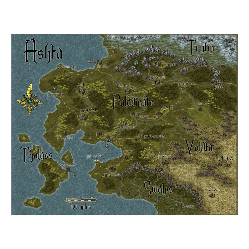
This is a redo of a map I did using the Fantasy Realms style (http://forum.profantasy.com/comments.php?DiscussionID=3277&page=1#Item_29) The new additions to the Weilink style really make a difference in the tone of the map. Feedback welcome. Thx!
Comments
Can i ask what font you used as it really is unusual.
And the same question as KenG, noticed the same. A river that just disappears. Maybe its gone underground?
JSM
The swamp around Swales looks wonderful ,
Your rivers look 10x better than in your original map, you could improve them
Between Pomsk and Velta there's no fading transition between grass and scrublands. (Change put either on a different sheet and it'll be fixed)
The river that streams past Thural goes from mountain to mountain?
And thanks for the lettertypes! I especially like the one you used for the cities.
The question about the river was asked before, too, by the way, in your Fantasy Realms-version post. Terraformer_Author posted an interesting discussion/defense of the rivers in that topic as well. It's a very interesting series of posts.
I feel I should add my voice to the chorus of praise for how you depicted the terrain. It flows nicely and your choice and layout of the symbols works hand-in-hand with the terrain to make the map look very organic. Great job!
~Dogtag