Country Map (Wielink Style)

After seeing some great Wielink style maps on here lately
I've tried to make one myself and I came up with this.


Image Hosted by PicturePush - Photo Sharing

Comments

  • Yeah I just really like this style. Your map looks very nice. I might only suggest shrinking a few of the titles just a little. To me they seem to overwhelm the map and draw my eye away from the map itself. But I am only one map into CC3 myself, so my advice is pretty rookie.
    JSM
  • Very good map! Looks very realistic to me
  • DogtagDogtag Moderator, Betatester Traveler
    edited November 2012
    Agreed! I really like the placement of the towns and cities. I agree with JSM about the titles, though. They seem a little overwhelming. I don't know if it's the size or the bright color or what, but they are a little distracting. Otherwise, I think it looks really nice!

    Well done.

    ~Dogtag
  • Maybe its the red text that makes it look so overwhelming?

    I'll try to change some things
  • Looks good. The text size could be that nation trying to grab attention away from others.
  • @JimP - Ha! That's reading a lot into a map LOL too darned funny.
  • Egos in the dark ages were rather large.
  • Very nice map.
    You may want to fractilize the rivers a bit, they run too straight for my taste.

    And the lettering, well, lets just say I can read it even without my glasses.
  • I'll post the full map when its finished this is actually only about 1/6th of the map
  • That's a great map, very attractive but also functional! Nice work. I see there's a town called Guildford....amusingly, I commute through Guildford every week on my way to London :-)

    auryx
  • Guildford is actually a capital city. :) I copied the name while looking on a map of England looking for city names.

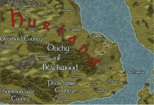
    A new version here, this is also the complete map and not just a small part of it.
    Notice there are a lot of names, because its an area of my worldmap with lots of small countries and City States (CS).
    (D) are Duchies and (C) are counties.

    It might be better to remove the roads and trade lines ?

    Image Hosted by PicturePush - Photo Sharing
  • Posted By: Henrie61Very nice map.
    You may want to fractilize the rivers a bit, they run too straight for my taste.

    And the lettering, well, lets just say I can read it even without my glasses.
    I actually redrew all the rivers, I hope they're better now.
  • Great Map! I actually really like all roads and trade-lines. If I were to make a suggestion, it would be to try to use slightly different colors for your different location types (i.e. white for City States, light blue for Duchies, light brown for Counties, etc.)...might help break it up a bit.
  • Yeah, I agree. All the white text is currently running together. You have a lot to label so you need to keep it from looking like paragraphs of information rather than labels. Still pretty darned nice though.
    JSM
  • Its a geat map. Would like to see it without all the names.
    I would leave the roads and trade lines, they add the feel to the map that its a well traveled part of the world.

    Rivers a better now.

    You could also consider doing the different City states, Duchies and counties in different vari colored symbols.
    Maybe on a different sheet. Would be a good way to show the borders between all the "powers".
  • I tried changing the colors but it basically lead to a big mess , so I tried a different approach by lowering the glow on some names. I think it looks a bit calmer now.

    Image Hosted by PicturePush - Photo Sharing


    Henrie61 : the version you requested without text, this takes 1min to make after all :)
    Image Hosted by PicturePush - Photo Sharing
  • Yeah I think the glow fix helped a lot.
  • 6 months later
  • Hey Moskva,

    its a very nice map - great mountain ranges, coastline and not too much/ less symbols.
    I just have one critical comment: the desert looks a little bit unrealistic to me.
    In reality you will find deserts below the 36st parallel after the subtropicals and shrublands and
    in a rain shadow. On your map you have a marsh an right after that comes a desert. Its just not realistic (from a geografical point of view).
    But dont get me wrong! Its a nice map all in all!
    Tilor
  • 11 days later
  • Posted By: TilorHey Moskva,

    its a very nice map - great mountain ranges, coastline and not too much/ less symbols.
    I just have one critical comment: the desert looks a little bit unrealistic to me.
    In reality you will find deserts below the 36st parallel after the subtropicals and shrublands and
    in a rain shadow. On your map you have a marsh an right after that comes a desert. Its just not realistic (from a geografical point of view).
    But dont get me wrong! Its a nice map all in all!
    Tilor
    Good point man, I adjusted this immediately in the worldmap which this is a part of.
Sign In or Register to comment.