

SS1A Fantasy style
 pdj
Traveler
pdj
Traveler
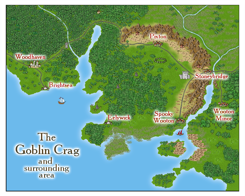
This is an attempt at making a Fantasy style map "out of the box", using only the drawtools, bitmaps etc
provided. The unlabelled items in the landscape are there as possible hooks for a childrens's story, adventure
game or whatever. What do you think?
provided. The unlabelled items in the landscape are there as possible hooks for a childrens's story, adventure
game or whatever. What do you think?
Comments
Congratulations.
Though I would put a little less glow on the fonts.
Cheers.
I take the point about the glow, HadranVI, and have toned it down bit
I think it looks much better than before.
I just saw two more things I would change. The waste or scrub beneath the sailing ship would look smoother with a slight edge fade, inner effect on it. If the effect doesn't work because the terrain is on the same sheet as the terrain around it, put it on a different sheet by using the "change properties" tool.
It would also be nice if there was a river at the end of the left fjord (the one on the right side of Brightsea). The river is not necessary because a fjord doesn't have to be like a valley which was created by a river, but I still think it would look nice.
~Dogtag
I agree with HadrianVI. An edge fade on the scrub to the south of the ship would look better. This is just a small quibble though. This is a beautiful map!
As symbols seem to be immune to edge fade, I tried mashing them up a bit with transparency and a muddy
glow. Whatever else this did, it at least made them look muddier
With regard to the blank blue ocean, that seems to part of the SS1A style. You may have noticed at the top of the thread that I was trying to create the map using the just the resources given - well,the SS1A style gives
you exactly 2 land contours and 0 sea contours to play with. There is a water bitmap fill (water with clouds
reflected in it) but it' looks really wierd by the ocean-full. So monochrome blue is what you get.
I know it seems perverse to take this approach, but it's been a sort of exercise in self-discipline to do it
this way. I had found myself constantly working around mapping difficulties by importing stuff, rather
than actually learning techniques to address them. Now I'm trying a similar project in the CD3B style....
Thanks again for taking the time to comment,
Peter
if your CC is immune to edge fade, you should try to de- and reinstall it. I had the same problem in the beginning. Then I reinstalled the program and the edge fade effect started to work