

Mahdran - A colossal world - Would you want to explore here?
 FarsightX3
Traveler
FarsightX3
Traveler
Hello all!
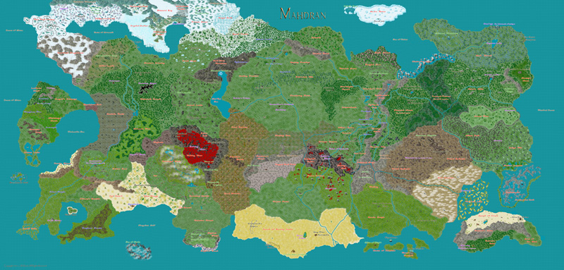
I know I have posted this map several times before. I keep on updating it with new symbols and new textures from the annuals. This map is my baby ha. I really need to work on others. But it's hard to not making this one better. I am sure some of you have seen it before and some have not.
This world map was designed for a MMORPG that I am designing. That's why each environment seems like it's "zoned" off. I hope I have established a realistic plus a fantasy feel. I hope it sparks imagination.
Here are the updated "zones' with the new Herwin Weilink's annual overland symbols and February's satellite textures...
Desolate Realm, Jacal Barrens, Swindler's Bluffs, Grimspire Crags, Hazemyst Glade, Weeping Fens, Orsa'ryn, Sea of Souls, Primal Badlands, Arid Dominion and the Fangkaun Swamp.
I hope these new symbols and textures make the world flow better and gives it a better feel. I will say that the Desolate Realm, Jacal Barrens and Hazemyst Glade texture is exactly how I envisioned it in my head.
Would you want to explore here? What are some intriguing places? I hope to hear some good feedback
Link to large version of the map
Moderator (Ralf): I attached a small version of the image and linked to the large file. That'll make things a little easier here on the forum.
Comments
That are SUGGETIONS to improve your work.
I would like to mention something I should of mentioned in the OP. That, this world map is compiled of 6 other small maps. I had to accommodate the world map with specific regions and zones that I had in the other maps.
Mateus you bring up a good point about the deserts. The only excuse I have is look at Northern Africa. And yes the continent is pretty rectangular, it was the only shape that would somewhat satisfy me to put all of the "zones" in. To be honest, as I am looking back now, I wish that I would of made the whole map more realistic. If I didn't have those other regions in mind then it would of been easier for me to do at the time. I am still willing to try to re-due this map. I know that there is way too much open land and not enough mountains to dictate other surrounding environments. Also when designing this map, I wasn't aware of correct river flow, so in the lore I gave it an excuse that rivers represent veins and that's why they flow like that. Good point about the Scoria Tropics, that was a filler area at the time when I made it. I have no idea how to explain that without the use of magic of some sort.
Jonasgreenfeather, when I initially started to work on it, I spent 30 hours straight because I had an idea in my head and I thought that if I went to bed I would forget it. Over time when the first version of the map was finished, I don't know how many hours I spent renaming stuff, or editing areas with new symbols or textures.
Also that my map is a balance of realism and fantasy. It's designed for an mmorpg game I am designing. That's why different areas have their own theme and seem "zoned" off. I wanted to try to be as unique as possible for each area.
Zoom into a region and make a map of just that region, add symbols.
I wouldn't take these "criticisms" too seriously if I were you. If your map is intended to portray a lot
of different environments, and that's what it does, there's no ground for complaint is there? And as for
clustered (or was it maybe cluttered?) why not just think "richly textured" - it means the same thing.
I can't comment on the gaming aspects of your map 'cos I don't play any of those sort of games, but
visually I think its got a lot going for it. The smaller version at first sight reminded me instantly of
a one of those big bright patchwork quilts the Americans do so well, really fun and lively and happy.
In the huge version I found the style fascinating. The way you use huge numbers of discrete symbols rather
than fills gives the whole thing a rather surreal, impressionist look (I think "pointillist" is what its called)
that I like a lot. But taste is a very individual thing, and you can only by guided by your own.
p
My point being, anyone who tries to judge this map with the real world in mind, will always find lots of stuff to complain about in this map (Same goes for your demi-plane map). However, since your map is basically divided into in-game zones, where each zone is basically a separate terrain type, I think this map does a good job of illustrating that. If you present this map to a player of the game, I also believe they will react far more positive to it than a more experienced cartographer (Term used lightly here).
Just as with your other map, I think this is actually a nice map, once one focus more on the actual purpose of this map rather than compare it with real-world features.
You depict your zones by filling the areas pretty much completely with the same kind of symbols. That makes them look a little "cluttered" and uniform. Try not cover everything with symbols quite so much and vary the density of the symbols, even within one area - in other words, try to "paint" a landscape with the symbols, even within one of your geographical areas. You've done this to some extent, but some areas look better than others, e.g. the Slatenox Mire is quite nice, but the Jacal Barrens look very crowded.
Also, I would not use symbols from different styles within the same map (except for the occasional exception). They do tend to clash.
Add some sea contours - that always makes an otherwise boring sea look more interesting.
Use more sheet effects. Glows on rivers and coasts, Inner Edge Fades on terrain types.
Avoid multiple instances of certain symbols close to each other. The cloud-ringed mountain peak is an example. It is just to unique to look good in clusters.
Jim P, that is good idea for scaling. However, that wouldn't work with the intention of the map. I wanted to show each "zone".
pdj, thanks for the comments, but I am not much of an artist heh. I am glad you found it impressive and I will try not to take those comments to seriously because they don't understand the intent behind the map. I like how say it's "richly textured", that's exactly what I say too! lol
Metaus, yeah it's more laid back over here and respectful. I really appreciate that.
Monsen, yes being clustered is the main feature of the map. And I believe you have told me the same before. Thanks for saying it again. I am glad you like the map. Perhaps I was looking for the wrong kind of feedback in the wrong area.
Ralf, that is excellent advice. I am currently in the process of doing some of that now. I can see how the Jacal Barrens is massively over populated with symbols. I believe the new texture there has something to do with it. I will fix that issue there. Also for the type of map I am designing I am not that clever to use some of the symbols from the same catalog to make different types of themed environments. Unfortunately, I have to clash symbols within the same map. I am trying to edit that now and try to make it flow better even with different symbols from different styles.
I will try using the contours. I believe when I first started working with this map my sheets where messed up. I know that the Shir'ral sea is using the lake texture, not sure how to use contours for that. Also for sheet effects, i have tried that but I can never render it because of the colossal size of the world and the massive amount of symbols used. I am not sure if that's CC3 or my computer.
Thanks again everyone I will use these comments to better my self and try to make a better map!
I cleaned up Jacal Barrens, made the Windrunner Peaks less congested, added new elevation symbols from Herwin's set, changed the Mastodon Nook to the Bleak Mirage, Put a cloud effect on the Eternal Blizzard, a new texture for the Skylands, renamed the Boon Mirage to the Parching Blooms, the Desert of Burning sands is redone and looks a bit more realistic with vegetation by water and mountains between the jungle and desert.
So below is the new map with some new edits...
Link to large version of the map