

Show and Tell: Naturns City Map

Long time, no see.
Its been tough not being able time-wise to create maps, which I have enjoyed since I bought the first Campaign Cartographer about 18 years ago (wow, is it that long time ago?). I am still having a look here and then in the forums and on the list, and I subscribe to the annual, just to see and follow the great development CC has taken. Every month I picture myself creating a map with the new style and even if life is more busy than ever with kids and career, now was the time to create a new map, after over a year of absence from the .exe file.
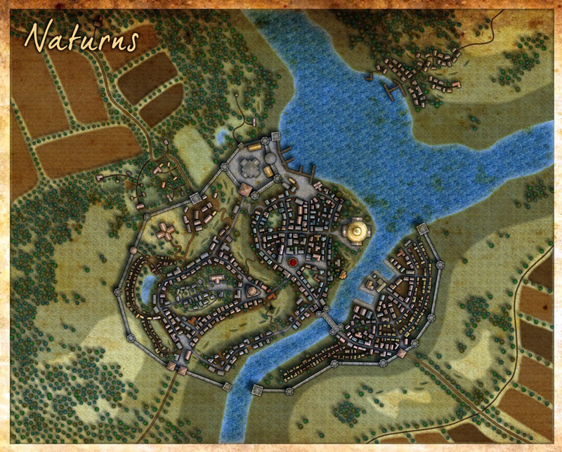
The image is still a draft and I threw in a quick and dirty "age-something" filter on the ipad to cover for the undone areas") There is still some work to be done on the contours, cartouches and on detailing and text, but since I hadn't got time the last week either, I thought I'll throw it in as a show and tell. The maps shows Naturns in Earlsdale, my homebrew gaming world for the same 18 years as my CC-history. The world can be seen here in this interactive map, I created some time ago (sorry, not in CC - but I got 3-4 versions ranging from CC1 to CC3 of the world as well): http://mapventures.com/int/
There is still some work to be done on the contours, cartouches and on detailing and text, but since I hadn't got time the last week either, I thought I'll throw it in as a show and tell. The maps shows Naturns in Earlsdale, my homebrew gaming world for the same 18 years as my CC-history. The world can be seen here in this interactive map, I created some time ago (sorry, not in CC - but I got 3-4 versions ranging from CC1 to CC3 of the world as well): http://mapventures.com/int/
The City map is done in this year annual Jonathan Robers style:
Enjoy and let me hear what you think?
Its been tough not being able time-wise to create maps, which I have enjoyed since I bought the first Campaign Cartographer about 18 years ago (wow, is it that long time ago?). I am still having a look here and then in the forums and on the list, and I subscribe to the annual, just to see and follow the great development CC has taken. Every month I picture myself creating a map with the new style and even if life is more busy than ever with kids and career, now was the time to create a new map, after over a year of absence from the .exe file.
The image is still a draft and I threw in a quick and dirty "age-something" filter on the ipad to cover for the undone areas
The City map is done in this year annual Jonathan Robers style:
Enjoy and let me hear what you think?
Comments
How long did it take your computer to put in all the shade under the trees, if you don't mind me asking?
Gorgeous map, though. I like the switchbacks in the roads showing climbs in elevation.
Nick
Secondly - this map is not only georgiously beautiful, but actually looks like an antique, classic work of cartographic art. I've looked at about four million maps from now - to dating way back to before the Pharoahs (at least it seems that way - unfortunately I've misplaced my disk of public domain ancient maps, but I can always get more) - and I can pretty much tell you that you've got a nice example here of a map that looks like it was made in, at the earliest, the late 16th century - but more accurately around the mid to late 18th century because of it's clarity and attention to detail. A rather nice compromise if you want to combine an antique, medieval flavor with a more contemporary functionality. Me likes it!
Examples of real antique maps for comparitive, critical, and / or analytical purposes (your map actually looks a lot better than these maps do - in my opinion):
What's the story behind the open area that loops through the middle of the city? At first I thought it was where a city wall used to be, but then I couldn't figure out what it would have been protecting.
Steve
What size is the map.
And on what scale are the houses?
It is maps like this that push me to keep working at improving. Thanks so much for sharing!