Daelund Remake

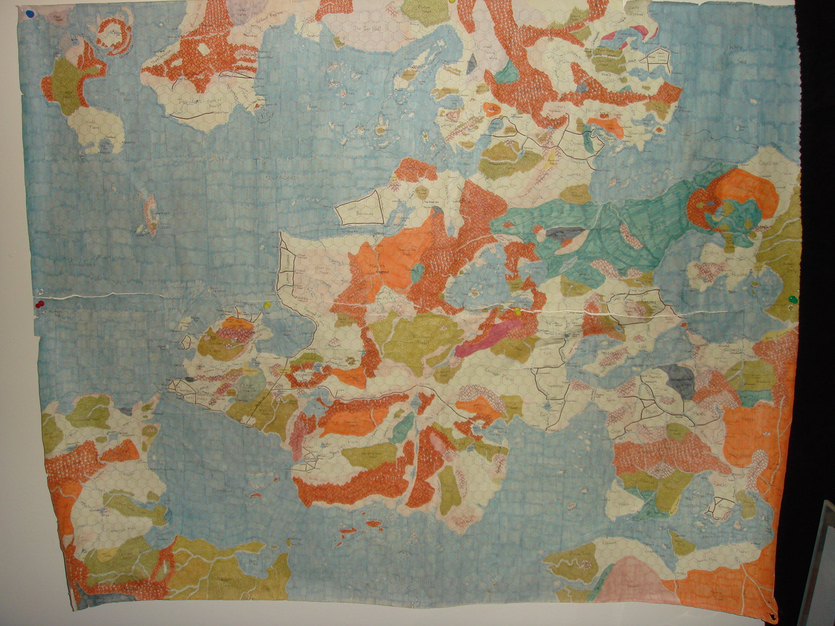
I have been running my game on this map for more than 20 years, but there has always been a problem with it. When I first started the campaign world, I was on a university campus with a consortium of DMs that wanted a "one-world" idea, where each DM had a part of the world and players could move between them, and thus, between DMs. Back in the day, software like this was unaffordable, but paper and colored pens were not. I collected DM maps and put them together into a world that worked. Unfortunately, two things happened. First, the idea of the "one-world" disintegrated when DMs moved on and the areas they ran were no longer being served, and second, most of the DMs didn't submit a map and I created about 75% of the world myself, so that future DMs would have an area they could use (which never panned out, should have known). Anyhow, since most of this world was mine, and the parts made by other DMs were rarely, if ever, visited by my players, it became my campaign world. I fleshed it out, I added notes and drew in sketches of new coastlines, including modifying other DM areas that were not to my liking. It's a mess, so I got CC3 and knew it was high time to correct the map. This is a visual journal of that journey.

Here is the paper and pen map I created some 20 plus years ago.

Comments

  • edited December 2011
    As you can see, there are a number of things I did that I regret. Not enough forestry (hand drawing that was a pain, and I tended to say "that's enough" alot). The mountains, hills, and rugged landscapes are not well developed (again, repeated use of the pen to draw multiple things go tiresome). So, I started with the upper left corner of the map, which was a nice island made by another DM, but I hated the "beholder isle", which I removed.
  • edited December 2011
    Post deleted, redundant.
  • I love your old map. I did a much similar thing with "add ons" to the edges of the Grayhawk map...continuing in much the same style with color pencils as you did.

    Ahhh the memories.

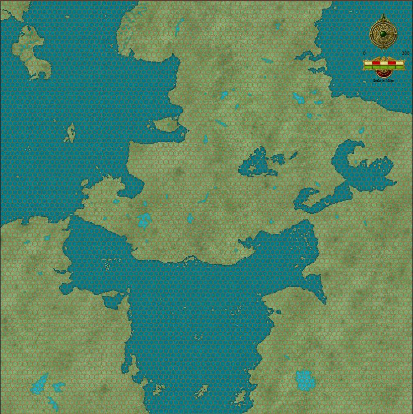
    I like the new map, but as I found when I converted to Campaign Cartographer (I, then II, and finally III) I had to be careful not to make the mountains and forests too "symbol dense" if you will.

    Your green mountains/hills look nice (IMHO) but the brown mountains seems too clusters up.

    Just a thought.


    Chris
  • I love seeing people's hand drawn maps!
  • I may make a backup map and try not making the symbols as dense. I like the dense symbols myself, but I don't like the draw time it spends on just this one small section of the map. So I'm going to take a 2nd swing at this area with less density and more of the symbol size of the hand drawn stuff. I've also toyed with the idea of making my own symbol set too, so I may try that as well. Maybe.
  • How's this by comparison? I'm probably going to do the same for my glaciers, I haven't been sure about them for a while. And I'm still not sure about how I'd like to do my mountains yet, but the forest is coming out much, much more to my liking.
  • Very nice. Much better with less dense mountain symbols. You could probably even take the symbol size down to about 75-80% of the size you are using now too by selecting all the mountains you've placed and using Scale. That way they won't be right on top of the coast line.
  • I intended them to be right on top of the coastlines in this case. It is a very rugged northern area with few access points along the jagged coast. I'm pretty satisfied with it for now. Moving on to the next challenge.
  • 8 days later
  • I prefer the larger symbols - I agree with jaerdaph though on taking them off the edge slightly - it looks slightly strange to have your mountains cast shadows onto the ocean the way they do (at least to me). I like how the larger symbols allow you to maintain a dense appearance without seeing the same 3 or 4 symbols dozens and dozens of times.

    All in all though I really like the direction the map is going and I think you're doing an excellent job capturing the essential parts of your hand drawn map (which, please let me say, looks REALLY good!).

    Cheers!
  • edited December 2011
    The shadows aren't bothering me, they drop where they drop. It's a non-issue for myself. Thank you for the compliment on the hand drawn map, I'd keep it around if it didn't get the wear and tear over time. It's just much easier to maintain and make changes to a digital map.
  • edited December 2011
    Here is the next stage of the map, the smallish island to the left center.
  • edited December 2011
    Another section of the map, with the area just to the west completely removed while this area is expanded a bit. Shows the western parts of the northern glaciers.
  • 12 days later
  • I dig it! What a great project. Can't wait to see the final product!

    -E
  • RalfRalf Administrator, ProFantasy 🖼️ 18 images Mapmaker
    I like how the glacier came out, good work!
  • Thanks guys! I've done a few tweaks, including improving the glacier aesthetic look. I removed alot of the backwards facing walls. Tweaking is about it though, as I have been sick through the holidays (yay!). I will get back to work on this today, feeling pretty good for the first time in a few weeks.
  • 27 days later
  • Ah, my time has not been as available as I'd thought. Still haven't been able to do alot of work on this project. And I'm beginning to think that my symbol set is inadequate for what I need. After seeing such excellent maps popping up here and there, I have a feeling I'm missing out on some techniques, and that I'm going to have to buy the annuals to get a foot up. When I have the money.

    Anyways, for the moment, I'm still going to try to finish this project as I have been doing it. Just not sure how I'm going to do my swamps (I have two kinds), grasslands, or wastelands. I guess I'll just get it done and worry about the details afterwards.
  • 2 months later
  • edited April 2012
    Ok, I'm back at it. Been a hiatus as I've been getting other things done, but I really need to get this map done. This section of map is just to the right of the last section of map above, with some expansion east-west and additional details added. I've expanded some of the glacial areas, and added a bit of aesthetic texture, though I'm not entirely sold on it yet, I may lighten it up a bit more.
  • edited April 2012
    This area is just to the east of the area shown above, the eastern coastal area in the upper part of the original map. Put in a lot of changes here by expanding the forests. Not sure about the mires I have there, sort of mud flats, not quite right, but good place-holders for now. Notice the fjords along the coast.
  • This is sweet! I can imagine how much work it is to try to convert / remap this. Actually the fun is gonna come with labelling this map. Abstract Fonts is a good site for finding fonts because they give you the licensing info on them - and the downloads have all of the documentation included.

    http://www.abstractfonts.com/

    I like what you've done here.
  • 1 month later
  • Looks like it's coming along great! I can't wait to see the HUGE map you come up with! :D
  • jaerdaphjaerdaph Traveler
    Yes, this is coming along very nicely!
Sign In or Register to comment.