

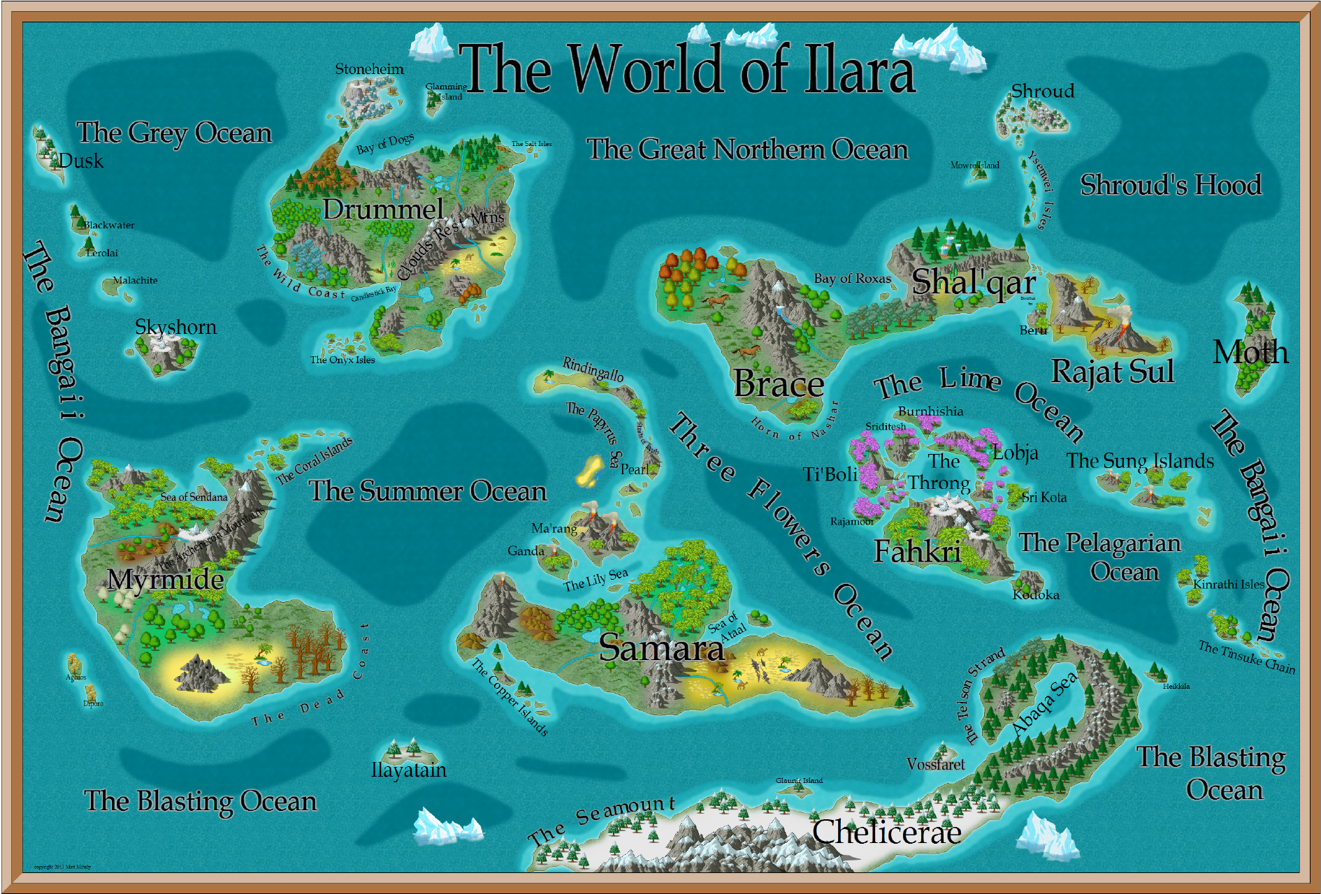
First Map - Please Criticize!

This is the first map I've made and I'd love some feedback on how to make it look nicer. Please ignore the fact that some of the labels are too small to read. Normally I'd turn those labels off when rendering to this resolution (the original is considerably larger).
Any feedback is appreciated. Thanks!
Any feedback is appreciated. Thanks!
Comments
- Make the text labels generally smaller. They very much dominate the map at the moment. This will also solve some of the characters running into each other in the curved sea labels like "The Lime Ocean".
- You have a Blur effect the Sea contours, right? I'd replace that with an Edge Fade Inner, since Blurs on bitmap fills rarely look good.
- Change the Forest background from that green to a partially transparent bitmap fill ("Solid 50 Bitmap" for example). The green is too bright and garish.
Keep up the good work!