

Introduction and a Map

Hello!
I have been lurking on the Profantasy and Cartographer's Guild forums for some time now but before I introduced myself I wanted to have a finished product to show as well.
I have had a lifelong interest in maps because for me they are a gateway for the imagination. Who lives over there? What secrets does that land hold? What kind of creatures live there? Until recently I have not had the time to turn cartography into a hobby but now that I do I am finding that I am spending just as much time researching why things are they way they are as I do actually making maps.
For example the how's, why's and where's of: deserts, rivers and lakes, the effect of mountains, political boudaries, systems of government, natural resources and their management, roads and transportation based on technology level, vegatation, farming practices, trade good production and trade patterns, weather patterns and the tradewinds, tilt and size of the earth and how that plays into the seasons and day / night cycle, effects on topography of an ice age, plate tectonics, etc. A dedicated cartographer wears so many 'hats' it can be quite overwhelming for a beginner. I am however enjoying myself so I do not mind.
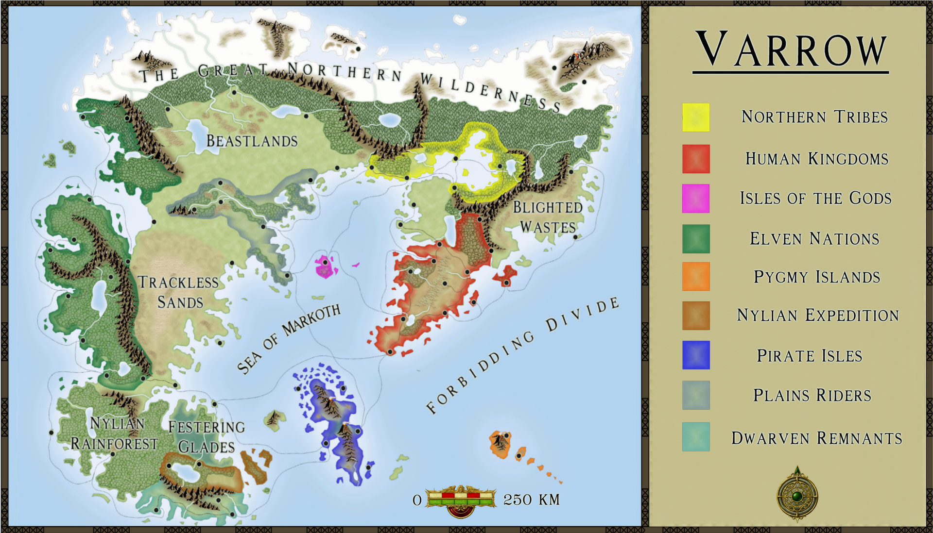
The attached map was created using the Fantasy Worlds annual for CC3 along with a few elements produced in GIMP, although those were very minor and could have been overcome with better planning. This is my first map and I do not mind the look of it but most of the credit belongs to the authors of CC and especially the author of the Fantasy Worlds overland style because without them I would not have been able to produce something like this. The process was surprisingly well automated and it just took some coaxing on my part to get it to do what I wanted it to.
That being said, I am not entirely satisfied with finished product but I am willing to consider it finished so I can move on to my next challenge. I had some problems getting the map to scale properly when I brought it back into CC3 as a bitmap after I modified it with GIMP and as a result it is 'squished' by about 10% horizontally. This is a result of my desire to have the border / sidebar but this came late in the production of the map. Better planning in the beginning would easily have saved me the extra legwork, although now I am much more familiar with GIMP.
Glaring problems that I will have to overcome in future will be to get a better eye for scale and how to get a higher level of detail (looking at you coastlines!) on larger maps. The continent was to be about the size of North America with multiple kingdoms around 18th - 19th century level of technology. Now that I have a globe sitting beside me I realize that my design is way off from what I was looking for. I should have been thinking more along the scale of Europe. We really do take our modern living for granted in terms of ease and speed of transportation which greater distorts how we conceptualize distance. All of Germany would fit nearly twice over in the province I live in, in Canada. My future maps will have an eye to the past and what distance would have meant to people.
As for the map itself I am not entirely satisfied with the transition between forested areas and the more empty areas. The rivers and lakes need some work. Some experimenting with tapering for the rivers would help. The text on the sidebar isn't aligned as evenly as I would have liked but thats what you get when you try to eyeball it. Some extra work on the border and cartouches might make the map more appealing to the eyes as well. The transition from CC3 to GIMP and back to CC3 did the overall clarity of the map no favors either. (I just noticed that that process seems to have clipped off the top of the top border as well. Lessons learned.)
Any criticisms are welcome and appreciated, whether they be technical in nature or geographic.
A special thanks to Medio who graciously shared with me the snowy mountians and volcanoes they made for the Fantasy Worlds annual!
TLDR: Hi! Here is my first map!
Also, I am not familiar at all with posting pictures to forums otherwise I would have gladly thumbnailed the map. Any pointers would be greatly appreciated.
I have been lurking on the Profantasy and Cartographer's Guild forums for some time now but before I introduced myself I wanted to have a finished product to show as well.
I have had a lifelong interest in maps because for me they are a gateway for the imagination. Who lives over there? What secrets does that land hold? What kind of creatures live there? Until recently I have not had the time to turn cartography into a hobby but now that I do I am finding that I am spending just as much time researching why things are they way they are as I do actually making maps.
For example the how's, why's and where's of: deserts, rivers and lakes, the effect of mountains, political boudaries, systems of government, natural resources and their management, roads and transportation based on technology level, vegatation, farming practices, trade good production and trade patterns, weather patterns and the tradewinds, tilt and size of the earth and how that plays into the seasons and day / night cycle, effects on topography of an ice age, plate tectonics, etc. A dedicated cartographer wears so many 'hats' it can be quite overwhelming for a beginner. I am however enjoying myself so I do not mind.
The attached map was created using the Fantasy Worlds annual for CC3 along with a few elements produced in GIMP, although those were very minor and could have been overcome with better planning. This is my first map and I do not mind the look of it but most of the credit belongs to the authors of CC and especially the author of the Fantasy Worlds overland style because without them I would not have been able to produce something like this. The process was surprisingly well automated and it just took some coaxing on my part to get it to do what I wanted it to.
That being said, I am not entirely satisfied with finished product but I am willing to consider it finished so I can move on to my next challenge. I had some problems getting the map to scale properly when I brought it back into CC3 as a bitmap after I modified it with GIMP and as a result it is 'squished' by about 10% horizontally. This is a result of my desire to have the border / sidebar but this came late in the production of the map. Better planning in the beginning would easily have saved me the extra legwork, although now I am much more familiar with GIMP.
Glaring problems that I will have to overcome in future will be to get a better eye for scale and how to get a higher level of detail (looking at you coastlines!) on larger maps. The continent was to be about the size of North America with multiple kingdoms around 18th - 19th century level of technology. Now that I have a globe sitting beside me I realize that my design is way off from what I was looking for. I should have been thinking more along the scale of Europe. We really do take our modern living for granted in terms of ease and speed of transportation which greater distorts how we conceptualize distance. All of Germany would fit nearly twice over in the province I live in, in Canada. My future maps will have an eye to the past and what distance would have meant to people.
As for the map itself I am not entirely satisfied with the transition between forested areas and the more empty areas. The rivers and lakes need some work. Some experimenting with tapering for the rivers would help. The text on the sidebar isn't aligned as evenly as I would have liked but thats what you get when you try to eyeball it. Some extra work on the border and cartouches might make the map more appealing to the eyes as well. The transition from CC3 to GIMP and back to CC3 did the overall clarity of the map no favors either. (I just noticed that that process seems to have clipped off the top of the top border as well. Lessons learned.)
Any criticisms are welcome and appreciated, whether they be technical in nature or geographic.
A special thanks to Medio who graciously shared with me the snowy mountians and volcanoes they made for the Fantasy Worlds annual!
TLDR: Hi! Here is my first map!
Also, I am not familiar at all with posting pictures to forums otherwise I would have gladly thumbnailed the map. Any pointers would be greatly appreciated.
Comments
For the forest to grassland transition, you might want to try to replace the glow that's on the forest sheet with an inner edge fade effect. Perhaps that is more to your liking.
As a suggestion I would perhaps make the labels a bit smaller. They look fairly large in this version. Especially the "Sea of Markoth" label looks cramped and would benefit from being more stretched out or having smaller letters. The font is very legible and can stand quite a bit of size reduction.
I would also make the sea routes straighter. There is no reason for a ship to "wobble" it's path on the open sea.
Although i like most of the map, i´d avice you on these things:
-Polish the small islands. They look way too poligonish. There are many ways of doing them, i either smooth them, or fractalize them to death!
-The Festering Glades look is a bit ...odd. I´d polish it a bit, specially if you want to show there are marshes there. I think there is a swamp forest in the CA28, although i´m not sure right now. It would stick better in the surroundings. I even put some forest in there, with a high grade of transparence. It gives a great look.
-Go for some compass or more art in the map. Specially the ones with strong colours, it shows fantastic on a smooth colours map as this is.
It´s a very good work, hard not to love the Fantasy Worlds Annual
Only thing I would be keen to adjust would be the scale of your political legend. Good information, but I think it could be made to take up less of my attention when viewing it in one breath.
Lastly, I would rather see some other sort of clip art replace the compass, and move the compass to the map somewhere. But no biggy, really.