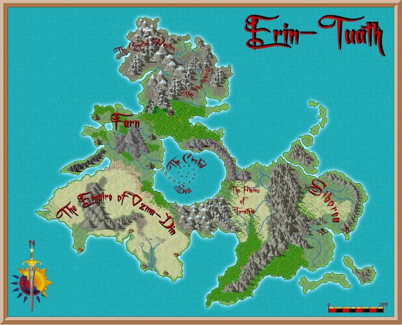
First Map - Comments welcome
Hello All
This is my first post here having just bought CC3 and I thought I would post up my first attempt.
It was a really steep learning curve and I think I have learned how to do things better second time round, but I would appreciate any comments or suggestions you have on this my first map.
Thanks
This is my first post here having just bought CC3 and I thought I would post up my first attempt.
It was a really steep learning curve and I think I have learned how to do things better second time round, but I would appreciate any comments or suggestions you have on this my first map.
Thanks


Comments
The rivers running into the central sea that are essentially next to the outflow at the north look unusual, but not impossible given the mountain range. But clearly there is something unnatural going on in there as evidenced by the spiral islands.
I think you should do something to make the labels pop a little. Perhaps a slight glow to lighten the area behind them. Very, very nice map
Steve
Some improvement could be made to the mountain ranges. For example, in the North there are some superpositions problem with the biggest symbols. Moreover, I would rework a little the arched range in the far east. It looks way too regular and "thin".
For cities/villages... perhaps it will be good if they had names too, or use two different symbols (dot/square for nameless villages and symbol for larger cities who get a name). For this last point you will easily find a better solution than mine ;-), but I just wanted to point out that village or city symbol without a name looks "strange".
Anyway, nice map!!
The labels I did in Gimp, but will try them in inkscape to make them stand out more
The mountains I found really difficult and I ended up using the automatic tool in symbols menu - not too sure how to do this any better, after doing the automatic symbols, trying to fiddle them into a different order manually was difficult.
The problem I found with the city symbols was the sheer size of them so good point about just using a dot rather than an icon. Can't for the life of me remember why I didn't name the cities :-)
The Eastern range *does* look regular doesn't it - Thanks! I knew I didn't like it, but couldn't see what it was that was wrong - I will definitely change that!
Thankyou all for the comments
Sometimes you hit a situation where A needs to be in front of B, which needs to be in front of C, which needs to be in front of A. In that case you either i) live with it, ii) draw in a little redundent piece to cover the collation problem, or iii) explode one of the symbols and arrange it manually.
Steve