

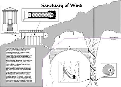
Sanctuary of wind
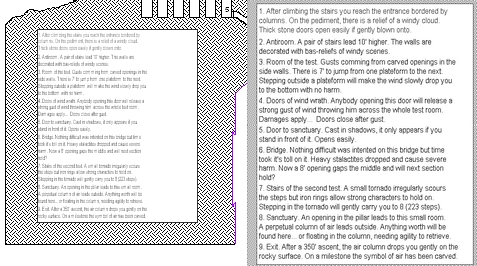
 Joachim de Ravenbel
Surveyor
Joachim de Ravenbel
Surveyor
Here is another elevation/cross-section work.
I wanted to show (off) the great pillar and the bridge in elevation but the rest in cross-section.
Is it undestandable ? (click pic to enlarge)
I also noticed diffrences on the text display that changes with the zoom level.
On the pic below, the right display is on zoom extents while the left one is zoomed on the text.
Sometimes exports to jpeg/bmp is again different from both views...
Is it a known bug?
I wanted to show (off) the great pillar and the bridge in elevation but the rest in cross-section.
Is it undestandable ? (click pic to enlarge)

I also noticed diffrences on the text display that changes with the zoom level.
On the pic below, the right display is on zoom extents while the left one is zoomed on the text.
Sometimes exports to jpeg/bmp is again different from both views...
Is it a known bug?
Comments
The design is fantasy, but looks inspired by a real temple?
Well, the design is fantasy though inspired by greek temples for the outside part.
The platform part was somehow inspired by a Tomb Raider episode but with a twist (in the game, stepping out of the platforms is fatal). Characters unfaithful in the wind power would try to jump from platform to platform in order to reach the far door. The solution is to simply let the wind carry you to the bottom as is also the case with the great pillar...
Of course, the bridge was inspired by the Lord of the Rings movie Moria part.
The great pillar part is pure JdR work because I love to render stairs in elevation/x-section...
To fix this, either use vector fonts (Unfortunately, not many good-looking fonts in that department), or use explode text (TEXPLODEMP) on the text, to convert the text to a vector object (You can't edit the text afterwards if you do this, and it might become slighly more jagged around the edges) which will make it behave as a proper CC3 object.
Great work on the drawing though. Really nice.
Could you please be more precise on vector fonts? What are their type and extension?
I have that crazy idea of doing my own fonts...