

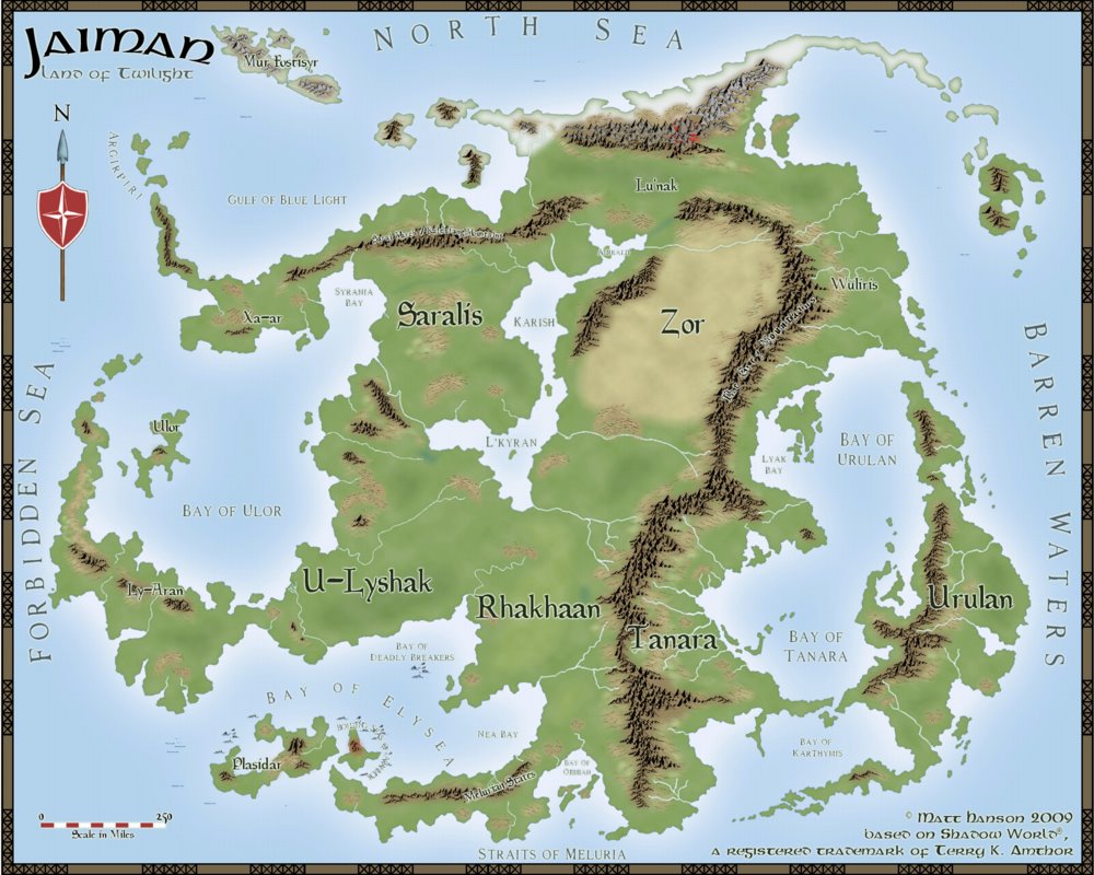
Map of Jaiman

Hello all,
This is my first mapping project (after having CC3 for a few years) and am working on some maps for Shadow World, a fantasy world originally published by Iron Crown Enterprises. I'm working on a players guide for that world which will be published later this year by The Guild Companion, and probably followed up by a Gazateer/Atlas containing many more GM maps. I've first tackled the continent of Jaiman and started by recreating the continent from several existing maps.
I decided to go with the Fantasy Worlds style from the Annual 28. I've posted some work at the Cartographers Guild, as well as at the ICE forums and the most common criticism has been of the forests which always bothered me as well. Some people felt as if the forest symbols didn't fit in with the rest of the map, while my concern was more that at the continent scale, and especially at these latitudes of 45-70, there wouldn't just be discrete forest regions scattered about. Rather, the entire continent would be nearly all covered in forests. The forest would be the default land background while the Fantasy Worlds style with it's lighter green landmass and forest symbols assumes more of a grassland as the default land background. (forget the issue of deforestation, which I have recently come to realize was a serious problem in medieval cultures).
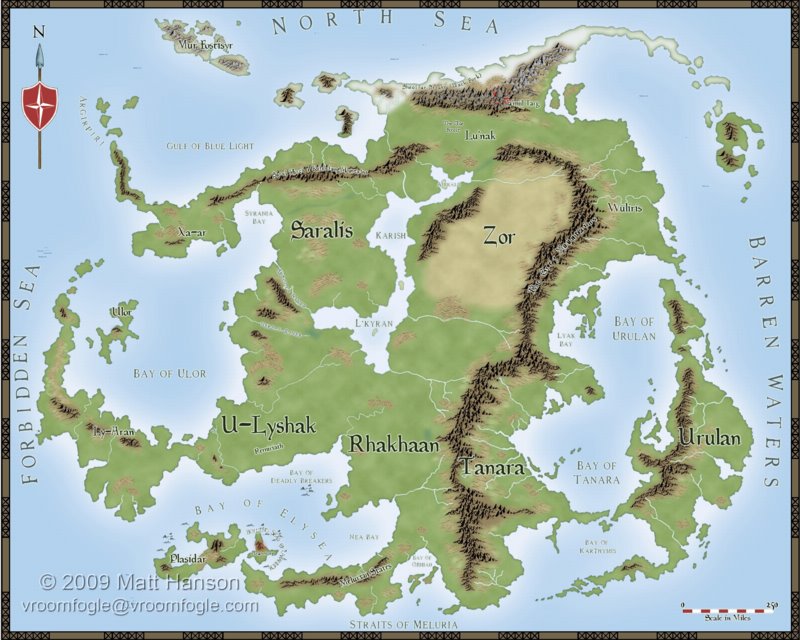
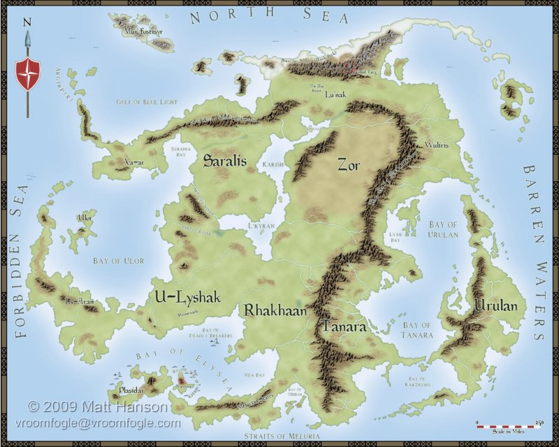
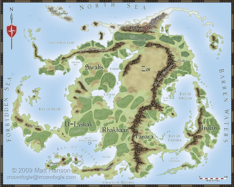
I've got three maps. The first is the with the original forests shown. The second is without the forests, but since the land is rather light I darkened it up a bit to illustrate continuous forest across the continent. The third is the standard FW background color without forests. I prefer the darker land but I'll probably go in and add some grasslands in the south using the original FW bitmap fill for land (CA28 Grass).
Any comments or suggestions? Which one do you prefer?
This is my first mapping project (after having CC3 for a few years) and am working on some maps for Shadow World, a fantasy world originally published by Iron Crown Enterprises. I'm working on a players guide for that world which will be published later this year by The Guild Companion, and probably followed up by a Gazateer/Atlas containing many more GM maps. I've first tackled the continent of Jaiman and started by recreating the continent from several existing maps.
I decided to go with the Fantasy Worlds style from the Annual 28. I've posted some work at the Cartographers Guild, as well as at the ICE forums and the most common criticism has been of the forests which always bothered me as well. Some people felt as if the forest symbols didn't fit in with the rest of the map, while my concern was more that at the continent scale, and especially at these latitudes of 45-70, there wouldn't just be discrete forest regions scattered about. Rather, the entire continent would be nearly all covered in forests. The forest would be the default land background while the Fantasy Worlds style with it's lighter green landmass and forest symbols assumes more of a grassland as the default land background. (forget the issue of deforestation, which I have recently come to realize was a serious problem in medieval cultures).
I've got three maps. The first is the with the original forests shown. The second is without the forests, but since the land is rather light I darkened it up a bit to illustrate continuous forest across the continent. The third is the standard FW background color without forests. I prefer the darker land but I'll probably go in and add some grasslands in the south using the original FW bitmap fill for land (CA28 Grass).
Any comments or suggestions? Which one do you prefer?
Comments
Ah... Jaiman. Great setting. One of the first ShadowWorld supplement I bought... ages ago...
(tear of nostalgy)
You asked, so I will answer: the second one is the one I found more appealing.
I also agree that the forests of the first one stand out too much.
I would remove both glows from the Forest Sheet effect and add instead an Edge Fade, Inner. Inner opacity 100% and outer opacity 0%.The size depends of your map as is the case with almost all sheet effects. Perharps the trouble comes only from that. Did you scale your sheet effects ?
On the other hand I think the forest won't strike out that much on the second map because the background is darker, almost the color of the forest's glow... The rivers are also better defined on the second map because of that.
Very good work!
I like the first and the second map the most. It's hard to make a pick... although I agree realistically the forests should not be distinct regions, they really don't bother me. A lot of fantasy maps have distinct forests regions, even at continent scale. I think it's up to you to decide if you want a more realistic map or not.
Kudos for you!
In general I believe your showing too much detail from that elevation, so it distracts from the overall image. What you can do is a logical distribution of different shades of green to brown to represent low lands and high forests instead of the “cluster” of trees used in the first map. The trick is adding enough randomness to the coloration so it appears natural.
The result will start to look like a vegetation map (see reference here: http://www.theodora.com/maps/new9/el_salvador_vegetation_map.jpg)
Note: They used bright contrasting colors to help illustrate boundaries, I think it will look better in shades of more natural green ^^
I made you a short mockup of what I was talking about, all I did was speckle some darker greens around the map using your original forest placement as best as I could. That should give you the overall idea I was going for. I hope you don't mind!
PS I just noticed I fudged up Zor. Sorry about that, it was a very fast demo.
Avotas, no problem at all - thanks for the illustration! That's basically where I was headed next I think...I was planning on using the second image without forest but adding in some additional variation to show some grassland, but maybe I'll mix it up more using a background color in between the lighter and darker then scattering around some lighter (browner) and darker green patches.
On a related note I had a question regarding bitmap fills. To make the land darker rather then change the fill I added an Adjust Hue/Saturation effect just to see the result and if it was what I was looking for. Now I'm going to adjust the bitmap fill. I see there are three files for every bitmap fill, a filename_LO.png, a filename_HI.png, and sometimes a filename_VL.png and filename_VH.png (for very low and very high res). But sometimes there is also a filename.png that is identical to the Hi resolution version. What exactly is that used for and what is the proper way to make include new bitmap fills?
When you create a symbol from a png CC3 automaticaly creates the four other png (VL,LO,HI,VH)(well, if you choose to do it, there's a dialog). Perhaps this happens as well when you create a new bitmap fill style...
From the original three I like the middle one the best.
Also very much like what Avotas did.
And yes, if there is a bitmap version without the resultion indicator at the end, it will be the original bitmap from which the other resoltuions were created. It should be safe to remove.
The proper method to create the fills is to create the hisgest resolution file in the place where you want it to be, then use the "Import bitmap fill styles" command fromt he Tools menu.