

My First Map: Kleiosis

Hi guys! Like many others, I picked up the Humble Bundle, and I've been playing around with landscaping around my city a lot. I'm wanting to make maps for some magical worlds for a game I run - so of course I chose what is gonna be the hardest, first!
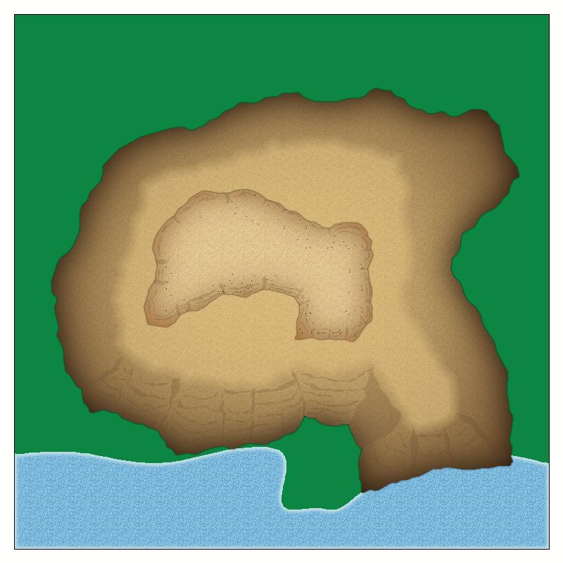
Kleosis is a world full of wild dangers, including a thick forest, an ocean full of monsters, and raging storms that do tremendous damage. It has a single town, built in antiquity to rescue the Library of Alexandria. The own is built atop a magically-leveled mountain that has had plateaus carved into its heights. Most of the town itself is carved into the core of the hollowed mountain, while the fields and pastures and a few public spaces are on the flattened top of the mountain.
I've been working on drawing cliffs to get this feel of height. I've looked at a number of maps, including the fantastic Orde-on-the-Rock tutorial, which has been very helpful.
I'm hoping for some tips on how to improve the look of these - especially the 'layered' look of the plateaus. There will actually be three layers, but as I started drawing, I realized that I need to make my map much, much bigger than I'd planned in order to account for drawing the 'height'.
I could also use some help understanding and working with scale. I read that CD treats a map unit as a foot. The flattened top of my mountain on which my city and fields live needs to be about 850x850 (roughly 15 acres). Any advice on how big to make my map drawing space to get this? Or how to math things smartly? The one I've been playing in is 1,000 x 1,000. It looks like I'm using about 6 grid squares on each side to get the height - is each square a map unit?
I'm also looking for tips on managing colors and the aesthetics of a map. I'm trying to work from darker to lighter to give the feel of height, but I'm having a hard time figuring out how to work with a palette that
flows smoothly. Is there an 'eyedropper' equiv that will let me select a color I've already used and just adjust it?
Also, anyone have any idea what the dark dots are/where they came from? I don't see them in CD, with all sheets visible.
Any overall advice is super appreciated!
Comments
So, as you say, CD3 threats one map unit as a foot (or a meter when you work with metric maps).
When you talk about grid squares, they are the size you told them to be. They are probably NOT 1 map unit each, as that would be an incredible dense grid. I don't see an actually grid on your map here, so I am guessing you are talking about the snap grid. I believe the default value for that is 20 map units for the CD3 templates (this is a template-spesific option, and not a global one), but you can set it to whatever you want.
Whenever you are a bit unsure about the sizes of things, use the distance tool (Info menu --> distance), that is a great way to figure out sizes in your map. As long as you do work in real world units as I mentioned above, and which you already seem to be doing, the information tools are great for getting the lengts and sizes you need.
One important point to consider when you figure out how much space needed to draw those cliffs are actually how steep you want them to be. Remember, this map is seen from straight overhead, so any "width" to the cliffs do indicate a slope rather than a sheer drop. The wider you draw them, the gentler the slope.
Visually, you seem to have gotten yourself a nice start, it is looking very good.
You can use Copy to Sheet (right click on Copy button to see it)
Each way has its own uses.
Thank you! I'm pretty pleased with it so far - even if I'm accepting that I'll inevitably have to start it all over once I get the hang of the technique.
In terms of its colour, you can then click the small coloured rectangle in that top line in your CC3+ window, see what number the colour is on the colour palette you're currently using, and then change it by-eye from the options presented. Having done that, you can use the Change Properties tool (the icon below the eye-dropper) on the object you wish to change to adjust its colour as normal. I think this is a rendering effect because of whatever resolution you're using to extract the image. Others far better versed than me in the technicalities can doubtless correct that if I'm wrong though!
I think the dots may be a result of repeating the same sheet system twice, where it was only done the once in Orde-on-the-Rock. In places that has meant that textures with exactly the same effects applied to them are overlying, and that causes problems with the current rendering engine.
You can get around that by doing it all on the same set of sheets and just leaving gaps between the cliffs for different levels - remembering to draw the appropriate shapes on the "CLIFF stone cap" sheet to cover all the level areas. Or you could have several of that sheet depending on how high up the levels are on the 'tier cake' arrangement.